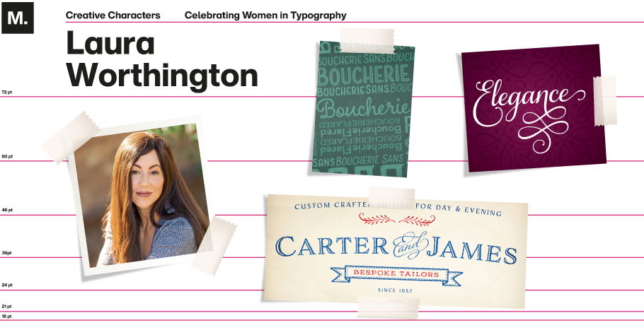
Celebrating Women in Typography: Laura Worthington

March is Women’s History Month, so we’re taking the opportunity to celebrate some amazing women working in the type design industry.
This week, we’re talking with Laura Worthington of Bonney Lake, WA, about her journey and insights as a type designer.
MyFonts: Tell us about your journey as a type designer and any challenges you had to overcome.
Laura Worthington: I started out in 2010, it was an interesting time as there wasn’t a lot of information about how to design type online. I got really lucky. I was a graphic designer at the time and had struck up a friendship with a fellow type designer, Charles Borges de Oliviera, who was also a lettering artist. And ironically he and I had the same graphic design clients. He had seen a signature in my email where I hand lettered my name and he asked, “Hey, are you a lettering artist? Are you interested in this? I am too.” And we became friends and he kept pushing me to design type. And I remember him telling me his first type design took 800 hours and I’m thinking to myself, yeah, I don’t have a spare 800 hours to experiment with something like this.
But I was just really interested in it and I decided to take him up on his offer for, you know, a little bit of tutelage. So we met up and I spent about an hour and a half teaching him some things in Dreamweaver about web design and he spent about an hour and a half teaching me FontLab. And that’s about all the instruction that I got. People ask me all the time about how much training did you get? And I say, about an hour and a half at the computer lab at Highland community college at the end of finals week when I was teaching there with Charles Borges de Oliviera, that’s about the extent of it, and reading Learn FontLab Fast, by Leslie Cabarga. Other than that, I’m really self-taught in the realm of type design.
MF: What would be one tip that you would give women who are considering becoming a type designer?
LW: I would encourage them to get into programming and learning the ins and outs of the software and its capabilities. I mean, there are so many interesting things that can be done from the programming end with type. And I think that there’s just a lot to be explored and I would encourage that.
MF: Can you share some insights with us, Laura, on what more can be done to advance diversity in typography?
LW: You know, it’s kind of an interesting question because at first we were talking about women and type, and when I thought about it from there, I felt really fortunate that I got into type at the time that I did. There was a lot of encouragement for women and pushing for women to advance into typography and a lot of opportunities. It was at the time, I remember reading a statistic that only 11% to 13% of all the people in typography were women. And so I got in at a time when there weren’t a lot of women in type. It started changing, and very rapidly and I noticed a lot more women at the conferences. There were a lot of just wonderful guys who really wanted to improve upon that.
But I think now to me, the big problem that seems to exist with diversity in the type world is not promoting non-white type designers. That’s actually my concern more than anything. I think that there’s so much of a focus on Latin typefaces that we’ve almost divided the world of typography into what’s Latin and what’s non-Latin. There are thousands of other writing systems that exist out there. And some that provide incredibly beautiful complexity and diversity. I would love to see more of that being promoted.
MF: Are you looking to explore some of that on your own as well in your type design?
LW: Yeah, actually I worked on a typeface a couple of years back that opened up the world to me of non-Latin typeface design. I was working on a design for, I don’t know if you’re familiar with the Cherokee writing system, before it became a typographic system, there was a writing system that was developed by Sequoyah, one of the leaders of the Cherokee tribe. It was handwritten. I worked on that with Ross mills at Tiro Type Works and synthesized his handwriting into a typeface. And it was almost like reverse engineering how he developed the system and looking for patterns within it, and then how to make it match up with the other typographic systems that were put into place by him. That was a fascinating experience. I’m definitely looking forward to doing more of that. That was really where I kind of cut my teeth and broadened my horizons. Hopefully there’ll be more of that kind of work in the future for me.
MF: You said that you are self-taught. What did you go to school for prior to doing type design?
LW: I have a vocational degree in production illustration, which is graphic design, but more of the mechanical. When I got started, the world was on the cusp of where the digital world kind of took over the manual cut and paste world of graphic design. In my first year as a graphic designer, I learned all the traditional techniques of paste up work in graphic design. And then the next year we got into, learning the computer programs. I’m proud to say, I was using Photoshop when it was in its first version and all of the early software programs that we used to design. So that was how I got my start. And like I said, it was the two year vocational degree at Highland community college. I ended up teaching there part-time about 10 years later, which was pretty wild, teaching in the same classroom that I went to school in. So that’s 13 years as a graphic designer.
Prior to that, my real interest started in calligraphy when I was about nine years old. I always talk to people and they ask— how did you become a type designer? It’s kind of this merger of my childhood and my adolescence, calligraphy combined with graphic design and in 2010, it turned into type design, with a focus on scripts. I’m pretty self-taught, it seems that at the time it was a little bit easier to be self-taught because the programs that we were using to design type were pretty simplistic. Now they’ve gotten to be a lot more complex, so I’ve kind of gotten to grow up along with it.

MF: Shifting gears — What do you do besides type; We would love to hear a little fun fact about you?
LW: Oh gosh. All kinds of things. Something that I love to do, and I forgot to pull it out real quick. If you don’t mind, I’ll grab it. And you guys can look at this cool little monogram that I’ve got on my chair, it’s my logo. When I bought this office chair, it was an option to have your logo, or your initials or whatever, stitched into the chair. And I was like, yeah, $40 to do that. Are you kidding me? Absolutely.
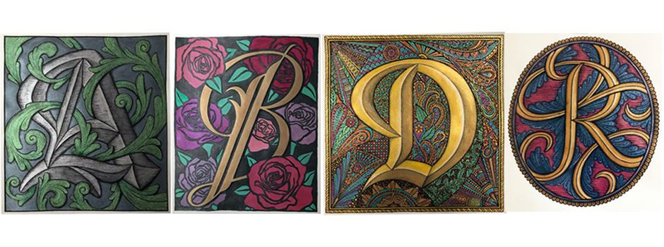
So here’s kind of a little thing that I’ve been doing for fun — It’s decorated initials, I sketched them out on paper first and then using metallic inks and pretty much like an old fashioned dip nib. So this one’s for my little sister, Elena, and here’s a letter letter B, and then of course, you have to do two different versions of it. Which one do you like better?
MF: I like the A because my name starts with an A.
LW: I can get a copy of that and send it to you. I’ve got a couple of others, like that are up in the background, that’s a digital version, but I painted that up for my mom, her name’s Regina. And then I did a really cool letter D for my dad. His name is Douglas. So that’s kind of something that I do for fun. Also, I like to go on nature hikes and be outdoors and gardening. We live on a little over an acre of woods out here in Bonney Lake. It’s like wild America here, we have bobcats and feral chickens and roosters, which is interesting. So whatever I can do to be outside in the summertime, and then in the winter, I like to do something a little bit more artistic.
MF: I have one last question for you. What would you want to say to our customers? Anything you want to leave for them?
LW: Thank you. A huge thank you so much for you being interested in type, watching the series. And really just being there for us. I think that it’s something that we forget to do, I get emails from time to time where people say we really love your fonts. And you bring beauty into the world and you say thank you back. But sometimes I think it’s nice to use the platform to, to really say, thank you. Without our customers, we obviously wouldn’t be able to do what we do. So, That’s appreciated.
Interview edited for length and clarity.


