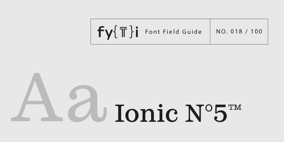
Ionic N°5™ Font Field Guide

Foundry: Monotype Designers: Clément Charbonnier Bouet, Malou Verlomme Classification: Clarendon, Slab Serif
Best Practices
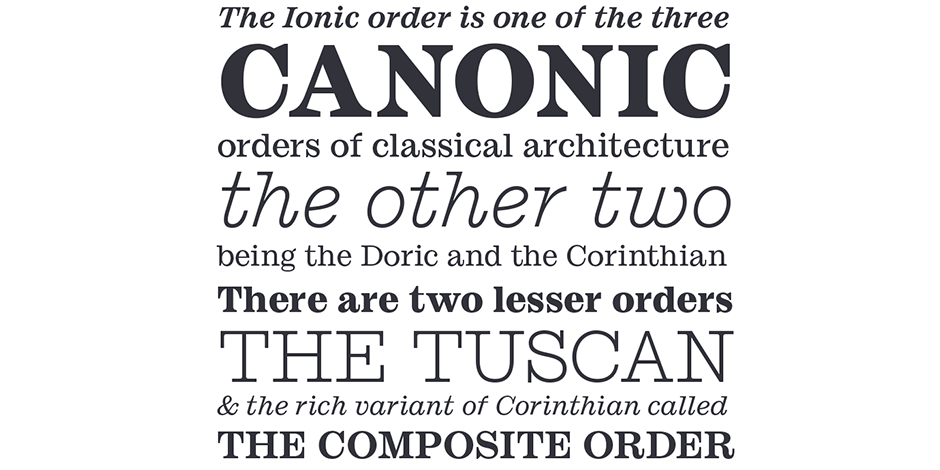
With its particularly small ascenders and descenders, Ionic N°5 have tight linespacing for a solid texture and impressive space-saving performances. If it is given a little more line height, a more bookish and sophisticated feel will start to show. At large sizes, the radical shapes will give it a very contemporary touch. The Light weight can be used on its own for its typewriter-like features.

Family
Five roman weights with Italic counterparts.
Font Facts
- The 1925 Ionic N°5 release was an immediate success: in less than 18 months, it was used by nearly 3000 newspapers around the world. It was the first to demonstrate that a single typeface could solve the technical problems shared by all newspapers.
- When Linotype’s 1925 N°5 was designed, it aimed at maintaining legibility at small sizes, under the particularly harsh printing conditions of the time. The same logic was here applied with contemporary shapes. “Historical” round shapes are still in the font but as alternates.
Roots
Ionic N°5 is based on the 1925 Linotype typeface by Chauncey H. Griffith (1879–1956). It was released as part of the “legibility group” (Ionic No. 5, Excelsior, Paragon and Opticon). Designed specifically for the newspapers of the time, it became quickly a huge success and was widely adopted in newspapers around the world.
Almost a hundred years later, Clément Charbonier Bouet and Malou Verlomme set out to revive the typeface. The result is a contemporary interpretation of the original goals, tailored for graphic designers.

Legibility
Ionic N°5 has strong legibility even down to relatively small sizes. Terminals have been treated in a radical manner which avoids any ink smudge.
How to spot Ionic N°5™

Alternate Choices
Perfect Pairing
Download a pdf version of the Ionic N°5™ font field guide and view the Ionic N°5™ font family.
More Font Field Guides

Somewhat condensed and slightly angular, Bitstream News Gothic is an efficient user of space and holds up well on screen. Learn more

The original Baskerville typeface was created for setting books, and its modern revivals are ideally suited to the setting of continuous text. Learn More


