Optima Nova Font Field Guide

Foundry: Linotype Designers: Hermann Zapf & Akira Kobayashi Classification: Humanistic Sans
Best Practices
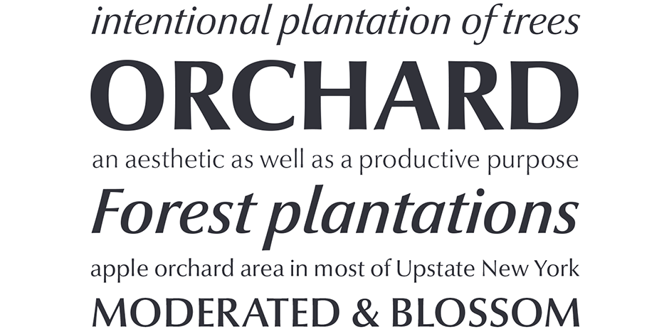
Optima nova should be set more open than tight. The unhurried elegance and light gray color created by the face is disrupted when letters are set too tight.

Family
Seven roman weights, each with an italic counterpart, plus six condensed designs and a titling font.
Font Facts
- The first sketches for Optima were made on a 1000 Lire bank note, which served as a sketchpad to record Zapf’s findings on ancient Roman gravestone.
- The italic designs were based on photo distortions made by Photo-Lettering Inc. in New York City.
Roots
Harmann Zapf worked on the design two years before he turned final drawings over to Stempel’s master punchcutter. The first trial fonts were made in 1952, but it wasn’t until 1958 that the family was made available as hand-set metal fonts.
In 2002, Hermann Zapf and Akira Kobayashi, collaborated to revive and update the original Optima design. In the process, they added cursive italic designs to replace the sloped roman characters of Zapf’s first drawings.

Legibility
Distinctive character shapes and open counters ensure legibility. The Optima nova design is most readable when set open and with abundant line spacing.
How to spot Optima Nova

Alternate Choices
Perfect Pairing
More Font Field Guides

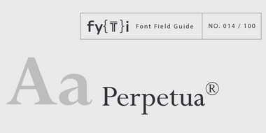
Because of its fine hairlines and delicate serifs, Perpetua should be set a little larger in on-screen applications that in print. Learn More

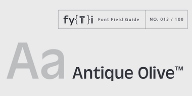
Antique Olive design is not intended for continuous text copy. It can, however, be used for short blocks of textual content if given ample line space. Learn More


