TT Rationalist Font Field Guide

FOUNDRY: TypeType
DESIGNERS: Marina Khodak, Radik Tukhvatullin & Yulia Gonina
CLASSIFICATION: Slab Serif
Best Practices
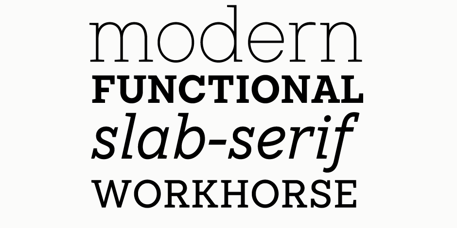
The font looks beautiful in printed products: books, brochures, and posters. The design is well-suited for setting in large sizes as well as in text arrays.

FAMILY
The TT Rationalist font family consists of 22 faces: 10 upright, 10 true italics and two variable fonts. It supports over 200 languages and contains 27 OpenType features.
Font Facts
- The refined nature of the font is emphasized by true italics and the set of alternative calligraphic characters.
- The refined trapezoid serifs make the design look contemporary.
- The carefully balanced font contrast helps avoid retro references.
Roots
This is the first font by TypeType that was created to match the studio’s existing fonts TT Norms® Pro and TT Commons Pro. TT Rationalist borrowed its geometric character from sans serifs, but in the process of development it has also received new humanist features.

Legibility
TT Rationalist is easily legible and does not attract extra attention in text, and in large size, it shows its character: the design details – trapeze shaped serifs and delicate compensators – become visible.
How To Spot TT Rationalist

Alternate Choices
Perfect Pairing
Download a pdf version of the TT Rationalist Font Field Guide and view TT Rationalist.
More Font Field Guides

TT Fellows Font Field Guide
Thanks to the font’s uniwidth and versatility, TT Fellows is ideal for use on websites or in periodicals. Bold styles will work harmoniously in headlines or as accents in print or on packaging. Learn more

TT Commons Pro Font Field Guide
TT Commons Pro is a versatile tool. It has a wide area of application: app interfaces, websites, printed materials, branding. Learn more


