2021 Font Trends for Designers to Use this Year
In 2020, Clif Stoltze and Katherine Hughes, of Stoltze Design, told us about the power of new experimental typefaces, symmetrical layouts with selective deviations, and the value of classic designs.
Gloria Kondrup, design consultant and full-time professor at ArtCenter College of Design encouraged us to “not to play it safe typographically.” Angie Wang and Mark Fox, partners in the award-winning Design is Play design studio, provided sound advice about using blunt force typography, highly readable text and variable fonts, to capture and keep audiences.
What’s up with the Font Trends for 2021?
We’re seeing some clear typeface trends. There will be more use of lighthearted scripts. In addition to a new breed of sans serif designs getting popular use, industrial strength sans are making commanding statements. Fonts with a flourish are still trending and heavyweight display typefaces are attracting attention.
Font Trend #1: Lighthearted Scripts
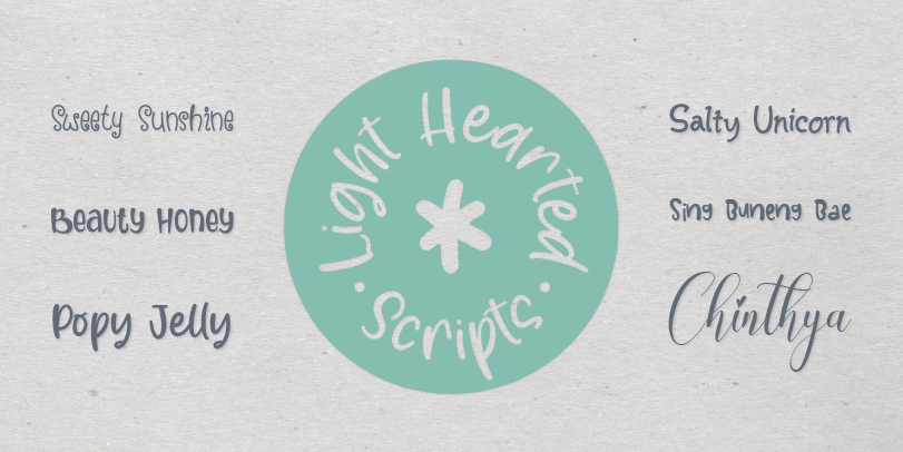
Perhaps it’s because of an optimistic view for 2021 that playful, lighthearted, scripts are being used more. They have a fresh handwritten quality and their free-form characters and unusual stroke weights give the fonts an irreverent, carefree, nature. Children’s brands are a natural for these special scripts. Their playful rounded forms are ideal for products aimed at a younger audience. They’re also happily at home in packaging, cover art and editorial design.
Sweety Sunshine is a breath of fresh air, its letters dance on the page with childlike freedom, while Beauty Honey combines cap and bi-form letters into a friendly, casual script that easily creates distinctive logos, powerful packaging and eye-catching banners. Popy Jelly and Salty Unicorn could be typographic brothers and sisters – or at least very close cousins. They celebrate the charming quirks of hand-drawn letters, while being energetic and playful. Both are ideal for packaging, social announcements and game branding. Chinthya has just a touch of formality, but is never stuffy, while Sing Buneng Bae takes advantage of a bevy of alternate characters to create one-of-a-kind headlines and logos.
Font Trend #2: Sans With a Twist
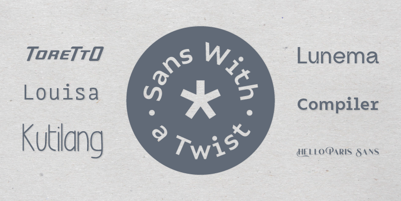
There’re new kinds of sans serif typefaces being drawn, and they’re getting attention. They range from Hubble Space Telescope precise to free-form and wildly romantic. All, however, take the basic sans serif design and add something special.
The Hello Paris Sans family is five weights of all-cap designs with contextual ligatures and flowing swash letters in the shift position. The result is a typographic confection with remarkable versatility. The Compiler family is 32 designs of apparent monospaced exactitude – except it isn’t monospaced. Compiler has the vestigial serifs typical of monospaced designs, while Compiler Plain does without. Brand recognition is guaranteed and the fonts can be used for websites, apps, corporate design, annual reports, wayfinding, and more. Louisa, however, is a true monospaced design. But characters like the lowercase a, e, g, k, v, w, x and y give it a friendly, welcoming demeanor. The italic fonts also have cursive underpinnings. ToreTtO is yet another take on highly structured, geometric sans. It’s forward-slanting caps and small caps can create commanding yet minimalistic statements in headlines, subheads, posters and cover art. Kutilang is a high-waisted, condensed design softened with a subtle calligraphic influence. It’s versatile, space-economical and distinctive. Lunema takes “ink traps” of the 1970s and 1980s to new heights. While very noticeable at large sizes, as point-size is reduced, they create an almost soft, flowing demeanor. The tail of the g and y provide a sharp counterpoint to this implied flexibility, making for a memorable design.
Font Trend #3: Swashes Galore
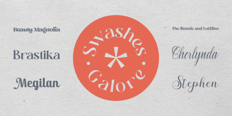
Fonts with swash characters have been around since the 1970s, so they’re not exactly trend setting.
But new designs are being added to the MyFonts offering almost daily. Most are modern versions of the 70s genre, but some are as new as tomorrow.
Brande and Lotaline and Beauty Magnolia are heavyweight serif designs that are surprisingly light on their feet, while Brastika is nine weights of flowing letterforms. The lightest and boldest weights create inviting banners and headings, while the midrange designs are perfect for navigational links and sub heads. Cherlynda is a flowing script that is ideal for crafting invitations, advertising headlines, product packaging, and posters for special events. Stephen is another flowing script with an abundance of swash alternatives, while Megilan is a soft sans serif with extraordinary flourishes.
Font Trend #4: Industrial Strength Sans
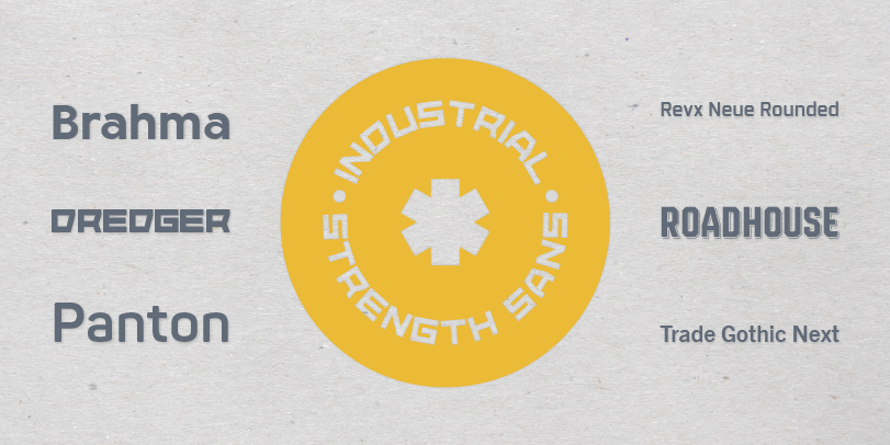
Industrial strength sans serif designs are marked by their straight forward power and design durability. They can be used in a wide variety of applications and with the assurance that they will not look dated or out of style.
Brahma is nine weights of assertive geometric sans suitable for print labels to digital banners – and pretty much everything in between. Revx Neue, and its companion design of Revx Neue Rounded, make for a large square sans serif family that is equally comfortable in print and on screen. The Panton family can only be described as massive. Another square-shouldered design with seemingly no limits, it is a typographic investment that will pay for itself many times over. Trade Gothic Next is a reimagining of the quintessential industrial strength sans serif design. Just as powerful as the original design, the new version is even more versatile. Dredger and Roadhouse are display designs with character that will easily stand the test of time.
Font Trend #5: Heavyweight Display Designs
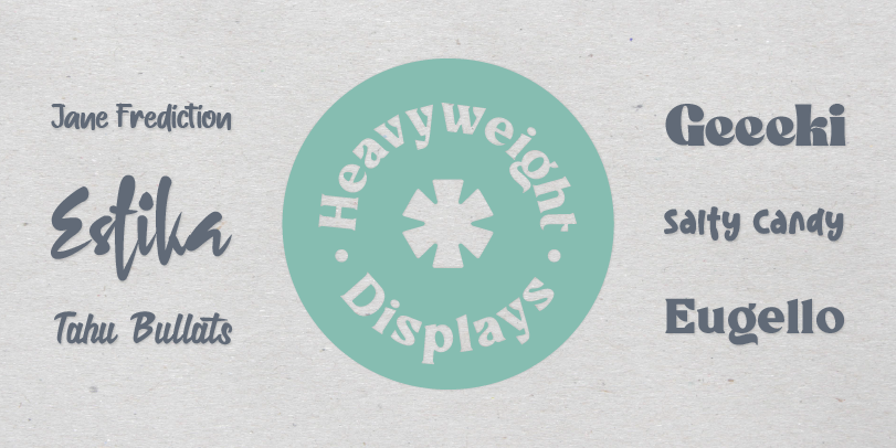
These are single-weight display typefaces with presence and character. Their plus-size proportions and playful vibe make them exceptional performers at large sizes.
Estika, Jane Frediction, Salty Candy and Tahu Bullats are scripts – each with a different demeanor. Estika is immediate and a little edgy, while Jane Frediction is folksy and friendly. Salty Candy has a fresh naivete and Tahu Bullats has an, almost upright, sign painter’s script. Eugello and Geeki are serif designs with heavyweight charm. All are perfect foundations for poster art, logo design, print headlines, digital banners and just about anyplace else that calls for a typeface that stands out and wears well.
