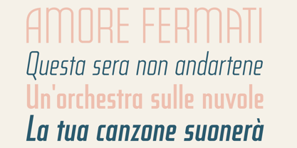
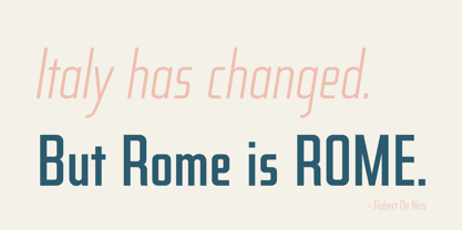
Postale
by Dear Alison

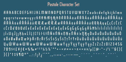
- Aa Glyphs
-
Best ValueFamily Packages
- Individual Styles
- Tech Specs
- Licensing
Per Style:
$15.00 USD
Pack of 4 styles:
$60.00 USD
About the family
Designers: Alison Argento
Publisher: Dear Alison
Foundry: Dear Alison
Design Owner: Dear Alison
MyFonts debut: Feb 29, 2020
About Dear Alison
Dear Alison is the creation of Alison Argento, a travel writer based in Cherry Hill, New Jersey. Although her work dictates that she spend most of her time typing and editing at the computer keyboard, she prefers the traditional look and feel of handwritten letters and the freehand lettering arts along with the look of vintage type. Dear Alison fonts are meant to bring the handcrafted feel of personal correspondence to the digital age.
Read more
Read less
- Choosing a selection results in a full page refresh.