Select this license type when you are developing an app for iOS, Android, or Windows Phone, and you will be embedding the font file in your mobile application's code.
Aparo
by DSType
Individual Styles from $40.00

Aparo Font Family was
designed by
Dino dos Santos and
published by
DSType. Aparo contains
1
styles.
More about this family
About Aparo Font Family
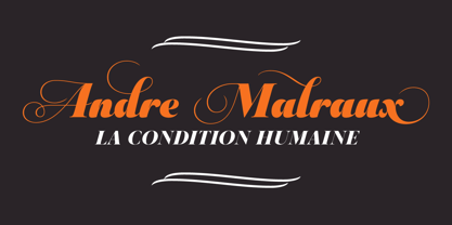
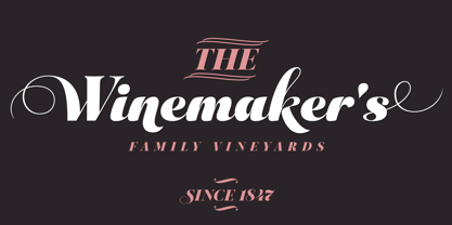
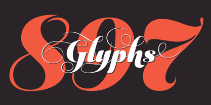
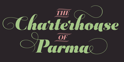
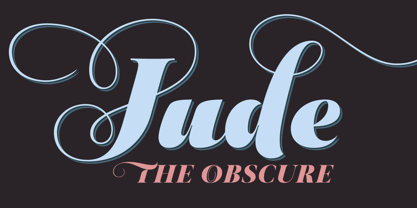
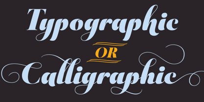
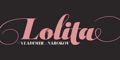
Typography or Calligraphy. Unconnected or Connected. For us, at DSType Foundry, that was the main question. With Aparo, we tried to bring the best of the two worlds into a single, yet complex, typeface. Aparo appears to be a very simple bold italic roman typeface, but it has plenty of calligraphic flair, including swashes that make your words stand out, collision detectors so that you don't get weird combinations, alternate characters activated by default for improved calligraphic effect and a very extended character set in a total of 897 glyphs. Download our detailed type specimen for complete information on Aparo.
Designers: Dino dos Santos
Publisher: DSType
Foundry: DSType
Design Owner: DSType
MyFonts debut: Jul 2, 2013
Aparo
About DSType
“I began designing typefaces in the early ’90s because there weren’t many typefaces available to us in those days,” Dino dos Santos, founder of DSType, said in his Creative Characters interview. “I started designing fonts that matched the new typographic experience. To me, graphic design was never about taking a picture and then just choosing one of the available typefaces” Based in Porto, Portugal, Dino got his start designing typefaces for magazines and large corporations. Frustrated that the only fonts available for use were system fonts and dry transfer sheets, he began selling his typefaces on MyFonts. Since then, the self-taught designer has created a library full of striking experiments, charming display type, and most notably, an amazing collection of well-wrought, extensive text families. His collection also boasts a handful of bestsellers such as Velino Text, Prelo Slab and Prumo Slab. “There is not much of a type design history in Portugal,” he noted in his interview. He is, however, interested in what has been done in his country by older generations of type designers and calligraphers. “I want to understand what happened, how things worked back then, and expose the world to some lesser-known work. History is often seen as something that passed away, and that’s it. But for me history is one of the most relevant aspects of type design. I believe we are made of history, but also that we should take a step forward by connecting it to the present and the future and we can do that through technology.”The Premium foundry page can be viewed Here.
Read more
Read less
- Choosing a selection results in a full page refresh.