Select this license type when you are developing an app for iOS, Android, or Windows Phone, and you will be embedding the font file in your mobile application's code.
Breve Text
by DSType
Individual Styles from $50.00
Complete family of 12 fonts: $380.00

Breve Text Font Family was
designed by
Dino dos Santos and
published by
DSType. Breve Text contains
12
styles and family package options.
More about this family
- Aa Glyphs
-
Best ValueFamily Packages
- Individual Styles
- Tech Specs
- Licensing
About Breve Text Font Family
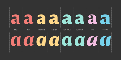
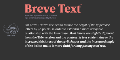
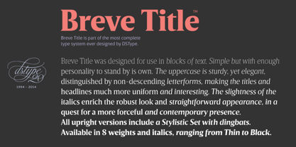
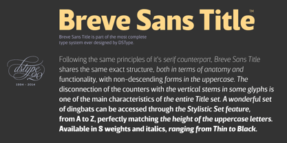
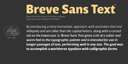
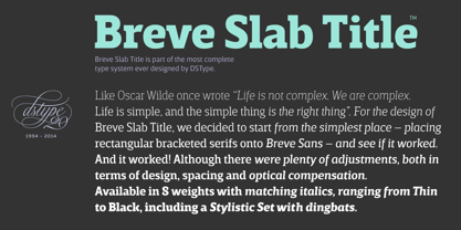
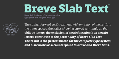
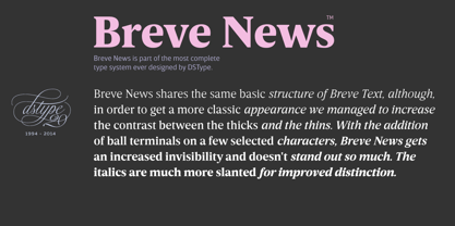
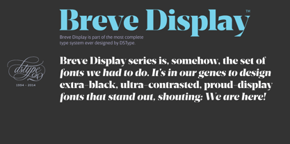
Breve was designed for use in editorial projects. Simple but with enough personality to stand by is own, in a quest for a more forceful and contemporary appearance. All the fonts in Breve superfamily, share the same exact structure, both in terms of anatomy and functionality. The Text versions provide a softer and warm feel to the typographic palette and is intended for use in much longer passages of text, while the Title versions are distinguished by non-descending letterforms, making the titles and headlines much more uniform and interesting. The News version is more classic, with ball terminals and classic proportions, while the Display is, somehow, the set of fonts we had to design: extra-black, ultra-contrasted, proud-display fonts.
Designers: Dino dos Santos
Publisher: DSType
Foundry: DSType
Design Owner: DSType
MyFonts debut: Oct 28, 2014
Breve Text
About DSType
“I began designing typefaces in the early ’90s because there weren’t many typefaces available to us in those days,” Dino dos Santos, founder of DSType, said in his Creative Characters interview. “I started designing fonts that matched the new typographic experience. To me, graphic design was never about taking a picture and then just choosing one of the available typefaces” Based in Porto, Portugal, Dino got his start designing typefaces for magazines and large corporations. Frustrated that the only fonts available for use were system fonts and dry transfer sheets, he began selling his typefaces on MyFonts. Since then, the self-taught designer has created a library full of striking experiments, charming display type, and most notably, an amazing collection of well-wrought, extensive text families. His collection also boasts a handful of bestsellers such as Velino Text, Prelo Slab and Prumo Slab. “There is not much of a type design history in Portugal,” he noted in his interview. He is, however, interested in what has been done in his country by older generations of type designers and calligraphers. “I want to understand what happened, how things worked back then, and expose the world to some lesser-known work. History is often seen as something that passed away, and that’s it. But for me history is one of the most relevant aspects of type design. I believe we are made of history, but also that we should take a step forward by connecting it to the present and the future and we can do that through technology.”The Premium foundry page can be viewed Here.
Read more
Read less
- Choosing a selection results in a full page refresh.