Select this license type when you are developing an app for iOS, Android, or Windows Phone, and you will be embedding the font file in your mobile application's code.
Shandon Slab
by Hoftype
Individual Styles from $0.00
Complete family of 18 fonts: $198.00


Shandon Slab Font Family was
designed by
Dieter Hofrichter and
published by
Hoftype. Shandon Slab contains
18
styles and family package options.
More about this family
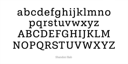
- Aa Glyphs
-
Best ValueFamily Packages
- Individual Styles
- Tech Specs
- Licensing
About Shandon Slab Font Family
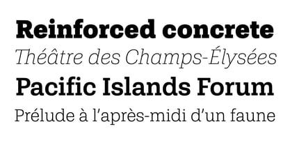
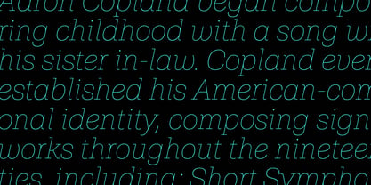
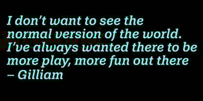
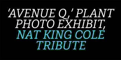
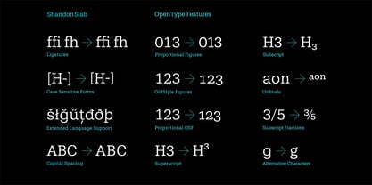
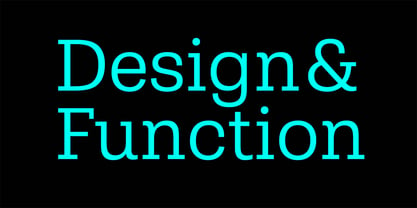
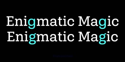
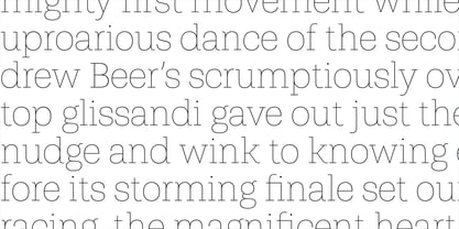
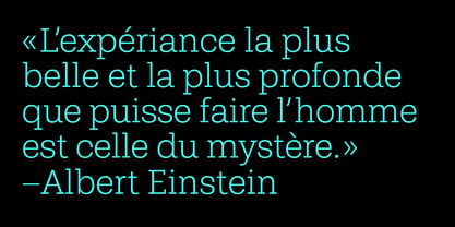
Shandon Slab adds a new colour to the prominent family of serif-dominant typefaces. A distinctive look with its slightly flowing characteristics sets it apart from most members of the category. The contrasting italic styles add a vivid accent. Shandon Slab is predestined for editorials, headlines, and eye-catching text applications. The Shandon Slab family consists of 18 styles. It comes in OpenType format with extended language support for more than 40 languages. All weights contain standard and discretionary ligatures, proportional lining figures, tabular lining figures, proportional old style figures, lining old style figures, matching currency symbols, fraction- and scientific numerals, matching arrows and alternative characters.
Designers: Dieter Hofrichter
Publisher: Hoftype
Foundry: Hoftype
Design Owner: Hoftype
MyFonts debut: Sep 20, 2018
Shandon Slab
About Hoftype
German designer Dieter Hofrichter started his foundry in 2010. Since then, he has remained focused on developing text fonts that integrate the rich history and tradition of typography with contemporary styles. Based in Munich, his first typeface on MyFonts was Impara, a sans serif with lively stroke ductus and distinct humanistic characteristics that is a representation of linear coolness and classic elegance. Since his debut, he has continued to produce beautiful, high quality serif faces. Capita, one of the foundry’s best sellers, is a self-dominated face with a fresh style that avoids the harshness of many slab serifs. Dieter has also seen success with one of his most recent designs, Mangan, a text face that combines classical rationality with contemporary design. “One of our intentions is to utilize the knowledge of the history of type to create contemporary types,” Dieter says. “Style consciousness and many years of experience in type design are our qualifications for producing functional and usable types of high quality.”
Read more
Read less
- Choosing a selection results in a full page refresh.