This is a listing of all glyphs contained in the font, including OpenType variants that may only be accessible via OpenType-aware applications.
Each basic character (“A”) is followed by Unicode variants of the same character (Á, Ä…), then OpenType variants (small caps, alternates, ligatures…). This way you can see all the variations on a single character in one place.
MyFonts licenses are tailored for individual creatives. Not all licenses are compatible with broad usage cases or complicated creative workflows, so make sure to read the full EULA text for details. If you are licensing fonts for use at an Agency or Company, or if you have a usage requirement that isn't listed below or are unsure about the use cases shown here, contact us and we'll help you determine the best fit for your needs.
The following licenses are available for this font.
Desktop: for creating designs
This entry-level license enables personal and commercial traditional graphic designer work.
The Desktop License allows you to create, print, and share flat, non-editable designs such as:
Brand identity
Use fonts to create a strong and consistent brand identity.
Videos
Apply fonts in titles, credits, and on-screen text.
PDFs
Style reports, brochures, and digital documents.
Greeting cards
Design unique, personalized cards for any occasion.
Logos
Craft memorable, professional logo typography.
Signage (wayfinding & billboards)
Make clear, eye-catching signage for indoor or outdoor use.
Flyers
Set readable, attractive headlines and layouts.
Packaging
Enhance product packaging with stylish text.
Album covers
Print custom text designs on t-shirts, hoodies, and more.
Posters
Bold, eye-catching poster layouts.
Invitations
Create stylish, personalized invitations for events.
Social posts
Enhance graphics and captions with unique fonts.
Business cards
Craft professional, memorable business card designs.
Fonts cannot be hosted on DAMs as downloadable assets.
Show all
Desktop licenses are based on the number of users of the fonts. You can change the number of users by clicking the quantity dropdown option on Buying Choices or Cart pages.
Please be sure to review the listing foundry's
Desktop license agreement
as some restrictions may apply—such as use in logos/trademarks, geographic restrictions (number of locations), and products that will be sold.
Adding users later:
Desktop licenses are cumulative. If you require a Desktop license that covers additional users, simply place a new order for the same Desktop package, for the number of additional users.
Webfonts allow you to embed the font into a webpage using the @font-face rule, so paragraphs and headings
of text can be styled as the webfont. You will be serving the webfont kit for your own site and linking
it in the CSS.
Webfonts can be used on a single domain. Agencies responsible for multiple websites, for example web
design agencies or hosting providers, may not share a single webfont license across multiple websites.
If the font file itself won't be embedded in the website (for example, when the font is used in a static
graphic image such as a logo) you should purchase a Desktop license instead.
Most foundries on MyFonts offer their webfonts with the Annual license model. Click here to
Learn more.
Select this license type when you are developing an app for iOS, Android, or Windows Phone, and you will
be embedding the font file in your mobile application's code.
You can use an Electronic Doc license to embed the font in an electronic publication such as an eBook, eMagazine, or eNewspaper.
An Electronic Doc license is based on the number of publications in which the font is used. Each issue
counts as a separate publication. Regional or format variations don't count as separate publications.
Updated versions of publications that are free to previous customers do not need a new license; otherwise,
each new version that is released counts as a separate publication.
For font usage in graphic images shown as the ePub cover, consider a Desktop license instead as most allow
for it.
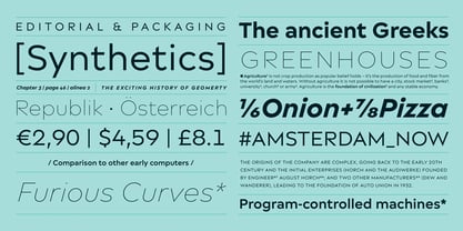
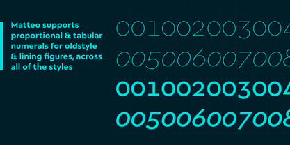
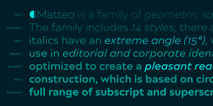
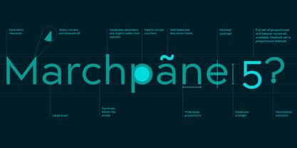
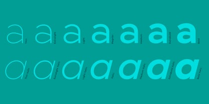
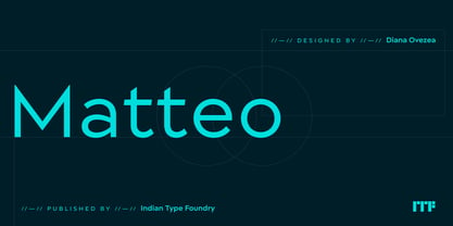
Matteo is a family of geometric sans serif fonts. Designer Diana Ovezea has given the family an Italian name so that users might call fast cars to mind when they see it. The family includes 14 styles; there are seven weights, ranging from Thin to Bold. Each of these includes a companion italic. Matteo’s italics have an extreme angle (15º), which is quite unusual for a sans serif design. These italics are oblique in form, with a single-storey ‘a’ in place of the upright’s double-storey ‘a’. Matteo is an excellent selection for use in editorial and corporate identity designs, as well as advertising or annual reports. The shapes of its letterforms, as well as their spacing, have been optimized to create a pleasant reading experience, even in longer texts. The most prominent feature of the typeface is its geometric construction, which is based on circles and ovals. Letterforms in all seven of the weights are based on the same skeleton, with the ‘O’ maintaining its circular proportions (this makes Matteo’s lighter weights feel wider than its heavier ones). Several of Matteo’s letterforms include sharp corners, e.g., the ‘A’, ‘N’, ‘M’, ‘V’, ‘W’, and ‘Z’, as well as in the numerals ‘2’, ‘3’, and ‘7’. The capital ‘T’, ‘E’, ‘F’, and ‘Z’ each feature slightly angled endings on their horizontal strokes. Three special characters are particularly noteworthy in terms of their design: ¶, ≠, and &. Each font includes four sets of numerals, as well as a full range of subscript and superscript figures for typesetting factions. The period, comma, colon, and semicolon have the same width in each of the family’s 14 fonts; this allows users to set tables more easily. The fonts are also ‘logo-ready’, with extensive kerning having been defined even between the lowercase and uppercase letters. This enables the easy typesetting of CamelCase terms, like ‘SonVender’, ‘eTones’, ‘MunYan’, etc., without any ugly gaps appearing between lowercase and uppercase letters.
Founded in 2009, the Indian Type Foundry (ITF) designs and distributes fine-quality, multilingual fonts for both the Indian and global market. ITF specialises in creating and developing both custom and retail fonts. ITF has designed and licensed fonts to some of the world’s most iconic brands including Apple, Google, Samsung, Sony, Amazon and Hyundai to name just a few. Its retail library offers fonts for text and display use, in visual styles ranging from traditional to experimental. ITF currently offers over 200 retail font families across 20 writing systems. ITF’s Kohinoor font family is on permanent display at London’s Design Museum as part of the “Designer Maker User” exhibition, which recognises this work as a historic milestone in the field of graphic design.