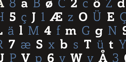
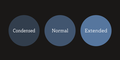
Skip to content
Home / Fonts / insigne / Haboro Slab Soft
Haboro Slab Soft

Haboro Slab Soft

by insigne
Individual Styles from $32.99
Complete family of 42 fonts: $259.99
Haboro Slab Soft Font Family was designed by Jeremy Dooley and published by insigne. Haboro Slab Soft contains 42 styles and family package options.

More about this family
FREE 30-DAY TRIAL of Monotype Fonts to get over 150,000 fonts from more than 1,400 type foundries. Start free trial
Start free trial

Per style:

$6.19

Pack of 42 styles:

$259.99

See 32 more... See less...

About Haboro Slab Soft Font Family


Haboro Slab Soft is a scion of the Haboro hyperfamily. This concept powers through with its well built, accommodating nature. Haboro Slab Soft’s serifs are rounded, giving it a softer look.


The Haboro hyperfamily is a comprehensive design suite that provides solutions for many projects. The iconic angled wedge makes this family ideal for apparel, packaging, apps, corporate identities and advertising campaigns. Subfamilies in the hyperfamily include the original Haboro, a Didone face, Haboro Sans, Serif, Soft, and Slab. The Haboro hyperfamily is known for its ability to make your copy appear clear and simple. The Haboro typeface is built on a common underlying model. It has the same cap height, the same x-height, and the same basic character shape. This unification of shape and proportion results in a complementary set of typefaces.


Haboro Slab Soft’s wide variety of ligatures and OpenType alternatives give your message the clarity it deserves. The Haboro Slab Soft family includes seven weights, from Thin to ExBold, three widths, and matching italics. There are over 550 glyphs per style and support for over 70 Latin-based languages. Haboro Slab Soft includes features such as small caps, ligatures, fractions, and alternatives.


Haboro Slab Soft is there when you need to present information in a clear and friendly fashion.

Designers: Jeremy Dooley

Publisher: insigne

Foundry: insigne

Design Owner: insigne

MyFonts debut: Feb 4, 2020

Haboro Slab Soft

About insigne

“Type is very much like music,” says Jeremy Dooley. “It is linear, and the notes or phrases have to fit the theme or song.” Jeremy, owner of the one-man foundry, insigne, is a self-taught type designer and a true self-made success story. His label is home to over a hundred font families, many of which have seen great success. Aviano has made our Best of the Year list not just once, but twice and has been featured in Hollywood blockbusters. You may have noticed various iterations of Aviano in Wall Street, Harry Potter, and Thor, and it was used for the branding of Robin Hood. Jeremy considers type to be the foundation of advanced visual communication. One form of communication that the Chattanooga-based designer is drawn to is branding. In 2011, Jeremy, took on the enormous project of coming up with a typeface that would communicate the tone and feeling of his hometown; a font that would effectively brand the city. In 2013, the result, Chatype, was named the official typeface of Chattanooga TN. “Every city needs a brand,” he says, “as every city needs to highlight its own distinctive offerings.” Like many designers, his creations are often the result of his interests. “I especially like seeing my typefaces in movies, on luxury packaging, and for technology companies,” he says. “These are interests of mine, and I often design fonts with those specific applications in mind. It’s very interesting to me that I frequently see fonts used in exactly the way I originally envisioned.” Since he began selling his first font on MyFonts in 2004, the man who will tell anyone who asks, “I’m not really from anywhere,” has continuously drawn inspiration from his many experiences gained from living all over the globe. Want more of Jeremy? The designer sat down with us for an in-depth interview in this issue of Creative Characters.

Read more

Read less