Select this license type when you are developing an app for iOS, Android, or Windows Phone, and you will be embedding the font file in your mobile application's code.
Evanston Alehouse
by Kimmy Design
Individual Styles from $5.00
Complete family of 25 fonts: $99.00


Evanston Alehouse Font Family was
designed by
Kimmy Kirkwood and
published by
Kimmy Design. Evanston Alehouse contains
25
styles and family package options.
More about this family
- Aa Glyphs
-
Best ValueFamily Packages
- Individual Styles
- Tech Specs
- Licensing
Evanston Alehouse Sharp pack
12 fontsPer style:
$5.00
Pack of 12 styles:
$60.00
Evanston Alehouse Round pack
12 fontsPer style:
$5.00
Pack of 12 styles:
$60.00
Evanston Alehouse 1858 Light Rnd
2 fontsPer style:
$5.00
Pack of 2 styles:
$10.00
About Evanston Alehouse Font Family
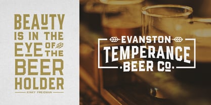
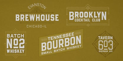
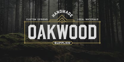
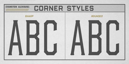
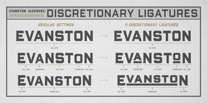
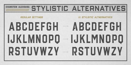
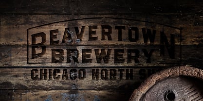
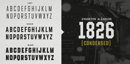
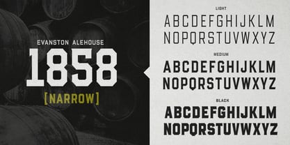
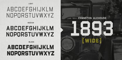
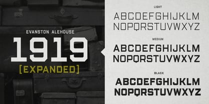
Evanston Alehouse is the first font in a larger collection of typefaces inspired by years leading up to the American prohibition. For the past two years I was living in Evanston, IL, a suburb of Chicago. After learning it was one of the birthplaces of the prohibition movement, I set out to learn more about it, and decided to develop a type collection that captures the dynamic era in our nation’s history. In the century that prefaced the ratification of the 18th amendment, saloons, taverns and alehouses boomed as the American working class enjoyed beer and discovered whiskey and gin. At the same time, the Temperance League was forming and gaining strength. By the turn of the century, these temperance societies were common in the culture of the country, with individual towns and states already on the move to abolish alcohol consumption. However, it was undeniable that by this time in history, America loved to drink. This font is inspired by the signage seen outside such drinking establishments. Back to the modern era, Evanston Alehouse is a 25 font family that includes 3 weights, 4 widths and 3 heights. It has special features that add depth to the font, with discretionary ligatures and stylistic alternatives. It also includes a complementary set of ornaments, including line breaks, frames, borders, and laurels. Here’s a snapshot of what you get with Evanston Alehouse: 2 Styles/Postions: Sharp (regular) and Round 3 Weights: Light, Medium and Black 4 Widths: 1826 (condensed), 1858 (narrow), 1893 (wide) and 1919 (expanded) 3 Heights: Capitals, lowercase and small caps 2 Alternatives: Discretionary Ligatures and Stylistic Alternatives 1 Ornament font with over 100 graphic extras
Designers: Kimmy Kirkwood
Publisher: Kimmy Design
Foundry: Kimmy Design
Design Owner: Kimmy Design
MyFonts debut: Mar 20, 2018
Evanston Alehouse
About Kimmy Design
“Kimmy Design is based out of Santa Monica, CA, but it’s as mobile as I am,” Kimmy Kirkwood says. “I love finding new inspiration and I work from Seattle, Palm Springs, Santa Monica, or wherever the next adventure takes me!” Kimmy founded her company in 2010; the same year that she graduated from college. Her first typeface, Madeleine, which is based on a logotype that she had created for a hotel in Positano, Italy, was actually a part of one of her final collegiate projects. She used it as an opportunity to teach herself about the intricacies of type design and develop the programming skills needed to create a true working font. Since then, her most successful designs have included Lunchbox and Lunchbox Slab: quirky hand-drawn typefaces that give an incredible array of customizable options and an authentically hand-crafted look. “My goal with these,” she says, “was to make them unique enough that the end product from any designer would look as if it was all made by hand.” “I love organic typefaces. Creating something that looks naturally handcrafted and letting the customers make it their own. In every hand drawn family I make I include multiple weights, styles and variations.” Kimmy uses contextual alternates in her typefaces and typically creates 3-5 variations of each letter, giving her fonts a truly hand-lettered feel. “I also usually include stylistic alternatives, which range from creating simple variations on specific letters to a unique style alternative for every character. Small Caps are a great way to give more options to designers while keeping the width and size of the font consistent. All of my font families are multilingual, and many include full Cyrillic and Greek alphabets. Whenever possible, I always include some sort of swash - either in fancy capitals, at the beginning and end of characters, or stylistic swashes.” All of these customizable options give the young designer’s families an intimate, personal feel. “Two different people could use my font and create something totally unique from one another. That’s what makes them so fun to use!”
Read more
Read less
- Choosing a selection results in a full page refresh.