Select this license type when you are developing an app for iOS, Android, or Windows Phone, and you will be embedding the font file in your mobile application's code.
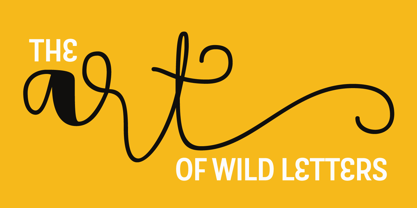
Touch Me
by Latinotype
Individual Styles from $0.00
Complete family of 19 fonts: $159.00


Touch Me Font Family was
designed by
Luciano Vergara,
Guisela Mendoza and
published by
Latinotype. Touch Me contains
19
styles and family package options.
More about this family
- Aa Glyphs
-
Best ValueFamily Packages
- Individual Styles
- Tech Specs
- Licensing
About Touch Me Font Family
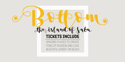
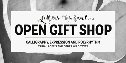
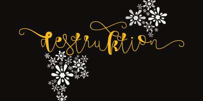
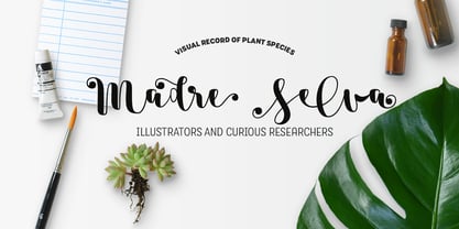
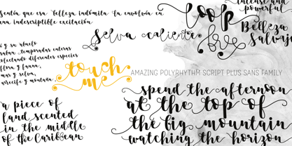
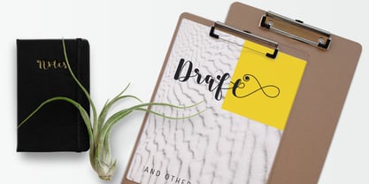
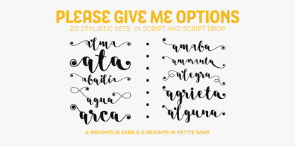
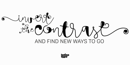
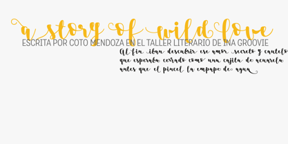
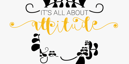
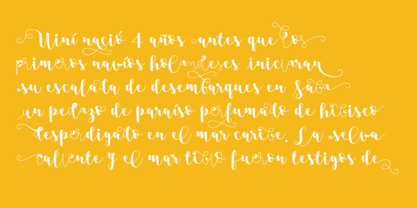
Touch Me is a Script hand-drawn style typeface—designed by Coto Mendoza—resulting from polyrhythmic exploration, sign deconstruction and altered calligraphic contrast plays with watercolour brush. Coto has been using these experimental calligraphy techniques when creating the catchwords for Macarons, the Boho Family, Bikini Season Script and Matcha Script and so forth. Touch Me was inspired by a character in a story written by Coto while attending a literary workshop with Ina Groovie in Santiago de Chile. The character is a tribal girl who lives on an island in the Caribbean. She is heir of ancestral knowledge and possesses wild beauty, very passionate and sensual: intense, strong and free. These features are reflected in the polyrhythm of the typeface's curves: an irregular baseline, variable x-height, different lengths of initial and terminal strokes (that sometimes expand and sometimes shrink) and amount of brush pressure that generates changes in contrast within the characters. This way, when composing, signs with stroke contrast randomly alternate with monolinear ones and with signs of altered contrast, thanks to the typeface's OpenType programming. The family, with more than 3,000 glyphs, provides a number of alternative characters, swashes, ligatures, initial and terminal forms, in short, a vast ocean of choices! Touch Me is a spontaneous typeface with a fresh and unique personality. It is the perfect choice for short text in both print and digital formats. The family comes with a Script Regular version and a seductive Script Drop that you will enjoy a lot! The Extras set includes some catchwords, dingbats and ornaments that allows for endless composition options. The family also comes with a Caps version —designed by Luciano Vergara—in 2 styles: a funny and big-headed condensed Sans Grotesk display of inverted vertical proportion plus a Grotesk, neutral and slightly expressive Petite. Both versions, available in 6 weights, have been especially designed to create hierarchies when composing. This allows for balance between strokes of different weight when it comes to the Sans and Script fonts. Come and dare yourself! Touch Me! Thanks Alisa for sharing your amazing and beautiful picture with us.
Designers: Luciano Vergara, Guisela Mendoza
Publisher: Latinotype
Foundry: Latinotype
Design Owner: Latinotype
MyFonts debut: Sep 13, 2016
Touch Me
About Latinotype
Based in Concepción and Santiago, Chile, Latinotype’s founders say, “Our goal is to design new typefaces remixing diverse influences related to our South American identity with high quality products for the contemporary design industry.” And the duo have been doing just that since their foundry’s creation in 2007. One of the most successful foundries on MyFonts in recent years, Luciano Vergara and Daniel Hernández, have put together a rapidly growing collection of typefaces in a wide array of genres. Specializing in colorful display and script faces, the group’s name “Latinotype” emphasizes the strong tie they feel to their cultural identity. The Premium foundry page can be viewed Here.
Read more
Read less
- Choosing a selection results in a full page refresh.