Select this license type when you are developing an app for iOS, Android, or Windows Phone, and you will be embedding the font file in your mobile application's code.
Magneton
by Melvastype
Individual Styles from $32.00
Complete family of 6 fonts: $99.00

Magneton Font Family was
designed by
Mika Melvas and
published by
Melvastype. Magneton contains
6
styles and family package options.
More about this family
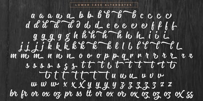
- Aa Glyphs
-
Best ValueFamily Packages
- Individual Styles
- Tech Specs
- Licensing
Per style:
$16.50
Pack of 6 styles:
$99.00
Magneton Angle Two Pack
3 fontsPer style:
$26.33
Pack of 3 styles:
$79.00
Magneton Angle One Pack
3 fontsPer style:
$26.33
Pack of 3 styles:
$79.00
About Magneton Font Family
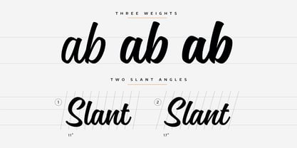
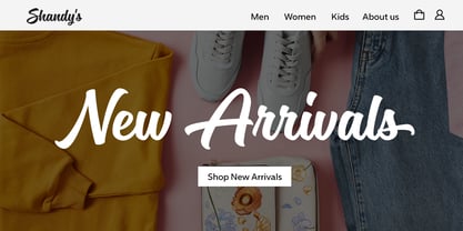
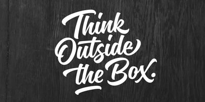
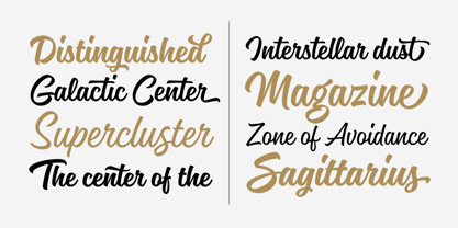
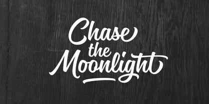
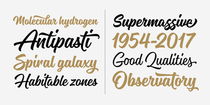
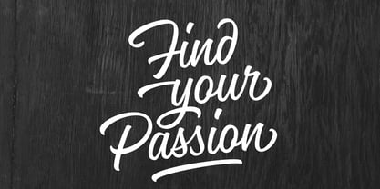
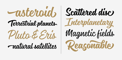
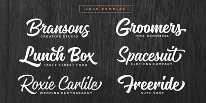
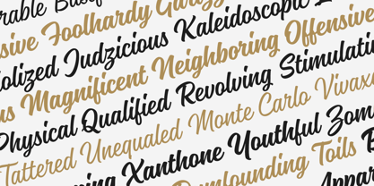
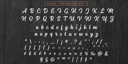
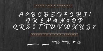
Magneton is a brush script typeface that contains three weights and two slant angles. Three weights simulates the pressure of the brush pen; light is written with a gentle pressure and the bold one with more pressure. Two slant angles gives Magneton two natures; the more casual one and the more dynamic one. So with this script you have lots of options to choose from. You can adjust the look and feel just like when writing with a real brush pen! Magneton has lots of alternates and swash characters. It has two sets (and more) of upper case letters. The more basic one and the more flamboyant one. It also has lots and lots of lower case alternates: two styles of end swashes, underlines, a few different ascender and descer swashes and much more. Please explore the images and glyhp set to get the idea. I hope you like what you see and use Magneton in logos, lettering compositions, t-shirts etc. there are lots of opportunities with this one. Thank you and please enjoy!
Designers: Mika Melvas
Publisher: Melvastype
Foundry: Melvastype
Design Owner: Melvastype
MyFonts debut: Jul 7, 2017
Magneton
About Melvastype
“I have always been interested in various forms of hand lettering, graffiti, sign painting and calligraphy,” Mika Melvas said in his Creative Characters interview. “As a kid I was very interested in graffiti. I drew and sketched it in my notebooks, and in art class my favorite tasks were always the ones that included some typographical elements. At some point I found calligraphy. There was something in calligraphy that fascinated me a lot. It is hard and demanding and needs regular training. And it is so pure; you can’t hide your mistakes or take short cuts. It is just forms and whitespace. I’m not a master calligrapher by any means but I like to do it and it makes me a better type designer and lettering artist.” For Mika, type design was a hobby long before it became the primary way he made his living. He began his career as an art director and graphic designer in advertising agencies and experimented with type on the side. Following his passion, Mika worked hard to guide his career towards becoming a full-time type designer and lettering artist. “I worked on my calligraphy and lettering a lot,” he said, “ and practiced vectorizing them. After a long period of hard training I was able to resign from my art director’s post and start my own foundry. I think it’s good to have knowledge and experience of graphic design — it has worked for me at least. It means that you have an understanding how your clients would use your fonts and what kind of expectations they have.” Since he first began selling his designs on MyFonts in 2011, the self-taught type designer has released over a dozen families. His library spans a typographic range from an extra bold slab serif, Ringa, to his more signature style of playful brush script fonts like Paintlay and Ahkio. “I think hand-sketching is a very important thing – at least for me — especially when you are doing a script font. You can’t beat the flow and rhythm one achieves with just pen and paper. I think you can focus better on the bigger picture; composition, flow and style, when doing things with just pen and paper. I easily rush to fine tune the details too early when using just a computer. Type design is a combination of creativity and engineering and that is very interesting to me. You get the best of both worlds.” For more on Mika, check out his website and follow him on Twitter and Instagram.The Premium foundry page can be viewed Here.
Read more
Read less
- Choosing a selection results in a full page refresh.