Select this license type when you are developing an app for iOS, Android, or Windows Phone, and you will be embedding the font file in your mobile application's code.
Berimbau
by PintassilgoPrints
Individual Styles from $20.00
Complete family of 2 fonts: $34.00

Berimbau Font Family was
designed by
Erica Jung,
Ricardo Marcin and
published by
PintassilgoPrints. Berimbau contains
3
styles and family package options.
More about this family
- Aa Glyphs
-
Best ValueFamily Packages
- Individual Styles
- Tech Specs
- Licensing
Per style:
$17.00
Pack of 2 styles:
$34.00
Berimbau Family BASIC
2 fontsPer style:
$14.00
Pack of 2 styles:
$28.00
About Berimbau Font Family
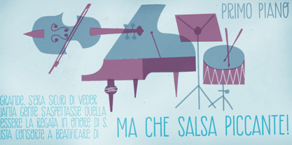
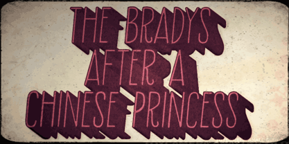
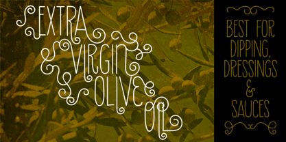
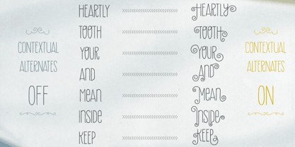
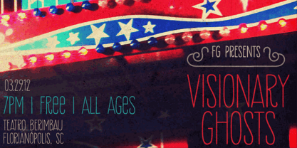
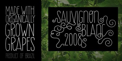
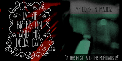
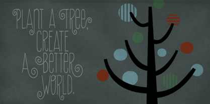
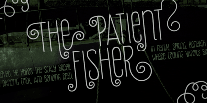
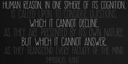
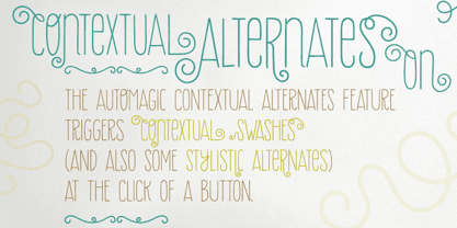
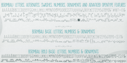
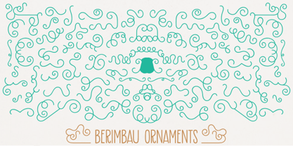
Berimbau is a whimsical narrow hand-drawn typeface. It’s stylish, versatile and loaded with amazing OpenType features that do their magic in OpenType savvy applications. Its sprightly swashes and twisting stylistic alternates (say that 3 times fast!) play together to deliver a really cool contextual feature that, in a push-button way, substitutes the first letter in a word with its left swash version and the last letter with its right swash version (please type a space before and after the words).The feature also applies stylistic variants to some of the intermediate letters. Which button to push? The Contextual Alternates one! If you're not a one-click-way-person you can pick your preferred glyphs through the glyphs palette. There you’ll find at least 4 variations for each letter: left swash, right swash and 2 regular forms that correspond to the upper and lower case keys. Some letters also have a 5th variation that acts as stylistic alternate. This font is conveniently packed with the ‘access all alternates’ functionality, so when you click on a glyph at the glyphs palette you’ll see all variations available for it, making it easier to choose the one that will fit better. A bold weight was made to provide that extra-strength when a bit of… boldness is needed. Please note that it doesn’t have the advanced OpenType features (but is still very charming!). Yet, both weights have a handy set of ornaments for added yumminess.
Designers: Erica Jung, Ricardo Marcin
Publisher: PintassilgoPrints
Foundry: PintassilgoPrints
Design Owner: PintassilgoPrints
MyFonts debut: Sep 16, 2011
Berimbau
About PintassilgoPrints
Their first commercial font is from 2009. And it didn’t take long for PintassilgoPrints typefaces to be picked by creatives to speak for brands such as McDonald's, Starbucks, Cartoon Network, Jamie Oliver, Hasbro, Mattel, Gap, Taschen, Rovio and others. Check out examples of the foundry's fonts in use here. With a strong background in hand printing techniques, PintassilgoPrints has been developing a consistent and original library, with fonts ranking to our best-selling list and Rising Star issues. Their work was also featured in printed magazines and books such as Computer Arts, Page Magazine, Slanted, PicNic, Typolyrics, Typodarium, The Yearbook of Type. The foundry was interviewed for our Creative Characters newsletter as well as for the prestigious 8 Faces Magazine. PintassilgoPrints fonts are often packed with many alternative glyphs and a clever touch of OpenType programming. Their typefaces mostly reflect a vigorous handcrafted feel, seasoned with some 'je ne sais quoi' that decidedly works. Horst was their first Best Seller and Rising Star font, the same route taken by Monstro and Populaire. This ubiquitous one also made it to the Most Popular Fonts of 2011 list. Now established in Florianópolis, an island city in Brazil, the foundry is run by Ricardo Marcin and Erica Jung, who also share life, kids and a long time love of typography, graphic arts, music and sun. By the time of their interview for Creative Characters they were based in Vitória, curiously also an island. Definitely many more sunshiny fonts are yet to come from PintassilgoPrints. Stay tuned!The premium foundry page can be viewed Here.
Read more
Read less
- Choosing a selection results in a full page refresh.