Freigeist XCon Thin
Freigeist XCon Thin Italic
Freigeist XCon Light
Freigeist XCon Light Italic
Freigeist XCon Regular
Freigeist XCon Regular Italic
Freigeist XCon Medium
Freigeist XCon Medium Italic
Freigeist XCon Bold
Freigeist XCon Bold Italic
Freigeist XCon Black
Freigeist XCon Black Italic
Freigeist Con Thin
Freigeist Con Thin Italic
Freigeist Con Light
Freigeist Con Light Italic
Freigeist Con Regular
Freigeist Con Regular Italic
Freigeist Con Medium
Freigeist Con Medium Italic
Freigeist Con Bold
Freigeist Con Bold Italic
Freigeist Con Black
Freigeist Con Black Italic
Freigeist Thin
Freigeist Thin Italic
Freigeist Light
Freigeist Light Italic
Freigeist Regular
Freigeist Regular Italic
Freigeist Medium
Freigeist Medium Italic
Freigeist Bold
Freigeist Bold Italic
Freigeist Black
Freigeist Black Italic
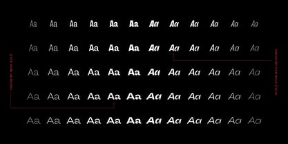
Freigeist Wide Thin
Freigeist Wide Thin Italic
Freigeist Wide Light
Freigeist Wide Light Italic
Freigeist Wide Regular
Freigeist Wide Regular Italic
Freigeist Wide Medium
Freigeist Wide Medium Italic
Freigeist Wide Bold
Freigeist Wide Bold Italic
Freigeist Wide Black
Freigeist Wide Black Italic
Freigeist XWide Thin
Freigeist XWide Thin Italic
Freigeist XWide Light
Freigeist XWide Light Italic
Freigeist XWide Regular
Freigeist XWide Regular Italic
Freigeist XWide Medium
Freigeist XWide Medium Italic
Freigeist XWide Bold
Freigeist XWide Bold Italic
Freigeist XWide Black
Freigeist XWide Black Italic
Freigeist Mono Thin
Freigeist Mono Thin Italic
Freigeist Mono Light
Freigeist Mono Light Italic
Freigeist Mono Regular
Freigeist Mono Regular Italic
Freigeist Mono Medium
Freigeist Mono Medium Italic
Freigeist Mono Bold
Freigeist Mono Bold Italic
Freigeist Mono Black
Freigeist Mono Black Italic
Freigeist Variable Roman
Freigeist Variable Italic