







Skip to content
Skip to main content

Gella Display

by Slava Antipov
Individual Styles from $35.00 USD
Complete family of 40 fonts: $299.00 USD
The Gella Display Font Family was designed by Slava Antipov and published by Slava Antipov. Gella Display contains 40 styles and family package options. More about this family

About the family


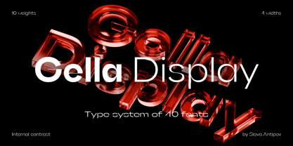
Gella Display is a high-contrast geometric sans serif family built around four widths and ten weights. Its width system expands from a regular-width construction to progressively wider styles, giving designers greater control over the visual scale and presence of typography without moving into condensed proportions.

The family includes 40 styles: 10 weights across 4 widths. The regular width provides a balanced geometric foundation, while the wider styles create increasingly expansive letterforms for stronger display compositions.

Gella Display is particularly suited to branding, logos, headlines, posters, packaging, editorial design, presentations, advertising, social media, and contemporary visual identities. Its width variations allow the same typographic character to shift from a balanced appearance to a much more open and emphatic one while maintaining consistency throughout a project.

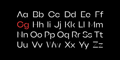
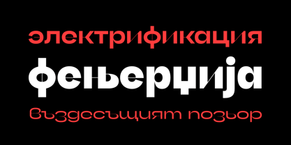
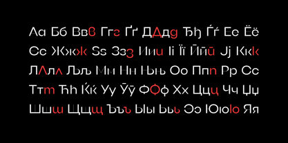
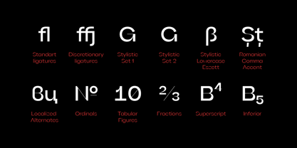
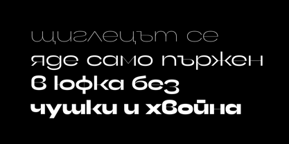
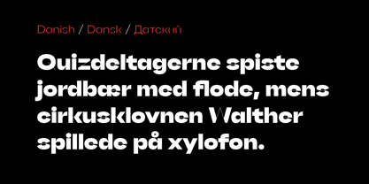
Each style contains 592 glyphs and supports Latin and Cyrillic scripts with broad multilingual coverage. The family includes standard and discretionary ligatures, Romanian and Bulgarian localized forms, fractions, numerator and denominator figures, superscript and subscript figures, monospaced figures, ordinals, contextual alternates, case-sensitive forms, 6 stylistic sets, localized forms within two of the sets, and stylistic alternates.

Its defining combination of high internal contrast, geometric forms, ten weights, and four progressively wider widths makes Gella Display a flexible display system for designers who want to control both typographic weight and horizontal presence within a consistent family.

Designers: Slava Antipov

Foundry: Slava Antipov

MyFonts debut: Apr 7, 2022

Gella Display

About Slava Antipov

Slava Antipov is an independent typeface designer focused on contemporary type families, with a particular interest in grotesques and sans serifs. His work explores the balance between functional typography and distinctive visual character, combining geometric construction, expressive details, varied proportions, and flexible typographic systems. Slava creates typefaces for a wide range of contemporary design applications, from branding and visual identities to editorial design, packaging, posters, digital products, and display typography. His families often explore multiple weights, widths, styles, and advanced typographic features, with an emphasis on creating useful and versatile systems rather than isolated typefaces. Multilingual typography is an important part of his work. Latin and Cyrillic have been the foundation of his typefaces from the beginning, while newer projects increasingly expand into Greek and Vietnamese and explore additional writing systems. He is particularly interested in developing high-quality typefaces that make contemporary typography more accessible to designers working across different languages and writing systems. While contemporary grotesques remain the main focus of his work, Slava continues to explore new typographic directions, visual approaches, and writing systems as his type library grows.

Read more

Read less