This is a listing of all glyphs contained in the font, including OpenType variants that may only be accessible via OpenType-aware applications.
Each basic character (“A”) is followed by Unicode variants of the same character (Á, Ä…), then OpenType variants (small caps, alternates, ligatures…). This way you can see all the variations on a single character in one place.
MyFonts licenses are tailored for individual creatives. Not all licenses are compatible with broad usage cases or complicated creative workflows, so make sure to read the full EULA text for details. If you are licensing fonts for use at an Agency or Company, or if you have a usage requirement that isn't listed below or are unsure about the use cases shown here, contact us and we'll help you determine the best fit for your needs.
The following licenses are available for this font.
Desktop: for creating designs
This entry-level license enables personal and commercial traditional graphic designer work.
The Desktop License allows you to create, print, and share flat, non-editable designs such as:
Brand identity
Use fonts to create a strong and consistent brand identity.
Videos
Apply fonts in titles, credits, and on-screen text.
PDFs
Style reports, brochures, and digital documents.
Greeting cards
Design unique, personalized cards for any occasion.
Logos
Craft memorable, professional logo typography.
Signage (wayfinding & billboards)
Make clear, eye-catching signage for indoor or outdoor use.
Flyers
Set readable, attractive headlines and layouts.
Packaging
Enhance product packaging with stylish text.
Album covers
Print custom text designs on t-shirts, hoodies, and more.
Posters
Bold, eye-catching poster layouts.
Invitations
Create stylish, personalized invitations for events.
Social posts
Enhance graphics and captions with unique fonts.
Business cards
Craft professional, memorable business card designs.
Fonts cannot be hosted on DAMs as downloadable assets.
Show all
Desktop licenses are based on the number of users of the fonts; in other words, the number of computers in which the font will be installed. You can change the number of users by clicking the quantity dropdown option on Buying Choices or Cart pages.
Please be sure to review the listing foundry's
Desktop license agreement
as some restrictions may apply—such as use in logos/trademarks, geographic restrictions (number of locations), and products that will be sold.
Adding users later:
Desktop licenses are cumulative. If you require a Desktop license that covers additional users, simply place a new order for the same Desktop package, for the number of additional users.
Webfonts allow you to embed the font into a webpage using the @font-face rule, so paragraphs and headings
of text can be styled as the webfont. You will be serving the webfont kit for your own site and linking
it in the CSS.
Webfonts can be used on a single domain. Agencies responsible for multiple websites, for example web
design agencies or hosting providers, may not share a single webfont license across multiple websites.
If the font file itself won't be embedded in the website (for example, when the font is used in a static
graphic image such as a logo) you should purchase a Desktop license instead.
Most foundries on MyFonts offer their webfonts with the Annual license model. Click here to
Learn more.
Select this license type when you are developing an app for iOS, Android, or Windows Phone, and you will
be embedding the font file in your mobile application's code.
You can use an Electronic Doc license to embed the font in an electronic publication such as an eBook, eMagazine, or eNewspaper.
An Electronic Doc license is based on the number of publications in which the font is used. Each issue
counts as a separate publication. Regional or format variations don't count as separate publications.
Updated versions of publications that are free to previous customers do not need a new license; otherwise,
each new version that is released counts as a separate publication.
For font usage in graphic images shown as the ePub cover, consider a Desktop license instead as most allow
for it.
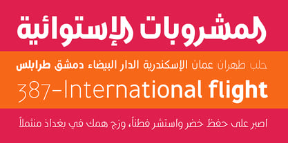
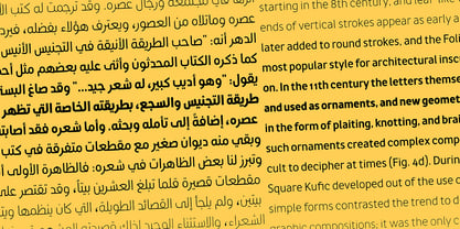
AwanZaman has a three-phase story, beginning with Dr Mamoun Sakkal’s two Arabic styles and culminating with Juliet Shen’s Latin extension. AwanZaman started as simply Awan, a commission for a modern, clean, monoline typeface for writing headlines and story titles in a forward-thinking Kuwaiti newspaper. Awan was based on the geometric forms of Kufic script, while in phase two, a second typeface (Zaman) was designed to add enough calligraphic Naskh details to make it easy to read in demanding newspaper settings. Together these two phases give the typeface a warm, familiar, and progressive look, as well as an explanatory two-part name — AwanZaman.
Since most editorials use typical Naskh headline fonts with an exaggerated baseline, Awan’s rational forms immediately distinguish it as a modern and progressive voice in the crowded field of Arabic editorial typefaces. As the companion Arabic typeface, Zaman has the same basic proportions and forms as Awan, but with many cursive, energetic, and playful details. And since modern monoline fonts are increasingly being used to set extended texts, more features were borrowed from Naskh calligraphy to expand the typeface’s use from headlines into text setting.
When using the AwanZaman Arabic family, Awan (geometric Kufic forms) is the starting point. To add the sweeping, energetic personality of Zaman (calligraphic Naskh forms), simply activate an alternate character through the option of 20 stylistic sets available in any OpenType-savvy software. The two typefaces function as one file — the AwanZaman Arabic family — allowing users to combine features from both designs to transform the appearance of text from geometric and formal to playful and informal.
The third phase of AwanZaman’s development introduced a companion Latin typeface designed by Juliet Shen to fulfil the persistent need in the Arabic fonts market for modern and geometric bilingual type families. Due to the Arabic’s monolinear strokes, AwanZaman Latin was destined to be a sans serif with a tall x-height, larger counters, and corresponding stem thickness to harmonise with the Arabic’s overall text colour and page presence. But it needed much more.
One of AwanZaman’s chief assets is making the two languages look on a par when typeset side by side. Arabic and English readers will have a different sense of what that entails, but this type family defers to the Arabic — graceful and artistic with a good mix of straight stems and curved forms. Latin in general doesn’t aesthetically flow the way Arabic does, yet the tone of the Latin needed to mirror both the Arabic’s more squarish curves and formal personality of Awan and the undulating and more playful shapes of Zaman without looking outlandish. That need was met by creating some novel Latin characters, which are accessed through four stylistic sets the same way as AwanZaman Arabic. The alternates are not just clever in the way they look and how they echo the Arabic aesthetic, but also in harmonising the disparate languages and serving designers well when needing a balanced, bilingual text face with a warm and lively voice.
AwanZaman is a clever, seven-weight powerhouse that makes extensive use of OpenType’s stylistic sets (20 in the Arabic and four in the Latin) so writers and designers can make the most of everything from a single glyph in display sizes down to dense text in paragraphs. As AwanZaman Arabic has no italic, neither does the Latin; contextual distinction normally handled by italics is achieved by exploiting the family’s seven weights. AwanZaman’s intricate OpenType programming supports Persian and Urdu, with features such as the returning tail of Barri Yeh treated properly. From its inception in geometry to its melding of two worlds with novel forms, AwanZaman is a personal labor by designers Dr Mamoun Sakkal and Juliet Shen, and embodies the TypeTogether ideals of serving the global community with innovative and stylish typeface solutions. The complete AwanZaman Arabic and Latin families, along with our entire catalogue, have been optimised for today’s varied screen uses.
Veronika Burian and José Scaglionemet and developed a respectful kinship while completing their Master’s degrees in type design at University of Reading, UK. Established in 2006, TypeTogether is an independent, cosmopolitan type foundry that creates text typography for intensive digital and print editorial use. We have grown into a core team living worldwide and invested in the daily work, networked with other type designers who intermittently cooperate on specific projects.
Through our unique, diverse, curated font platform, TypeTogether creates innovative and stylish solutions to the greatest problems in the professional typography market.
The advantage of being a small but highly specialized company is that we are able to work closely with our clients to accomplish their goals and to respond quickly to their requirements. To carry an organisation’s unique voice across all communications, TypeTogether creates custom type solutions for discerning clients worldwide. Distinct advantages in your market can be gained through logotype creation, commissioning a brand new typeface, modifying existing typefaces, or extending language support.
TypeTogether creates cross-platform OpenType fonts of recognised aesthetic and technical excellence and which perform well in continuous reading. Our internationally awarded catalogue — honoured for its high quality, usefulness, personality, and ability to grab attention — spans many languages and scripts and is diligently expanding each year.