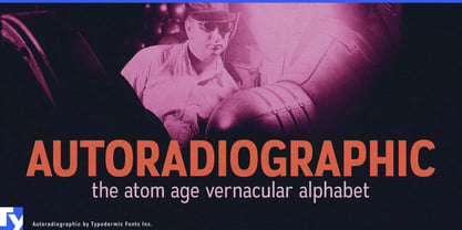
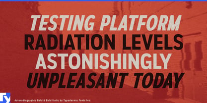
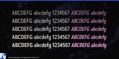
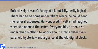
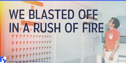
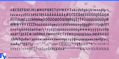
Autoradiographic comes from the visual world of the Atomic Age: postwar laboratories, industrial warning signs, test facilities, radiation equipment, and the improvised technical lettering that surrounded America’s new machines. Its condensed romans have the blunt utility of something painted on a cabinet or mounted beside a laboratory door, while the unusually narrow italics introduce a faster, more directional voice. Together they recall the period when rockets, reactors, electronics, and scientific instruments still looked like physical machinery.
That heritage has acquired some striking contemporary uses. Fusion-energy ventures, small modular reactor developers, nuclear-engineering firms, radiation-monitoring companies, and reactor-component manufacturers are once again working in fields with an Atomic Age visual inheritance. Autoradiographic can carry reactor-model names, explanatory diagrams, technology roadmaps, visitor-center graphics, conference displays, recruiting campaigns, and public-facing technical material without collapsing into generic futuristic styling.
Aerospace provides an equally direct connection, particularly around propulsion and testing. Rocket-engine manufacturers, launch facilities, ground-system suppliers, and aerospace test firms can use it for engine names, test-stand graphics, equipment markings, telemetry interfaces, facility identifiers, and technical presentations. Autoradiographic feels less like outer space than the machinery required to get there.
Scientific instruments offer another natural setting. Radiation detectors, laboratory analyzers, vacuum systems, optical equipment, industrial scanners, and measurement hardware can use the romans for model numbers, control labels, equipment faceplates, specification sheets, and calibration displays; the compressed italics can distinguish product names, project codes, or emphatic labels within the same system.
That contrast also suits synthesizers, studio processors, modular electronics, guitar effects, amplifiers, and other products that borrow visual cues from oscilloscopes, military electronics, and mid-century instrumentation. Science museums, aviation collections, nuclear-history exhibitions, Cold War galleries, and space museums can use the same vocabulary for exhibit titles, timelines, interactive stations, catalogs, and exhibition graphics.
Autoradiographic is strongest when the Atomic Age is more than decoration: where reactors are being reconsidered, rockets are being tested, instruments are being calibrated, electronics still have knobs and panels, or a modern project needs the visual language of the laboratory, test site, and machine room.