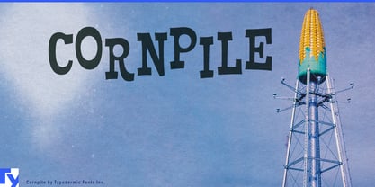
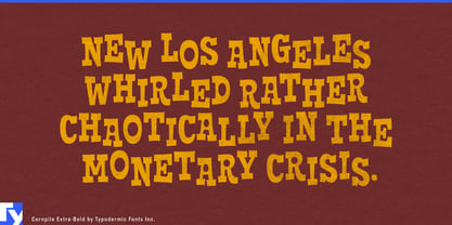
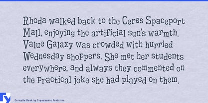
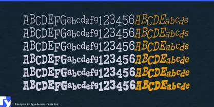
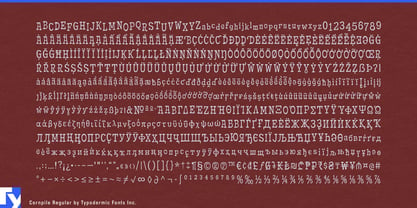
Cornpile is for brands and publishers that want the looseness of hand lettering without commissioning new lettering every time the words change. Its irregular curves and shifting forms keep prominent words from settling into the repeated mechanical patterns that can make playful typography feel obviously typeset. The result is lively and slightly unruly, yet practical enough to build a repeatable design system around.
That makes Cornpile especially useful for packaged-food brands with large product ranges. Popcorn, crackers, cookies, cereal, snack bars, frozen treats, flavored nuts, and confectionery lines may need dozens of flavor names, assortment packs, seasonal editions, and promotional variants. Cornpile can handle product names, flavor descriptors, short claims, and section headings while a quieter companion face takes care of nutrition and regulatory information. The lettering remains related across the range without every package feeling cloned from the same template.
Restaurant groups face a similar production problem. Burger, barbecue, sandwich, pizza, chicken, donut, and ice-cream chains continually generate digital menu boards, ordering-screen graphics, seasonal specials, cup and carton graphics, delivery-app promotions, and franchise marketing material. Cornpile brings some of the irregularity of custom lettering to content that still needs to remain editable and reusable.
Its origins in children’s publishing also make it well suited to illustrated nonfiction and educational series. Science, nature, engineering, geography, dinosaurs, space, and how-things-work books can use Cornpile for chapter openings, experiment names, fact boxes, diagram callouts, quiz sections, and recurring features. The same qualities suit educational platforms where lesson titles, challenge names, achievement messages, and category labels change dynamically rather than exist as fixed artwork.
Science centers, natural-history museums, aquariums, planetariums, family board games, and educational products extend the same idea into exhibitions and entertainment. Cornpile works best when irregularity has to become a system: reusable across product families, publishing programs, menus, exhibitions, and changing digital content.