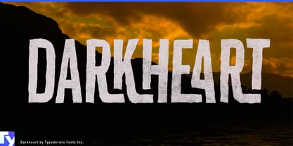
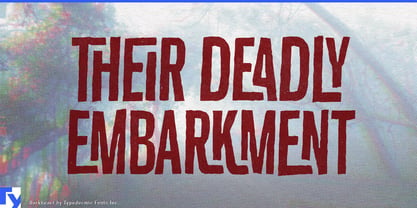
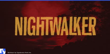
Darkheart is an all-caps horror typeface drawn in tall, crooked strokes that look cut from paper and fitted together by hand. Its natural setting is 1960s drive-in cinema: vampire castles, radioactive monsters, alien invasions, haunted laboratories, and trailers promising something unspeakable after midnight. It gives horror film posters, streaming thumbnails, trailer titles, comic mastheads, paperback covers, and VHS or Blu-ray reissues the compressed urgency of a hand-built title card.
Halloween provides Darkheart with an entire season of work. Haunted-house posters, maze signs, ghost-tour advertisements, escape-room identities, costume-party invitations, horror-convention schedules, and amusement-park fright nights all benefit from lettering that announces the premise immediately. Because Darkheart does not depend on dripping blood or gothic ornament, colour and illustration can move it from genuine menace to campy monsters, spooky children’s events, and playful seasonal packaging.
Its cut-paper tension also works beyond conventional horror. True-crime podcasts, cult documentaries, cryptid investigations, paranormal series, urban-legend anthologies, and psychological thrillers can use Darkheart to suggest unstable evidence or a headline assembled in a hurry. B-movie science fiction belongs in the same visual world, particularly stories involving mutant creatures, rogue experiments, Cold War paranoia, and badly supervised spacecraft.
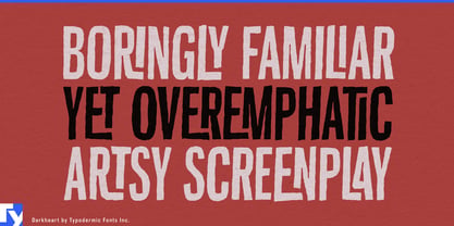
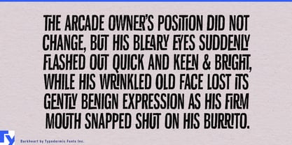
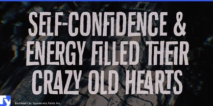
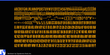
Narrow proportions allow surprisingly long titles to fit into compact poster panels, book covers, video frames, and package labels. Uneven widths, skewed verticals, blunt corners, and shifting stroke density prevent each line from settling into a mechanical rhythm. An extensive collection of built-in ligatures joins common letter combinations into crooked interlocking shapes, giving words the fitted appearance of custom lettering. Short blocks of condensed capitals remain cohesive enough for trailer cards, ominous warnings, episode blurbs, and comic narration.