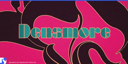
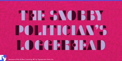
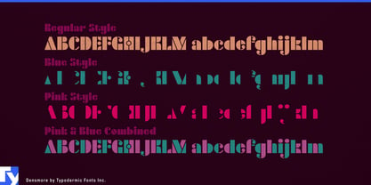
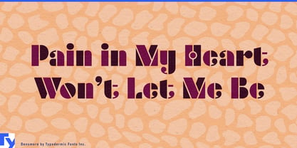
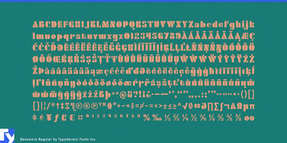
Densmore becomes much more than a headline face when its two complementary layers are put to work. Pink and Blue divide each character into separate geometric pieces that can be registered into a complete letter, recolored independently, shifted out of alignment, animated apart, or assigned different printing treatments. The color separation is already built into the alphabet.
That makes Densmore particularly useful for consumer packaging built around strong color systems. Beverage ranges, confectionery, cosmetics, grooming products, fragrance extensions, and specialty foods can assign one layer to a constant brand color while the other changes by flavor, scent, formulation, or edition. Product names, carton fronts, bottle labels, multipacks, countertop displays, and retailer-exclusive packaging can stay typographically consistent while color does more of the navigational work.
The layers become especially useful when a job involves special production finishes. One part of the letter can take metallic ink while the other remains flat; foil can meet ordinary print, fluorescent ink can cut through black, or gloss and matte treatments can divide the same word into contrasting surfaces. Fragrance cartons, cosmetic boxes, limited-edition beverages, collector packaging, music box sets, invitations, and premium merchandise can use the letter structure itself to determine where those treatments meet.
Apparel and merchandise provide another natural setting. Tour shirts, festival merchandise, streetwear capsules, resort collections, record-label apparel, and entertainment properties can use Pink and Blue as ready-made two-color separations for chest prints, oversized backs, sleeves, caps, tote bags, bandanas, hangtags, and merch-table graphics. The layers can register cleanly or shift slightly to create deliberate misregistration.
Brand collaborations give the split a conceptual role as well as a visual one. A footwear partnership, fashion capsule, artist edition, sportswear collaboration, or co-branded product can assign one collaborator’s color to each layer across launch packaging, shoe boxes, garment graphics, retail installations, shopping bags, event screens, and limited-edition merchandise.
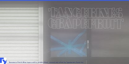
Motion graphics can push the construction further. Pink and Blue can slide into registration, drift apart, swap colors, pulse against one another, or reveal the finished word as the two structures converge. Densmore’s layered styles are graphic components: register them, misregister them, recolor them independently, animate them independently, or give each half a different physical finish.