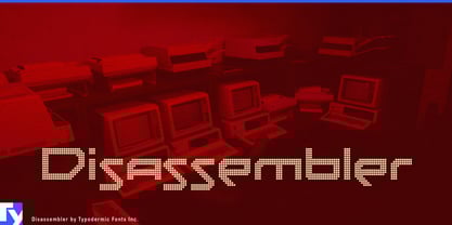
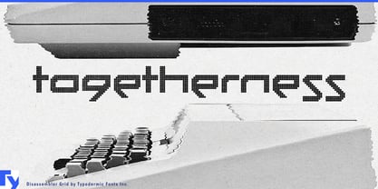
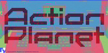
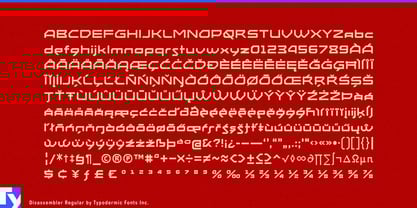
Disassembler is a precision-built homage to the typography of the 8-bit frontier. It doesn’t just mimic the look of early computing—it replicates it with obsessive fidelity. Every letterform is plotted on a true pixel grid, every curve reduced to its bare essentials, and every alignment locked to the chunky spacing of vintage displays. This is the language of Sinclair screens, dusty arcade monitors, and flickering terminals, rendered with modern reliability but zero compromise on authenticity.
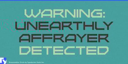
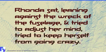
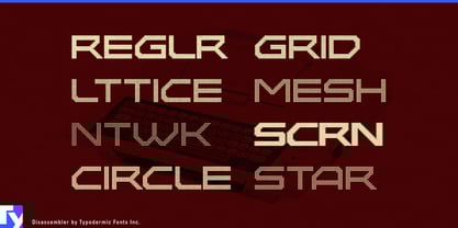
Available in eight distinct textures—Regular, Grid, Lattice, Mesh, Network, Screen, Circle, and Star—Disassembler is as adaptable as it is distinctive. Use Regular for unfiltered retro clarity, Mesh for tech branding with a gridded backbone, Screen for sci-fi title cards, Circle for playful arcade nostalgia, or Star for graphics that feel straight out of a space shooter attract mode. Each style offers its own pixel personality, letting you match the visual “grain” to your project’s tone.
Its applications stretch far beyond nostalgia. Disassembler excels in museum exhibits on computing history, chiptune album covers, glitch-art prints, and retro game box art. It’s at home on festival branding that leans into digital dystopia, candy, or soda packaging that plays up vintage tech quirks, and interactive installations on LED walls. Designers have used it for synthwave merch, esports event titles, sci-fi short film credits, tech blog headers, and even experimental fashion wordmarks. Wherever you need text to feel wired into a pixel-era circuit board, Disassembler delivers.
This isn’t a smoothed-over, modernized “retro” font—it’s a working replica of a display technology that shaped how a generation saw the digital world. And with its range of textures, you can go from crisp, screen-perfect fidelity to expressive, glitch-inflected chaos without breaking the spell.
In a design landscape obsessed with vectors and infinite resolution, Disassembler is a reminder of the raw beauty that happens when resolution is finite and every dot counts. If your message needs to buzz with pixel energy, you’ve just found your display typeface.