Skip to content
Skip to main content

Edifact

by Typodermic
Individual Styles from $69.95 USD
The Edifact Font Family was designed by Ray Larabie and published by Typodermic. Edifact contains 1 styles. More about this family

About the family


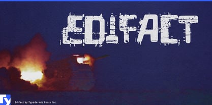
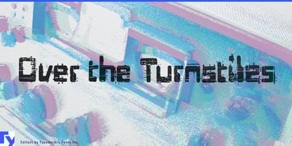
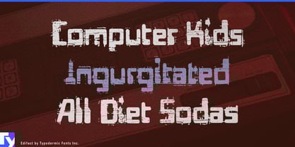
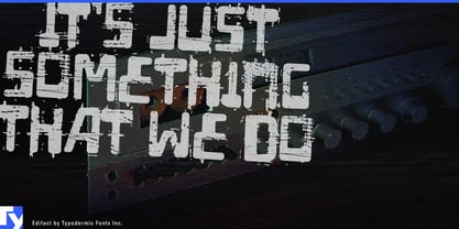
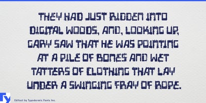
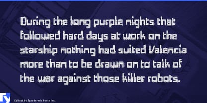
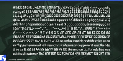
Distressed technical lettering often looks scratched, poorly printed or worn by age. Edifact looks as though something much worse happened. Its machine-derived skeleton is broken by deep interruptions and missing sections that suggest impact, structural failure and serious mechanical damage.

That places Edifact in a particular strain of early-to-mid-1970s dystopia: laboratories, reactors, concrete infrastructure, corporate authorities and elaborate systems that are still running while the world around them comes apart.

Infrastructure failure is a natural fit. Blackout documentaries, nuclear-accident features, collapsed-dam investigations, refinery disasters and abandoned megaprojects can use Edifact for titles and major headings. Containment scenarios, sealed laboratories, quarantine thrillers, resource-management games and stories about energy, water or food shortages exploit the same contrast between organized systems and visible breakdown.

Damaged machinery opens another territory. Demolition derbies, scrapyard events, post-collapse vehicle games, desert survival races and salvage graphics can use Edifact where ordinary distress would feel too decorative. Industrial archaeology provides the real-world counterpart: decommissioned power stations, Cold War bunkers, abandoned factories and obsolete civic complexes all suit lettering that combines technological optimism with evidence of failure.

Edifact also works for fictional bureaucracy; corporate directives, ration cards, sector identifiers and facility graphics can use its technical structure to establish order while the damage undermines it. Pair it with a quieter face for instructions and longer information.

Edifact is lettering for systems under stress: infrastructure breaking down, facilities being sealed, resources running short, machines surviving damage and institutions trying to function after the future has stopped going according to plan.

Designers: Ray Larabie

Foundry: Typodermic

MyFonts debut: Jan 30, 2007

Edifact

About Typodermic

Welcome to Typodermic Fonts, a spirited type foundry rooted in Nagoya, Japan, started by the Canadian typeface designer, Raymond Larabie in 2001. Our library brims with 500+ diverse typefaces to fuel creativity in graphic design, advertising, web, and app development. As digital type pioneers, we adopted web fonts and app licensing early, consistently pushing the design envelope. With Canadian heart and Japanese precision, we're your global partners in extraordinary typography. Explore Typodermic Fonts—where creativity meets character.

Read more

Read less
