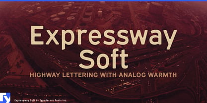
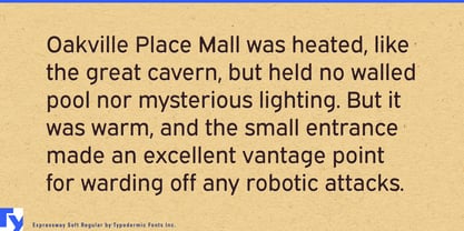
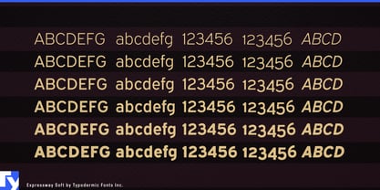
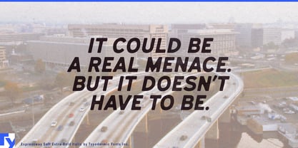
Expressway Soft takes the transportation vocabulary of lettering familiar from interstate highway signs and rounds the corners, carrying it into the public-facing side of contemporary mobility. The underlying forms remain direct and road-derived, but the softened construction reduces some of the institutional severity associated with highway signage. In the lighter styles the effect is restrained; as the letters get heavier, the rounding becomes increasingly visible and gives the broad strokes a distinctly cushioned finish.
That balance makes Expressway Soft useful for transportation systems that have to move between infrastructure and customer experience. An EV charging network might need roadside pylons, charger numbers, bay identifiers, rate displays, payment screens, membership plans, mobile interfaces, and account dashboards to feel like parts of the same system. Expressway Soft retains a connection to roads and vehicles without making every customer-facing element look like an official traffic sign.
Car-share and rental services, bike and scooter networks, autonomous neighborhood shuttles, roadside-assistance platforms, and other mobility services face similar design problems. Route names, station identifiers, vehicle classes, reservation screens, trip summaries, dock numbers, and service-status messages all need recognizable hierarchy across signs and software.
Parking is another particularly natural setting. Airport garages, hospital campuses, shopping centers, stadium districts, office developments, and smart-city parking networks combine road signs with pedestrian directions, payment kiosks, reservation apps, availability displays, level identifiers, zone numbers, tariffs, and license-plate screens. Expressway Soft can move from an entrance pylon to a payment interface without abandoning the visual language of transportation.
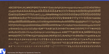
Passenger facilities extend that territory further. Airport ground-transport areas, park-and-ride systems, ferry terminals, commuter hubs, shuttle networks, and large transit interchanges need typography for pickup zones, gates, route maps, ticketing screens, waiting areas, service notices, and short instructions. Support for Latin-based languages, Greek, and Cyrillic makes the family useful when the same visual system has to operate across several regions or passenger groups.
The softer treatment can also work in large institutional environments with road networks of their own. Hospitals, universities, research parks, convention centers, and corporate campuses often combine parking structures, shuttle routes, building identifiers, drop-off zones, maps, digital directories, and pedestrian wayfinding.
Expressway Soft is closely related to Expressway, but the distinction is more useful than a simple choice between sharp and rounded corners. Expressway naturally suits the harder infrastructure layer; Expressway Soft shifts the same road-derived language toward charging, parking, passenger services, mobility apps, and the points where transportation systems meet the people using them.