

Skip to content
Skip to main content

Galderglynn Esquire™

by Typodermic
Individual Styles from $69.95 USD
Complete family of 14 fonts: $169.95 USD
The Galderglynn Esquire Font Family was designed by Ray Larabie and published by Typodermic. Galderglynn Esquire contains 14 styles and family package options. More about this family

About the family


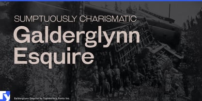
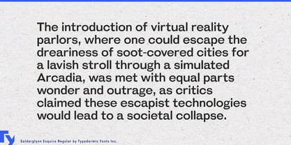
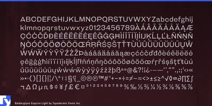
Historical typography can become too well behaved. Smooth every inconsistency and coordinate every letter too carefully, and the result may look more polished than the printed world it is meant to evoke. Galderglynn Esquire takes another route. Its letterforms were assembled from a broad collection of nineteenth-century grotesques, preserving mismatched widths, structures and peculiarities rather than forcing them into complete agreement.

That disorder makes Esquire especially useful for alternate history and historical comedy. Faux newspaper headlines, period games, theatrical posters and fictional advertisements can suggest the nineteenth century without adopting the solemn authority of a museum label. Telegraph companies, impossible inventions and dubious scientific breakthroughs benefit from typography that feels assembled rather than reconstructed.

Curiosity shops, antique markets, architectural salvage dealers, vintage fairs and used-book events offer another natural setting. Their collections rarely come from one perfectly coordinated period, and Esquire reflects that accumulation. Antique-market posters, oddities-shop signs, price cards and book-fair programs can feel gathered over time instead of packaged into a tidy heritage identity.

The same quality suits the noisier side of nineteenth-century advertising: patent medicines, mail-order contraptions, travelling demonstrations and questionable miracle devices. Film props, escape-room documents, historical-game graphics and museum interactives can use Esquire to create period material with a little confusion and salesmanship left in it.

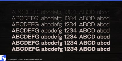
In lighter weights, the eccentric proportions become quieter without disappearing, opening the family to small-press publishing, cultural magazines and exhibition catalogues. Heavier styles bring the mismatched shapes and widths forward until the irregularity becomes part of the headline. Galderglynn Esquire is the nineteenth-century grotesque before somebody straightened the shelves.

Designers: Ray Larabie

Foundry: Typodermic

Original Foundry: Typodermic

MyFonts debut: Jan 20, 2010

Galderglynn Esquire™ is a trademark of Typodermic.

About Typodermic

Welcome to Typodermic Fonts, a spirited type foundry rooted in Nagoya, Japan, started by the Canadian typeface designer, Raymond Larabie in 2001. Our library brims with 500+ diverse typefaces to fuel creativity in graphic design, advertising, web, and app development. As digital type pioneers, we adopted web fonts and app licensing early, consistently pushing the design envelope. With Canadian heart and Japanese precision, we're your global partners in extraordinary typography. Explore Typodermic Fonts—where creativity meets character.

Read more

Read less
