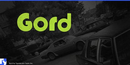
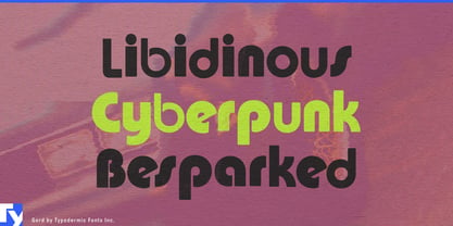
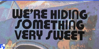
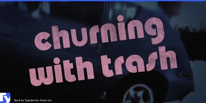
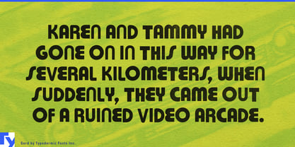
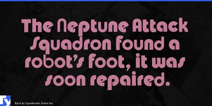
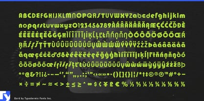
Professional design sometimes has to look professionally wrong. A fictional discount store, bargain food brand, sleazy motel, clearance campaign, or deliberately low-rent package can lose the joke the moment its typography becomes too tasteful. But convincing bad design is surprisingly difficult to art-direct. Mixing unrelated old fonts, nudging letters off the baseline, softening the edges, and introducing just enough incompetence can easily produce random chaos instead of a believable identity. Gord packages those bad decisions into a repeatable system.
Its forms were deliberately assembled from incompatible 1970s typographic ideas, drawing from sources including Pump, Churchward, and Bauhaus rather than trying to reproduce one coherent historical style. The letters were softened and vertically misaligned just enough to suggest neglect, poor production, or dubious judgment without turning into cheerful bouncy lettering. Gord is not badly made; it is carefully designed to look badly chosen.
That makes it particularly useful for fictional brands and environments. Film, television, animation, and games routinely need businesses that are supposed to have survived decades without a competent redesign: regional motels, discount supermarkets, bowling alleys, furniture warehouses, bargain restaurants, local cable stations, tourist traps, and questionable consumer products. Gord can establish that history immediately across storefronts, fake advertisements, prop packaging, title cards, vehicle graphics, and environmental lettering.
The effect is less about accurate 1970s reconstruction than an invented memory of commercial design gone wrong. A beautifully researched period typeface can make a fictional supermarket look too considered. Gord supplies the other layer of visual history: the sign that was probably a bad idea when it was installed and somehow remained there for forty years.
Consumer packaging can use the same strategy deliberately. Snack foods, frozen meals, confectionery, sauces, canned drinks, and limited-edition collaborations sometimes benefit from looking cheaper, older, or less sophisticated than the production actually is. Gord can take over the brand name, flavour name, or oversized promotional phrase while clean supporting typography handles ingredients and regulatory information. The package can look like a forgotten private-label product without actually behaving like one.
Large retail campaigns offer another place where deliberate bad taste can become a controlled visual device. Warehouse sales, outlet events, clearance promotions, discount chains, and secondhand marketplaces may need graphics that communicate cheapness before the customer has read a single price. Gord can spread that language across window posters, point-of-sale displays, campaign headlines, digital advertising, and temporary environmental graphics while remaining consistent enough for an agency to manage across a full rollout.
The same deliberate ugliness can work in fashion and merchandise when polished nostalgia feels too safe. A capsule collection, streetwear collaboration, licensed product range, or campaign built around bad taste can use Gord as an interruption inside an otherwise carefully produced identity. The contrast matters: the typography looks careless because everything surrounding it is not.
Gord works best when the design needs evidence of questionable judgment. Its mismatched forms, loose vertical rhythm, and softened outlines can make a brand or fictional environment feel as though its visual identity accumulated by accident rather than emerging from a contemporary design process.
Sometimes the professional solution is typography that looks like nobody hired a professional.