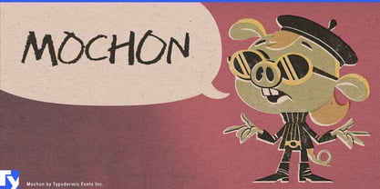
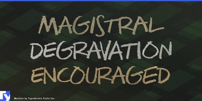
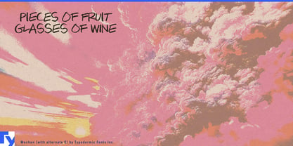
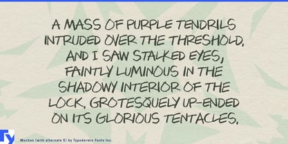
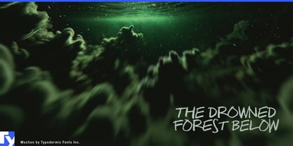
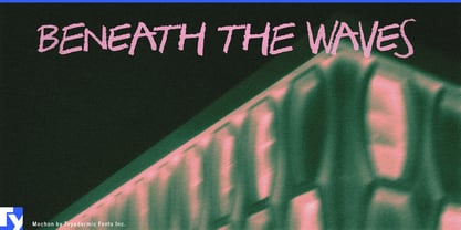
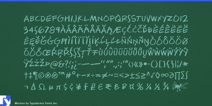
Mochon captures the look of fast grease-pencil notes without drifting into cheerful marker lettering or classroom handwriting. Its all-caps forms are loose and dark, but an underlying geometric rhythm keeps them coherent enough for professional presentation work. Three variations of each letter and numeral shuffle automatically, helping repeated characters retain the irregularity of real hand lettering.
That makes Mochon especially useful in architecture, where increasingly polished digital visualization can make even an early concept look finished. Competition boards, development proposals, renovation studies, masterplans, massing diagrams, material presentations, and public-consultation graphics often need a second visual register for alternatives, comments, diagram labels, and provisional ideas. Mochon can supply that handwritten layer beside a clean architectural sans without requiring every annotation to be drawn manually.
Photorealistic rendering, BIM, digital twins, and AI-assisted visualization make that distinction even more useful. A convincing rendering may still need to communicate NEW ENTRANCE, OPTION B, RETAIN EXISTING WALL, or another decision under consideration. Mochon introduces visible human deliberation into imagery whose finish might otherwise suggest that everything has already been resolved.
Industrial and product designers face the same problem. Automotive concepts, furniture systems, workplace products, lighting, appliances, transportation equipment, and medical-device proposals often combine immaculate renderings with material callouts, mechanism notes, alternatives, and revisions. Mochon separates those working observations from CAD labels and formal specification typography.
Engineering consultancies, innovation teams, foresight groups, and corporate R&D departments can use the same contrast in opportunity maps, prototype presentations, scenario boards, workshops, and internal concept decks. Architecture museums, industrial-design exhibitions, urban-planning shows, and material exhibitions can extend it into wall annotations, diagram labels, section markers, and process-oriented display graphics.
Mochon works best wherever polished digital work needs a visible layer of thinking. It gives architects, industrial designers, planners, exhibition designers, and R&D teams a grease-pencil voice for notes, alternatives, material callouts, and provisional ideas while leaving formal information to a more disciplined companion face.