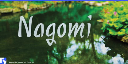
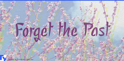
Wellness branding has an awkward typographic problem. Geometric sans serifs can make a yoga studio or spa feel clinical; high-contrast serifs can push it toward luxury cosmetics; loose handwriting can look homemade; energetic brush lettering often brings more motion than a quiet environment needs. Nagomi offers another option: a calm, controlled brush display face that adds a human presence without disturbing the atmosphere.
Nagomi is particularly suited to yoga and Pilates studios, meditation and breathwork programs, massage and bodywork practices, resort spas, wellness hotels, and restorative retreats. Use it for studio names, class series, treatment names, retreat programs, exterior signs, window graphics, wall lettering, and short campaign headlines. Pair it with a restrained sans serif for schedules, prices, booking information, and longer text; Nagomi supplies the expressive layer while the rest of the system stays clear and contemporary.
It also fits the growing world of recovery and restorative wellness: sauna clubs, contrast-therapy studios, cold-plunge facilities, sleep retreats, and recovery centers that need to feel neither like gyms nor medical clinics. On products, Nagomi works well for bath salts, massage oils, aromatherapy blends, spa skincare, sleep products, herbal wellness ranges, and relaxation kits, especially for collection names, scent names, and short label headings.
Tea is a natural neighboring territory. Matcha, loose-leaf tea, herbal infusions, botanical drinks, tea-house identities, seasonal blends, and gift collections all suit Nagomi’s measured, unhurried rhythm.
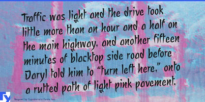
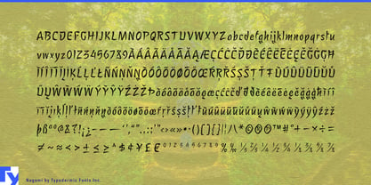
Nagomi’s visual language has Japanese roots without relying on imitation Japanese lettering. Its forms began with brush-painted hiragana and katakana; those strokes were mechanically repurposed and reshaped into a Latin alphabet. The result is narrow, organic, slightly angular brush lettering with the relaxed “zen” quality that makes Nagomi so useful for wellness design.
Nagomi works best where a few words need to slow the design down: the name above the timetable, the treatment above the price list, the blend name on the tea tin, or the retreat title on a quiet photograph.