Skip to content
Skip to main content

Naked Power

by Typodermic
Individual Styles from $69.95 USD
Complete family of 16 fonts: $169.95 USD
The Naked Power Font Family was designed by Ray Larabie, Chikako Larabie and published by Typodermic. Naked Power contains 16 styles and family package options. More about this family

About the family


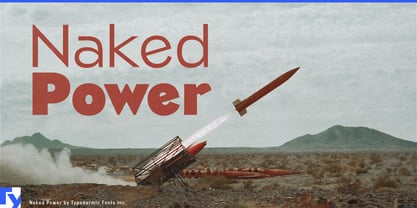
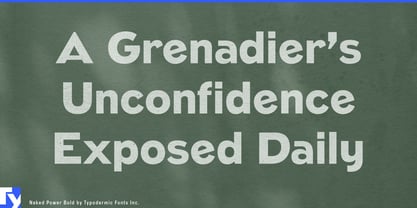
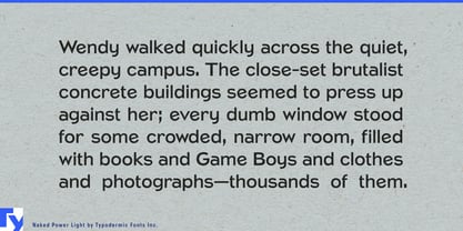
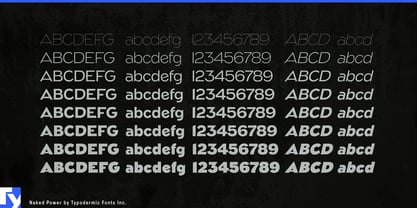
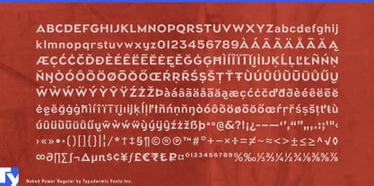
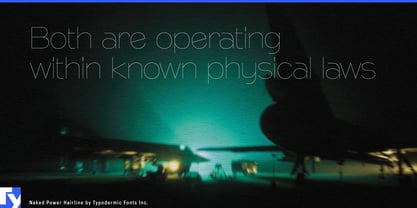
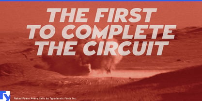
Many forceful display faces stop being useful as soon as the slogan ends. Designers then reach for a neutral sans to handle headings, diagrams and supporting information; the identity loses the character that made the headline effective. Naked Power addresses that gap by carrying one low-contrast geometric construction through eight weights from Hairline to Black, each with a matching italic.

Naked Power is particularly useful for architecture, major construction and public infrastructure. Architecture practices and property developers can use the lighter styles for competition-board titles, rendering captions, project books and development presentations; the heaviest styles can take over building names, construction hoardings and opening campaigns. Transit-station rebuilds, modular-housing developments, civic buildings, battery plants and data-center campuses all require identities that remain refined in presentations and unmistakable at the construction site.

Public-information and campaign systems benefit from the same range. A major housing program, transit proposal, climate initiative or ballot campaign needs forceful slogans, but it also needs section headings, timelines, policy summaries and event graphics. Naked Power allows both levels to share the same construction instead of splitting the message between a poster face and a generic supporting sans.

Performance machinery offers a more commercial version of the problem. Motorcycles, racing bicycles, power tools, fitness equipment and specialist vehicles can use the heavier weights for model names, frame graphics and launch headlines; lighter styles can organize specifications, diagrams and dealer material. Strong verticals and squared counters give short names a stable, manufactured shape, while softened joins keep the lighter end from becoming brittle.

Exhibitions and specialized publishing can use the family to build an entire display hierarchy. Architecture biennales, industrial-design museums, transport histories and books about infrastructure need large titles, section headings, timelines, captions and diagram labels. Naked Power keeps those levels related while leaving extended reading to a dedicated text face.

Designers: Ray Larabie, Chikako Larabie

Foundry: Typodermic

MyFonts debut: Jun 9, 2010

Naked Power

About Typodermic

Welcome to Typodermic Fonts, a spirited type foundry rooted in Nagoya, Japan, started by the Canadian typeface designer, Raymond Larabie in 2001. Our library brims with 500+ diverse typefaces to fuel creativity in graphic design, advertising, web, and app development. As digital type pioneers, we adopted web fonts and app licensing early, consistently pushing the design envelope. With Canadian heart and Japanese precision, we're your global partners in extraordinary typography. Explore Typodermic Fonts—where creativity meets character.

Read more

Read less
