Skip to content
Skip to main content

Polarband

by Typodermic
Individual Styles from $69.95 USD
Complete family of 3 fonts: $84.95 USD
The Polarband Font Family was designed by Ray Larabie and published by Typodermic. Polarband contains 3 styles and family package options. More about this family

Polarband Complete Family

3 fonts

Best Value!

Per Style:

$28.31 USD

Pack of 3 styles:

$84.95 USD

About the family


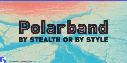
A vintage display face can make a great logo. Trouble starts when that logo has to become a brand. The same lettering suddenly needs flavor names, seasonal editions, campaign headlines and changing color schemes; a decorative alphabet that worked beautifully for five capitals may have nowhere else to go. Polarband turns an early twentieth-century inline idea into a practical mixed-case identity system.

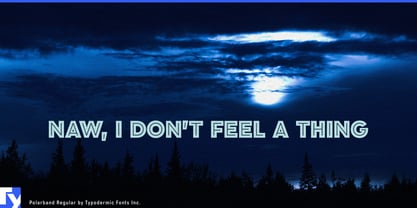
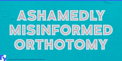
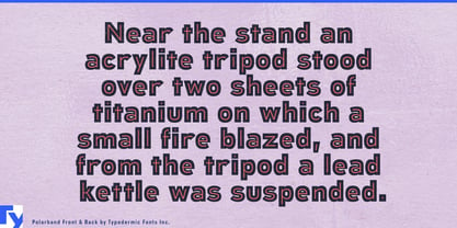
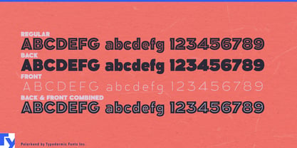
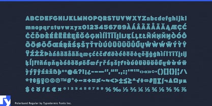
Its broad geometric forms combine substantial letter bodies with fine interior lines. Polarband consists of Regular, Back and Front; the separated components let the main body and inline treatment be colored and combined independently. A full lowercase extends the same visual language into product names, short descriptors and promotional copy rather than confining it to badges and all-cap titles.

That flexibility is especially useful for product ranges built around changing varieties. Premium soft drinks, confectionery, ice cream, coffee products and snack lines often need one recognizable identity across flavors, seasonal releases and limited editions. Polarband lets color change from one SKU to the next while the underlying letterforms remain constant. A quiet companion family can handle ingredients and longer copy; Polarband carries the expressive layer across the range.

Heritage brands face a similar problem. Referencing older commercial lettering can easily slip into fake aging and predictable nostalgia. Polarband’s historical character comes from its proportions and inline construction rather than simulated wear, allowing it to take crisp, saturated and contemporary color combinations. Revived consumer brands, anniversary programs and heritage merchandise collections can acknowledge the past without pretending the new work was printed decades ago.

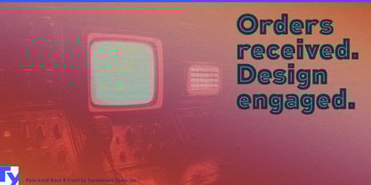
Restored cinemas, food halls, resorts and entertainment venues can use Polarband in the same way, carrying a decorative identity through event titles, merchandise and seasonal campaigns. The separate Front and Back components also translate naturally into motion graphics, where the layers can be revealed, recolored or animated independently for venue screens, digital advertising and product launches.

Polarband is most useful when historical display character has to survive beyond the hero wordmark. Its mixed-case alphabet gives the identity more language to work with; its layered construction lets color and treatment change without losing the structure that made the name recognizable.

Designers: Ray Larabie

Foundry: Typodermic

Original Foundry: Typodermic

MyFonts debut: Jun 25, 2010

Polarband

About Typodermic

Welcome to Typodermic Fonts, a spirited type foundry rooted in Nagoya, Japan, started by the Canadian typeface designer, Raymond Larabie in 2001. Our library brims with 500+ diverse typefaces to fuel creativity in graphic design, advertising, web, and app development. As digital type pioneers, we adopted web fonts and app licensing early, consistently pushing the design envelope. With Canadian heart and Japanese precision, we're your global partners in extraordinary typography. Explore Typodermic Fonts—where creativity meets character.

Read more

Read less
