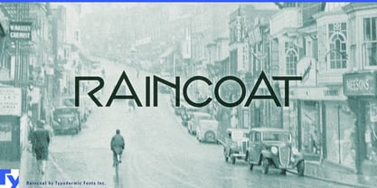
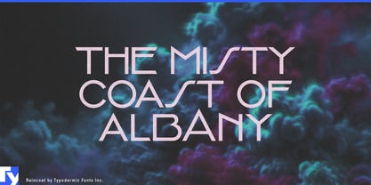
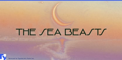
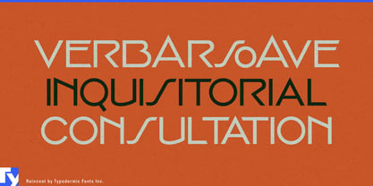
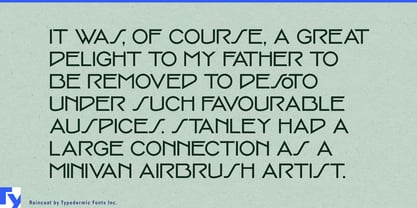
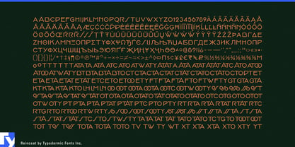
A geometric Art Deco font can give a name period style. What it usually cannot do is make that name feel as though the letters were drawn specifically to fit one another. Raincoat is built around that second problem. Its alternate forms and contextual combinations reshape short words, creating the fitted, inscription-like quality more often associated with custom lettering than ordinary typesetting.
Some adjustments are subtle. The angle at the end of a T can change according to the neighboring letter; certain combinations introduce a smaller O to improve the fit; other letters interlock or alter their structure as the word develops. A pointed alternate A can transform the silhouette of a name entirely, while Raincoat’s unusual S adds another distinctive interruption to the geometric construction.
That makes Raincoat particularly useful for boutique identities built around a memorable name. Milliners, bespoke tailors, jewelers, eyewear designers, bridal salons and accessory labels often need one short word to carry enormous visual weight. The same name may appear above a shop entrance, inside a presentation box, across tissue paper or on a small tag. Raincoat gives it enough internal variation to feel composed rather than simply typeset.
Jewelry and small luxury goods are especially natural territory. Compact names have to survive on boxes, pouches, engraved surfaces and window graphics without losing their identity. Raincoat’s narrow geometry keeps them controlled, while its fitted combinations can turn a simple sequence of capitals into something closer to a custom wordmark.
Architectural hospitality provides another strong setting. Boutique hotels, cocktail lounges, private clubs, restored theatres and destination restaurants often need a name that feels connected to the building itself. Raincoat can work on entrance lettering, brass doors, menu covers and interior signs where the identity should feel more like an architectural inscription than ordinary display type. Named buildings and residential developments can use the same quality on lobby walls, entrance canopies and sales material.
Niche fragrance, grooming and boutique cosmetics can use Raincoat as the signature layer above more practical typography. A fragrance name or product line can carry the distinctive lettering while a quieter companion face handles ingredients, specifications and longer text.
Raincoat is a single-style display face, and that concentration is part of its purpose. It is for the few words that have to carry the identity: the name over the door, the lettering on the box, the title on the wall. Its responsive letter combinations, pointed A and unusual S give those words some of the attention normally reserved for custom lettering.