Luxury typography often arrives carrying its own history. High-contrast serifs can suggest fashion houses, old wine estates and inherited prestige before the brand has said anything for itself. Ulian keeps the ceremony of a serif while changing the architecture underneath, giving new luxury products a formal voice without making them pretend to have existed for a century.
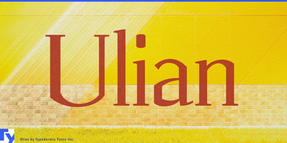
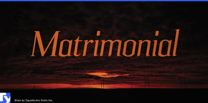
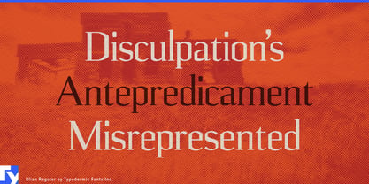
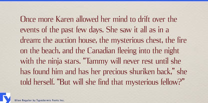
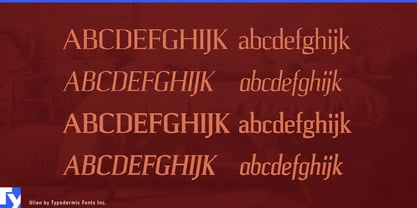
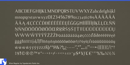
Its letterforms combine curved serifs and stroke modulation with unusually flat vertical sides. Those compressed, almost architectural forms make the upright styles feel composed and engineered rather than nostalgic, while the italics provide a more fluid counterpoint. Regular, Italic, Bold and Bold Italic give the family range for product names, collection titles, campaign headlines and short supporting display copy.
Prestige cosmetics and advanced skincare are especially well suited to that tension. Serum bottles, treatment concentrates, eye-care products, fragrance boxes and coordinated skincare ranges need typography that feels refined on carefully controlled surfaces without disappearing into familiar luxury conventions. Ulian’s narrow proportions work naturally on tall cartons and slim bottles, while its squared construction gives collection names and treatment titles a recognizable shape of their own.
Contemporary wine offers another strong setting. Architecturally designed estates, limited cuvées, single-vineyard releases and premium sparkling wines can use the authority of serif typography without rustic nostalgia or faux-engraved history. Estate names, vineyards, regions and vintages can share one restrained display vocabulary while the overall impression remains distinctly modern.
Botanical aperitifs, zero-proof spirit alternatives, sparkling teas and sophisticated alcohol-free dinner drinks present a newer version of the same problem. They need to feel adult and occasion-worthy without simply imitating conventional spirits packaging. Ulian brings formality to bottle names, botanical varieties and flavor descriptions while its harder geometry keeps the identity from feeling borrowed.
Lab-grown jewelry and cultured gemstones push the idea further. These products combine technological origins with expectations of rarity, ceremony and permanence. Collection names, stone cuts, presentation boxes, retail displays and campaign headlines can feel luxurious without concealing the engineered premise of the product.
Private longevity clubs, science-led wellness retreats and advanced diagnostic studios offer another future-facing use. Ulian can carry institute names, program titles, membership material and environmental display headings with enough structure to suggest precision and enough serif detail to preserve ceremony.
Ulian is built for premium categories moving forward rather than looking backward. It keeps the authority and ritual of serif typography while replacing some of its inherited softness with a tighter, more architectural structure.