Technical typography often forces a choice between character and usefulness. A display face can make a robotics kit, control panel, or science exhibit look convincingly technological, then become awkward as soon as the design needs instructions, labels, model numbers, captions, or explanatory copy. A neutral sans solves the readability problem but can lose the technological setting. Venacti occupies the useful ground between those extremes.
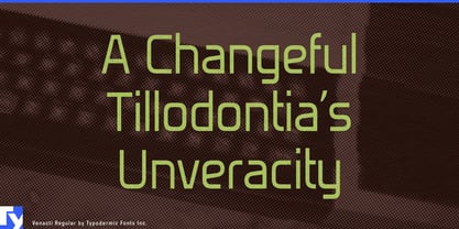
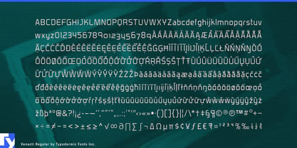
Originally commissioned by the BBC, Venacti combines rectangular geometry with details that keep it from becoming rigid. Softened vertical terminals, tapered diagonals, generous counters, compact joins, and subtly superelliptical curves temper the underlying squareness. It still looks engineered, but its open structure and functional lowercase let the same visual language continue beyond the headline.
That balance makes Venacti particularly useful for hands-on science and technology: planetarium exhibits, programmable robots, electronics-learning sets, model rockets, classroom experiments, maker-space graphics, and children’s science publishing. It can move naturally from a title into diagram labels, captions, instructions, measurements, and short explanatory passages without turning every piece of information into a sci-fi prop.
The same qualities suit synthesizers, audio interfaces, laboratory instruments, DIY electronics, robotics hardware, test equipment, and control panels. Venacti gives function labels, settings, specifications, and model numbers an engineered context; its distinctive numerals are especially useful where measurements, scores, part numbers, and equipment designations carry much of the visual load.
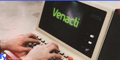
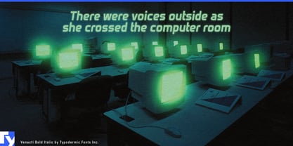
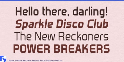
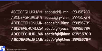
Venacti can also suggest retro computing and institutional science fiction without relying on pixels, monospacing, OCR forms, or literal terminal lettering. Computer-history exhibits, restored-hardware graphics, fictional laboratories, research stations, spacecraft systems, and technology-focused games can use it to evoke machinery and computing while still accommodating ordinary language. Three weights with matching italics extend that vocabulary through headings, labels, specifications, short copy, and emphasized information.