Anisette Std®
by Typofonderie

- Aa Glyphs
-
Best ValueFamily Packages
- Individual Styles
- Tech Specs
- Licensing
Per Style:
$71.50 USD
Pack of 4 styles:
$286.00 USD
About the family
A geometric Art Déco multi-widths type family
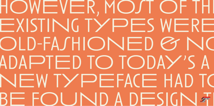
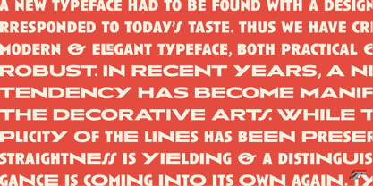
Anisette has sprouted as a way to test some ideas of designs. It has started with a simple line construction (not outlines as usual) that can be easily expanded and condensed in its width in Illustrator. Subsequently, this principle of multiple widths and extreme weights permitted to Jean François Porchez to have a better understanding with the limitations associated with the use of MultipleMaster to create intermediate font weights.
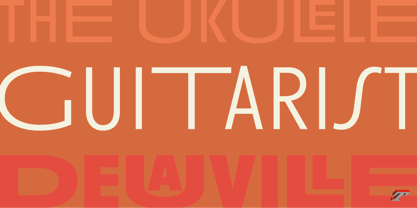
Anisette is built around the idea of two widths capitals can be described as a geometric sanserif typeface influenced by the 30s and the Art Deco movement. Its design relies on multiple sources, from Banjo through Cassandre posters, but especially lettering of Paul Iribe. In France, at that time, the Art Déco spirit is mainly capitals. Gérard Blanchard has pointed to Jean François that Art Nouveau typefaces designed by Bellery-Desfontaines was featured before the Banjo with this principle of two widths capitals.
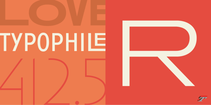
A simple sentence will be as diverse in its representations, as the number of Anisette variables available to the user. With Anisette, typography becomes a game, as to design any title page as flamboyant as if it has been specially drawn for it.
Two typefaces, many possibilities
The complementarity between the two typefaces are these wide capitals mixed with narrow capitals for the Anisette while the Anisette Petite – in its latest version proposes capitals on a square proportions, intermediate between the two others sets. Anisette Petite proposes capitals in a square proportion, intermediate between the two other sets, all of which are interchangeable. In addition, Anisette Petite also includes a set of lowercase letters. Its style references shop signs present in our cities throughout the twentieth century.
Anisette, an Art Déco typeface
Anisette: Reveal your typographic expertise
Club des directeurs artistiques, 46e palmarès
Bukva:raz 2001
Slanted: Contemporary Typefaces #24

About Typofonderie
We are an independent French type foundry since 1994, we design, manufacture and distribute exclusive typefaces. Meticulously built years after years, our library includes type families suited for every aspect of typographic usage. We are passionate about our work. Each of our published typefaces is the result of years of teamwork at Typofonderie. Typofonderie is digital type foundry who has become over the years, a real institution in France and abroad. Our customers recognise the timelessness of our typefaces, which help them give meaning and strength to their projects, whether they are companies, brands, publications or institutions. Our typefaces can be found in the métro in Paris, as well as in Osaka, at the Opéra de Paris, La Tour d’Argent, Vuitton, Séphora, Galeries Lafayette, Yves Saint Laurent Beauty and are used by the French Olympic team. You will also encounter them in museums, in the Who’s Who, Wired, at Dell, at the Boston Consulting Group, on the jerseys of the French Olympic team and in the Alps thanks to SwissSki. Hillary Clinton and Emmanuel Macron used our typefaces during their presidential campaigns. The palais de l’Élysée uses three of our typefaces families for the identity and communication of the French president.
Read more
Read less
- Choosing a selection results in a full page refresh.