Skip to content
Accueil / Polices / Device / 112 Hours
112 Hours

112 Hours

par Device
Styles individuels à partir de $9.00
Famille complète de 120 polices: $390.00
112 Hours Font la famille était conçu par Rian Hughes et publié par Device. 112 Hours contient 120 styles et des offres familiales.

En savoir plus sur cette famille
ESSAI GRATUIT DE 30 JOURS de Monotype Polices pour obtenir 112 heures et plus de 150 000 polices. Démarrer l'essai gratuit
Démarrer l'essai gratuit

112 Hours Family

120 polices

Meilleure offre !

Par style :

$3.25

Paquet de 120 styles :

$390.00

Voir plus 110... Voir moins...

A propos de 112 heures Police Family


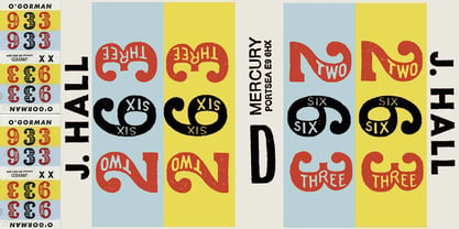
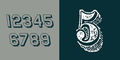
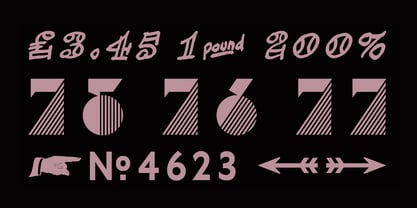
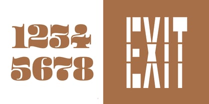
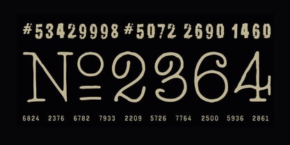
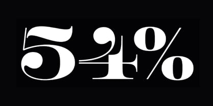
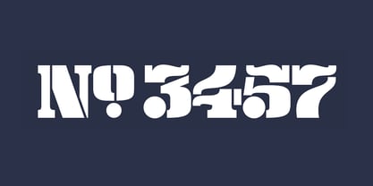
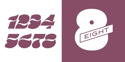
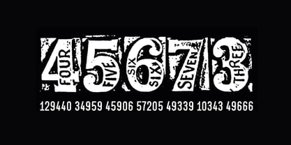
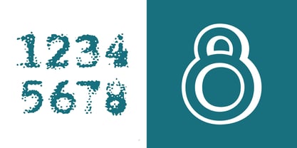
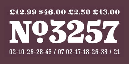
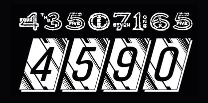
Rian Hughes’ 15th collection of fonts, “112 Hours”, is entirely dedicated to numbers. Culled from a myriad of sources – clock faces, tickets, watches house numbers – it is an eclectic and wide-ranging set. Each font contains only numerals and related punctuation – no letters. A new book has been designed by Hughes to show the collection, and includes sample settings, complete character sets, source material and an introduction. This is available print-to-order on Blurb in paperback and hardback: http://www.blurb.com/b/5539073-112-hours-hardback http://www.blurb.com/b/5539045-112-hours-paperback From the introduction: The idea for this, the fifteenth Device Fonts collection, began when I came across an online auction site dedicated to antique clocks. I was mesmerized by the inventive and bizarre numerals on their faces. Shorn of the need to extend the internal logic of a typeface through the entire alphabet, the designers of these treasures were free to explore interesting forms and shapes that would otherwise be denied them. Given this horological starting point, I decided to produce 12 fonts, each featuring just the numbers from 1 to 12 and, where appropriate, a small set of supporting characters — in most cases, the international currency symbols, a colon, full stop, hyphen, slash and the number sign. 10, 11 and 12 I opted to place in the capital A, B and C slots. Each font is shown in its entirety here. I soon passed 12, so the next logical finish line was 24. Like a typographic Jack Bauer, I soon passed that too -— the more I researched, the more I came across interesting and unique examples that insisted on digitization, or that inspired me to explore some new design direction. The sources broadened to include tickets, numbering machines, ecclesiastical brass plates and more. Though not derived from clock faces, I opted to keep the 1-12 conceit for consistency, which allowed me to design what are effectively numerical ligatures. I finally concluded one hundred fonts over my original estimate at 112. Even though it’s not strictly divisible by 12, the number has a certain symmetry, I reasoned, and was as good a place as any to round off the project. An overview reveals a broad range that nonetheless fall into several loose categories. There are fairly faithful revivals, only diverging from their source material to even out inconsistencies and regularize weighting or shape to make them more functional in a modern context; designs taken directly from the source material, preserving all the inky grit and character of the original; designs that are loosely based on a couple of numbers from the source material but diverge dramatically for reasons of improved aesthetics or mere whim; and entirely new designs with no historical precedent. As projects like this evolve (and, to be frank, get out of hand), they can take you in directions and to places you didn’t envisage when you first set out. Along the way, I corresponded with experts in railway livery, and now know about the history of cab side and smokebox plates; I travelled to the Musée de l’imprimerie in Nantes, France, to examine their numbering machines; I photographed house numbers in Paris, Florence, Venice, Amsterdam and here in the UK; I delved into my collection of tickets, passes and printed ephemera; I visited the Science Museum in London, the Royal Signals Museum in Dorset, and the Museum of London to source early adding machines, war-time telegraphs and post-war ration books. I photographed watches at Worthing Museum, weighing scales large enough to stand on in a Brick Lane pub, and digital station clocks at Baker Street tube station. I went to the London Under-ground archive at Acton Depot, where you can see all manner of vintage enamel signs and woodblock type; I photographed grocer’s stalls in East End street markets; I dug out old clocks I recalled from childhood at my parents’ place, examined old manual typewriters and cash tills, and crouched down with a torch to look at my electricity meter. I found out that Jane Fonda kicked a policeman, and unusually for someone with a lifelong aversion to sport, picked up some horse-racing jargon. I share some of that research here. In many cases I have not been slavish about staying close to the source material if I didn’t think it warranted it, so a close comparison will reveal differences. These changes could be made for aesthetic reasons, functional reasons (the originals didn’t need to be set in any combination, for example), or just reasons of personal taste. Where reference for the additional characters were not available — which was always the case with fonts derived from clock faces — I have endeavored to design them in a sympathetic style. I may even extend some of these to the full alphabet in the future. If I do, these number-only fonts could be considered as experimental design exercises: forays into form to probe interesting new graphic possibilities.
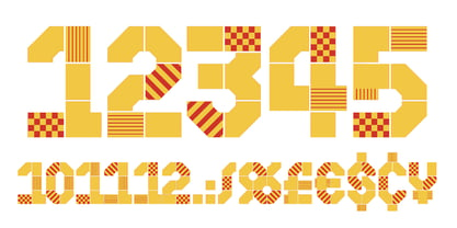
Concepteurs : Rian Hughes

Éditeur : Device

Fonderie : Device

Maître d'ouvrage : Device

MyFonts débout : 23 avril 2015

112 heures

À propos Device

Device Polices est la branche police du studio Device de Rian Hughes, situé à Kew Gardens, à Londres. Contributeur de la première heure à la gamme FontFont de FontShop, Device Polices a été lancé en 1997 afin d'accueillir la bibliothèque grandissante de Hughes. Il a publié plus de 200 caractères originaux couvrant plus de 1000 graisses individuelles, y compris des conceptions personnalisées pour des clients aussi divers que Mac User, 2000AD et The Teenage Mutant Ninja Turtles. Rian a étudié au London College of Communication à Londres avant de travailler pour une agence de publicité, Smash Hits, le magazine i-D et une série d'entreprises de conception de pochettes de disques. Sous la bannière du studio Device, il fournit du design, des caractères personnalisés et des illustrations pour des campagnes publicitaires, des pochettes de disques, des jaquettes de livres, des romans graphiques et la télévision. Il a conçu des affiches pour la chaîne Yellow Boots de la société de mode Jun Co. à Tokyo, le film d'animation sur la sécurité à bord des avions de Virgin Airlines, la campagne d'affichage d'Eurostar, une collection de chemises hawaïennes, une gamme de montres pour Swatch, la brochure des MTV Europe's Music Awards, ainsi que de nombreuses illustrations de jaquettes de livres et de couvertures de CD. Il a conçu de nombreux logos pour DC, Marvel, Valiant, Image et d'autres sociétés de bandes dessinées pour des titres tels que Batman, X-Men, James Bond, The Avengers et Spider-Man. Lié depuis longtemps au monde de la bande dessinée, le premier roman graphique de Rian Hughes a été "The Science Service" pour l'éditeur belge Magic Strip. Il a ensuite publié "Dare" pour l'éphémère "Revolver" d'IPC, une "refonte iconoclaste du héros de bande dessinée des années 50, Dan Dare", écrit par Grant Morrison. Ses bandes dessinées de Galaxy's Greatest ont été rassemblées dans Yesterday's Tomorrows ("Dare", "Really and Truly" et d'autres) et Tales from Beyond Science (écrites par Mark Millar, John Smith et Alan McKenzie). Plus récemment, il a écrit et dessiné une histoire de "Batman : Black and White", a contribué à "Vertigo : Magenta", a dessiné la carte du DC Multiverse et a retrouvé Morrison pour deux histoires dans le magazine "Heavy Metal". Il a participé à de nombreuses expositions internationales, a donné de nombreuses conférences au Royaume-Uni et à l'étranger, et une exposition personnelle de son travail a eu lieu en 2003 à la Conningsby Gallery, à Londres. Une monographie rétrospective, "Art, Commercial", a été publiée en 2002, et "Ten Year Itch", une célébration des dix premières années de Device Polices, a été publiée en 2005. Les livres récents comprennent "Custom Lettering of the 20s and 30s" et le roman graphique sans paroles pour tous les âges "I Am A Number", "Soho Dives, Soho Divas" rassemble ses dessins burlesques, et il expose son manifeste mémétique dans Cult-Ure : Ideas Can Be Dangerous. Il possède une collection de souvenirs des Thunderbirds, un réfrigérateur rempli de vodka et une pile d'albums d'easy listening qu'il écoute très calmement. www.rianhughes.com www.devicefonts.co.ukThe La page de la fonderie Premium peut être consultée ici.

En savoir plus

Lire moins