


Robard
par Dear Alison

À propos de la famille
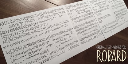
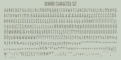
My brother is an architect, and I have always loved his lettering, you know, the style of writing that can be found on architectural drawings. There is a common thread to it, yet each architect or engineer brings their own personality to it. I have seen a similar style being used by some hand-letterers for invitations, place cards and signage. Inspired, I set out to create my own, and the result is my new typeface, Robard! I wanted something compact, somewhat modular, done quickly but with control, and sourced from hand-lettering. Starting out with a handful of pigment ink pens, I settled on a 0.1mm Copic Multi-Liner, and using a light table with a grid underneath the paper, I cranked out grouping after grouping, letter after letter, numbers, punctuation, accents, just trying to zero in on the feeling and the look I was after. There were some ideas that didn't work, like unicase (there would be no regular lowercase), or swash alternates. Ultimately, I ended up with a decent array of glyphs to choose from, and alternates like oldstyle numbers, and an alternate set of caps for the lowercase slots, and even alternative figures so doubles like 88 would be different. In the font, the OpenType ligature code automatically alternates the cap and lowercase (alternate cap) letters, and numbers as you type, lending Robard that hand-lettered look in a digital typeface that I was hoping for. There are also oldstyle figures, and unlimited fractions, ordinals, and a few alternate letters. I hope you like Robard!
Concepteurs: Alison Argento
Éditeur: Dear Alison
Fonderie: Dear Alison
Maître d'ouvrage: Dear Alison
MyFonts débout: Nov 30, 2016
À propos Dear Alison
Dear Alison is the creation of Alison Argento, a travel writer based in Cherry Hill, New Jersey. Although her work dictates that she spend most of her time typing and editing at the computer keyboard, she prefers the traditional look and feel of handwritten letters and the freehand lettering arts along with the look of vintage type. Dear Alison fonts are meant to bring the handcrafted feel of personal correspondence to the digital age.
En savoir plus
Lire moins
- Le choix d'une sélection entraîne l'actualisation de la page entière.