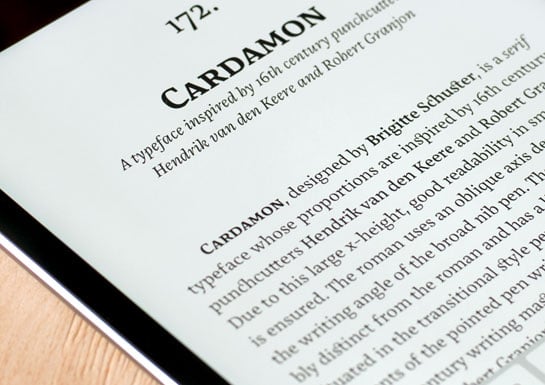
Cardamon
Cardamon: A well-conceived, readily legible antiqua typeface with an historical touch by Brigitte Schuster
Cardamon is the first typeface designed by Brigitte Schuster. Without being overly obtrusive, the font family Cardamon, inspired as it is by historic antiqua typefaces, has a very characteristic voice and will thus add special appeal to your designs.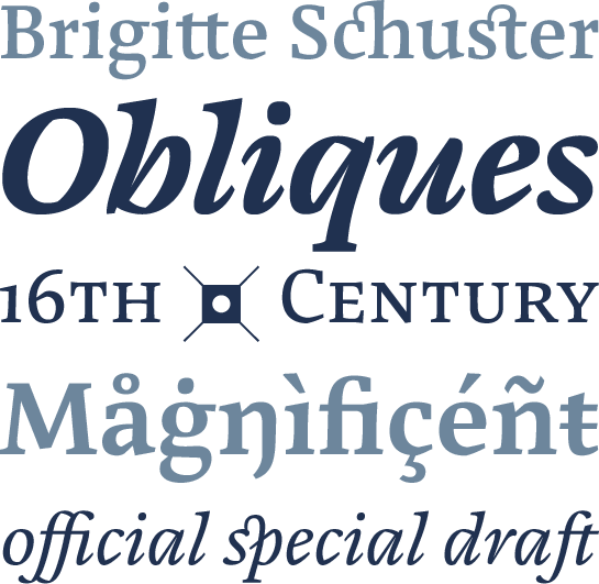 Several years ago, Brigitte Schuster made the original designs for Cardamon™ while participating in a Master of Design in Type and Media course at the Royal Academy of Art in the Hague in the Netherlands. Her own personal interest in typography and type design is something that has only gradually developed over the years in parallel with her work in the field of graphic design, but eventually she decided to create her own typeface. She began looking at historic typefaces from the 16th century by Hendrik van den Keere and Robert Granjon as the basis for the upright variants and turned to look at those by Giovan Francesco Cresci as inspiration for her italic. She took those elements that she particularly liked to provide the foundation for the forms of Cardamon. In addition, she decided to experiment with placing an emphasis on angular outlines in order to increase the legibility of the font in smaller point sizes and its individuality in the larger point sizes. However, as it turned out, she was unable to achieve the desired effect and decided to abandon this approach, although traces of her original concept still survive in the completed font. Before Cardamon was finally ready for release in early 2015, it was subject to various development phases over a longer period of time during which new and, in some cases, very subtle modifications were made to it.
The evidence of the influence of historic Renaissance antiquas is clearly apparent in the forms of Cardamon, and this is combined with calligraphic elements of text written with a broad-nib pen. The latter can be found, for example, in the partially angular forms, the slight inclination of the characters along the direction of movement of writing and the somewhat tapering stems. Schuster has added to the vibrancy of Cardamon by slightly varying the length of the serifs. A large x-height and generous counters ensure that the font is clearly legible even in small point sizes.
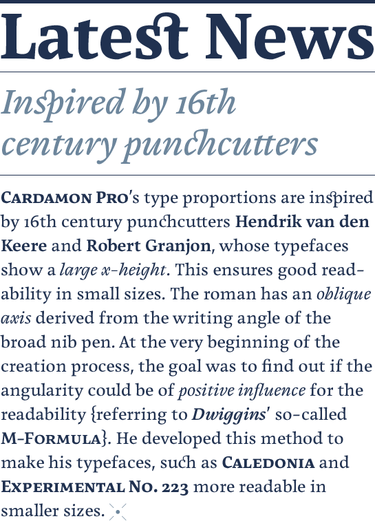
Designer Interview
-
Brigitte Schuster
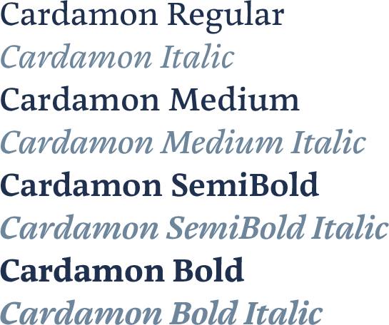
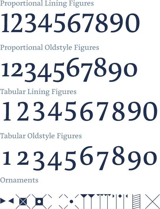
 Cardamon is available in four finely differentiated weights, from Regular to Bold. All weights are accompanied by a corresponding italic and come with small caps, oldstyle and lining figures and many ligatures, some of which are particularly attractive. There is also a range of ornaments.
 Cardamon may be a neutral, restrained antiqua font but considered as a whole it has a marked and individual character. Its somewhat angular forms give it a feel of bygone times that perfectly complements the appearance of the carefully designed italic. The well-conceived and readily legible Cardamon is the ideal tool for setting longer texts or creating editorials, for example. At the same time, the clear and characteristic forms of Cardamon also ensure that it cuts a good figure on device screens.
