
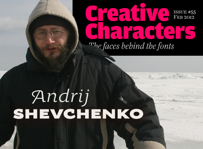
Photo by Yuriy Antonov
This series is gradually growing into a kind of typographic world tour. During the past year or so, we have interviewed designers from Sweden to Thailand, from Brazil to Siberia, from Chattanooga to Japan. This month’s interview takes us to Ukraine — not its capital Kiev (or Kyiv, as Ukrainians prefer to transcribe their cyrillic spelling), but a pleasant southern town on the Sea of Azov. Here, in Berdyansk, is the seat of AndrijType, one of several likable Eastern European font foundries that have joined MyFonts in the past few years. Its one-man typeface library successfully blends Ukrainian-flavored sensibilities with universal typographic common sense. Meet designer Andrij Shevchenko, coming in from the cold.
Andrij, you work from Berdyansk, described on your foundry page as being “on the hottest Ukrainian seaside.” What kind of city is it? And how hot does it get?
Well, right now it is probably the coldest Ukrainian seaside. Berdyansk is a small town — very provincial — and a leisure resort. We have salt lakes here with therapeutic muds, and a long spit of land projecting out into the sea: sands, winds and sun. Our sea is very shallow, so in summer it is very warm and pleasant. When it’s not windy, it’s really safe to swim with babies. When there’s wind, it is perfect for windsurfing, kiting and sailing. During the winter the sea is often frozen, as it is right now, and people walk across the Berdyansk bay, skating, playing hockey and so on. This aerial photo of the Berdyansk spit and bay (by Alexandr Korolev) gives a good idea of its structure. It’s a very sunny place, even in winter. I really like it.
Is there a lively art and design scene in Berdyansk?
We have some art activities in the Museum of Art here, and classes for art teachers. Generally these are about painting, not design. I am not involved in it and prefer to spend time in outdoor activities, such as open-air calligraphy on the beach.
I am also very pleased to be able to take part in type and calligraphy festivals in a couple of the major Ukrainian cities: the Festival of Cyrillic in Kharkiv, and Rutenia in Kyiv (Kiev). These are very energetic, exciting meetings with an exhibition, activities, workshops and informal conversations for type people from Ukraine and our guests from Russia, Belarus and, I hope, other Cyrillic countries as well in future festivals.
Did you receive any formal design education? Were you always interested in letterforms?
I have no formal design education, but I was fascinated by letters even during my school years, when I read Leonid Pronenko’s book Calligraphy for Everyone. Mr. Pronenko is a calligrapher and teacher from Russia. His book is an album of western calligraphy from around the world, including some cyrillic examples. When it came out in the late 1980s, it was like a window onto a beautiful new world.
When I was working as a programmer, I wrote some rather naive code to make and use my own pixel fonts. Later, when I started working as a graphic designer, I tried to convert my own calligraphy and even my writing into typefaces.
OK, so you worked as programmer — that is a skill that is becoming more and more useful for type designers. In what ways does this help you in your design work? For instance, do you use Python or other scripting languages to automate the process?
Shame on me, but no. Sure, I use other people’s code, and some of my own automation scripts, but that’s all done on a very primitive level. I need some good instruction in font programming! If anybody can recommend such a book or online resource, that would be great.
Apart from designing the retail fonts that are sold through MyFonts, what other work do you do? And what do you enjoy most?
I design identities (I even did a touristic logo for Ukraine a few years ago, altered by now), I do lettering and calligraphy, and draw custom fonts; the latest was inspired by Robert Lisovsky, whose work I admire very much. I am also interested in creating identities for cities, and I am currently trying to share this interest with the Berdyansk city council — though I’m not certain those attempts will be successful. In any case I enjoy drawing fonts for retail very much, and I have MyFonts to thank for that opportunity.
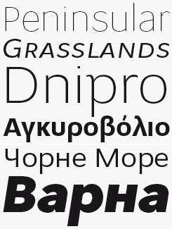
Oksana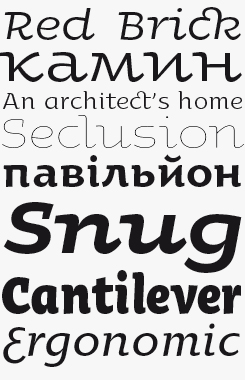
Oksana sans
Oksana and Oksana Sans are Shevchenko’s flagship font families. With its roots in calligraphy, this is a soft and personable typeface — the normal version especially. Versatile enough to accommodate wide extremes of style while retaining a unified character, there is an Oksana suitable for any occassion. Oksana Text is great for richly flavored typesetting and is ably supported by a narrow version.
The sans-serif subfamily Oksana Sans is available in four widths, making it a useful addition to any logo designer’s toolkit; while the impressive range of weights, styles, swashes and alternate characters will be handy for creating individuality and personality in corporate publications.
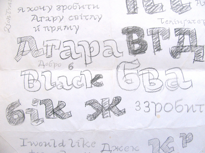
A sample of Andrij Shevchenko’s raw sketches.
How do you stay informed about what is going on in the international type world? What blogs and websites do you visit, and what kind of magazines or books do you read?
My general source for news from the world of type is the Typophile forum. I read ilovetypography.com, news from a number of foundries, the What’s New page on MyFonts, and I always look out for what is new in other Slavic countries, for instance through tipometar.org for the Serbian type scene and Typo Magazine’s website for Czech type and design. By the way, I also publish some Ukrainian type news myself on type.org.ua. Thanks to Robert Oles from d2d.pl I could read the Polish translations of Robert Bringhurst, Jost Hochuli and Adrian Frutiger. Someday, I hope to eventually see Ukrainian translations of major books on type design.
Who are the designers and artists that influence you most?
Ukrainian masters such as Heorhiy Narbut, Robert Lisovsky, Volodymyr Yurchyshyn, Jacques Hnizdovsky, and Vasyl Chebanyk
always inspire me. I am amazed by European classic typographers like Gill and Zapf. As for my contemporaries, I am always curious to see what is new from the hands of František Štorm from the Czech Republic, Łukasz Dziedzic from Poland, Vera Evstafieva and Oleg Macujev from Russia, Ukrainian Dmytro Rastvortsev — I could go on and on.
There has been a powerful typographic upsurge in Ukraine, and more generally in the Cyrillic countries. Has this been an important factor for you?
I think it is the effect of a bit of new-found freedom in our lives. There is more graphic design, so more designers are bored by the “Cyrillic fence” and have started to make actual fonts — et voilà, new small independent foundries appear. It is nice. More people are teaching the making of a font, like Ilya Ruderman’s course in Moscow, inspired by the famous type]media course at the KABK Royal Academy in The Hague, of which he is a graduate.
Your signature typeface is Oksana, which has grown into a huge suite of subfamilies. It has some rather unusual characteristics. Do you think its shapes are somehow related to Ukrainian or Cyrillic lettering and writing styles?
Ukraine has a rich heritage in calligraphy and lettering, but it is a forgotten tradition. I could tell you a long history here, but I will try to summarize. Ukraine is a country of annihilated traditions. Despite having a long and deep heritage, almost every generation somehow has had to start from zero. Traditions seldom get a chance to be passed down to the next generation. How can a typographic tradition exist when our Ukrainian language has been prohibited, writers have been executed, and even certain letters of our alphabet have been erased by foreign powers? Fortunately, great masters left us brilliant lettering examples from the Ruthenian age as well as from Ukrainian Baroque and the twentieth century.
The “Ukrainian style” is often associated with asymmetrical serifs, as in the works of the great Heorhiy Narbut. I gave Oksana big, smooth and active asymmetric serifs, wide proportions and some shapes that are specific to freehand writing. So Oksana was soon recognized by many people here as being very Ukrainian. Then I tried to reduce those formal signs: fewer serifs, narrowed proportions, more formal shapes. It was an interesting experiment: how long will a typeface be recognized as national when formal characteristics are removed one by one? For now, there is still no end in sight.
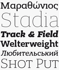
Osnova
Osnova is a common Slavic word meaning basis, and that is indeed what Osnova is — a solid bedrock, a set of typographic foundation stones with a modest personality, yet enough muscle to support demanding typesetting assignments. In addition to Latin, Greek and Cyrillic language support, small caps and six weights from Thin to Heavy (plus matching italics), there are “fancy” alternates for some glyphs, making this a versatile family which will be at home in all kinds of editorial and identity projects.
Bandera Pro
In contrast to Osnova, above, Bandera is named after something usually found flying in the air. Meaning “flag”, it’s as well equipped as its sibling (Shevchenko designed it in the same proportions as Osnova), and would make a great companion for those situations requiring sans and slab serif fonts to be mixed and combined in the same layout.
Who, if I may ask, is Oksana?
This is not a specific person. I’ve met a few beautiful Oksanas in my life (hi there, if you read this!), but I have named the font after all Ukrainian women.
Your typefaces seem to gradually have become more mature and confident. Would you say Oksana was part of a learning process?
Absolutely — like every process. But there is more. When I released Oksana (very much a display face), I felt the need for Ukrainian text faces, so I decided to draw a few. I want to draw some more serious faces and then go back to drawing flourishes and funny letters.
When you design, do you do a lot of manual sketching or writing?
Yes, I draw a lot. It helps me to explore the conceptual principles of a future font; besides, drawing and writing are a good way for me to relax. When I have a general idea, I first make lots of raw sketches in a free manner, without paying any attention to proportions or detailed shapes. I don’t make any finished drawings by hand. As soon as the main idea is clear to me, I take the design into the font editor.
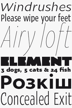
Seaside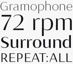
The Seaside family is a contrasty, multi-purpose sans serif typeface ideal for contemporary magazine and packaging design. The normal version is good for medium to long text settings, while the Display variety ups the contrast slightly for elegant, restrained headlines and call-outs. Shevchenko recommends pairing it with Osnova.
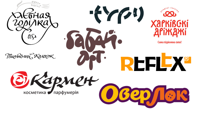
Some of Andrij Shevchenko’s custom logo and lettering work.
One of your early typefaces is called Zion Train. Is that name indicative of the kind of music you like? More generally, does music play an important role in your designer’s life?
Absolutely! I listen to music all the time. If it is not Bob Marley, it may be some Ukrainian rock (like Haydamaky) or folk (like Burdon) or something traditional and ethnic from another culture. I like to sing something when working, and I like it very much if my children sing along with me sometimes.
When thinking about your work in general terms, what are your main objectives? And more specifically, what kind of typefaces are you planning to work on in the near future?
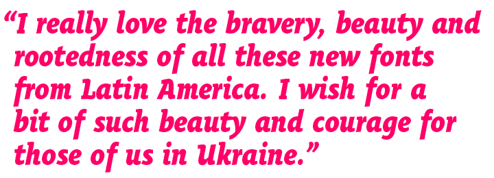
I would say that avoiding anything like a faux Soviet style (unclear, ugly and full of taboo) and working towards a new Cyrillic — vivid, clear and based on historical calligraphic roots — looks like a great objective for me. I want to play with it in different typefaces: text, display and calligraphic (and I need to finally release AndrijHand!). I really love the bravery, beauty and rootedness of all these new fonts from Latin America. I wish for a bit of such beauty and courage for those of us in Ukraine.
I’m sure you are already contributing to this! Do you have any final remark or suggestion?
I do, in fact: Dear western type designers! It is not an obligation to curve the legs of cyrillic ‘К’. They can be straight too, believe me!
Thank you for setting that one straight!
AndrijScript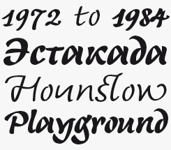
There are greater differences between the three weights of AndrijScript than simply a thicker stroke — the glyphs themselves change substantially, as they would if the calligrapher had changed to a different type of pen while writing. Most visibly, the descenders in the lighter weights are rather longer, while there are more subtle distinctions in the way most of the characters have been drawn — compare the two versions of ‘o’, ‘u’ and ‘n’ in each weight in our sample above.
MyFonts is on Twitter and Facebook!
Join the MyFonts community on Twitter and Facebook. Tips, news, interesting links, personal favorites and more from MyFonts’ staff.


Who would you interview?
Creative Characters is the MyFonts newsletter dedicated to people behind the fonts. Each month, we interview a notable personality from the type world. And we would like you, the reader, to have your say.
Which creative character would you interview if you had the chance? And what would you ask them? Let us know, and your choice may end up in a future edition of this newsletter! Just send an email with your ideas to [email protected].
In the past, we’ve interviewed the likes of Gerard Unger, Melle Diete, Jonathan Barnbrook, Chank Diesel, the Kapitza sisters, Jos Buivenga, Erica Jung and Ricardo Marcin. If you’re curious to know which other type designers we’ve already interviewed as part of past Creative Characters newsletters, have a look at the archive.
Colophon
This newsletter was edited by Jan Middendorp and designed using Nick Sherman’s original template, with specimens and type descriptions by Anthony Noel.
The Creative Characters nameplate is set in Amplitude and Farnham; the intro image features Oksana Text Swash Bold Italic and Oksana Sans Wide Heavy. The pull-quote is set in Oksana Text Narrow Heavy Italic; and the large question mark is in Farnham.
Comments?
We’d love to hear from you! Please send any questions or comments about this newsletter to [email protected]
Subscription info
Want to get future issues of Creative Characters sent to your inbox? Subscribe at www.myfonts.com/MailingList
Newsletter archives
Know someone who would be interested in this? Want to see past issues? All MyFonts newsletters (including this one) are available to view online here.