|
|
|
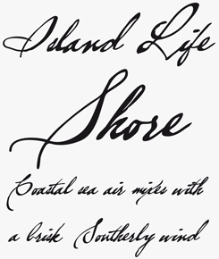
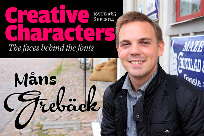
He’s from Sweden, and to help foreigners figure out how to pronounce his first name, his website used to be called “mawns”. Since 2013, his foundry goes by the name of the HTML entity that represents the Scandinavian å character: Aring Typeface AB. That “AB” is equivalent to “Inc.”: in just a few years, Måns Grebäck has gone from newbie typophile to company owner. For a type designer in his mid-twenties, he has already created an impressive library of typefaces. Many of them are confident script fonts in a broad range of styles, often inspired by advertising and lettering from the mid-20th century. He is immensely productive, and increasingly successful. Meet our man in Örebro — and try pronouncing that.
|
|
|
Måns, you do a lot of different things — besides typefaces, you’ve produced logos, 3D designs and animations. Would you say that type design is your number one activity? At what point in your career did you decide to focus on type?
For as long as I can remember, I have enjoyed drawing and similar forms of art. I went to art school (mixed with regular classes) from about age 16 to 19. At that time I had an interest in graffiti and remember doing other kinds of typography projects as well. I created my first font when I was 15 or 16, in 2006. Luckily, I have not been able to dig it up again — even at the time I thought it was low quality. My final project at art school was a short film animated in Flash. For several years I actually created a lot of animations, websites and useless games, but unfortunately I don’t have time to do any of that today. Animations are fun, but they’re extremely time-consuming.
By the time I began university my art interests had started to lean towards graphic design, which is what I decided to study after finishing art school. I considered it to be an alternative to pure art which was more likely to get me a job. While studying graphic design I learned the basics of typeface design and typography. In class we did some typographic art, but not any full typefaces or fonts. With an interest in graffiti, I created some graffiti fonts at home, along with a couple of supposedly normal typefaces. When I noticed that people actually wanted to use (and in some cases even pay for) my typefaces, this motivated me to keep creating them. Through the fonts I got design jobs, and less than a year after the release of my first font, in 2011, I started an official sole-proprietorship business. It was initially meant to be a general graphic design business, in which I could create logotypes and other design jobs beside fonts. But finally I decided to concentrate 100% on typefaces. In 2013 I changed the name of my foundry to Aring Typeface, and opened my own website; in 2014 I started the equivalent to a limited liability company. So type is now my number one design activity.
During my studies at university I attended a couple of 3D modeling classes, which interested me a lot. 3D is still something that amazes me and that I enjoy as a creative activity — part of me still wants to work with 3D modeling. But as I am currently successful in type design and have a strong interest in it, it would be hard to leave it behind, and also difficult to take the time to get established in 3D. So at the moment 3D modeling is just a rarely practiced hobby. When my business starts going in another direction I may try out different fields in the designing or creative worlds.
You’ve gradually specialized in script typefaces. Where does your love of scripts come from? Do you have any formal training in calligraphy or lettering?
My early typefaces were in all kinds of different styles, more like experimentation and training than serious design. I think, looking back, that I saw formal script and other script types as something “impossible” to create.
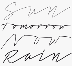
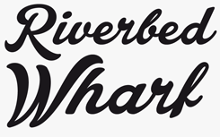
I shifted towards script typefaces with designs like Feathergraphy and Some Weatz, which became quite popular compared to my earlier typefaces. And popularity is probably my greatest inspiration and motivation. Somewhat unconsciously that’s how I came to create that big library of script typefaces. Even though I have a lot of fonts in different genres, scripts are generally the ones that become popular, which kind of tells me that those are the ones I’m best at and should concentrate on. I can’t remember whether I started creating them because I liked them, or if I began liking them when I realized I was able to create them, but I do love good script typefaces. If I see great scripts created by others I get impressed, with a slight touch of jealousy, but that’s just another great motivation.
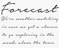
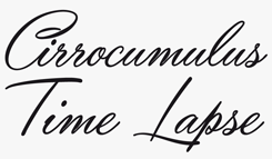
I never had any formal training in calligraphy, or anything similar, and I’m not particularly good at free-hand script. When I create typefaces I try to make each glyph in as much detail as possible from the beginning, and create them by concentrating on the details, even on the fonts that have a more sloppy feeling. Spontaneity is good, but that has not been how I’ve created the majority of my typefaces. This may be a weakness of mine, but I think it’s often a good thing too. The ideal is most likely somewhere in between spontaneous and perfection.
|
|
|
|
|
|
|
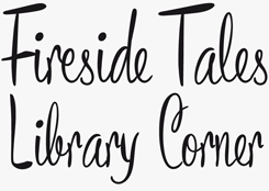
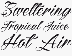
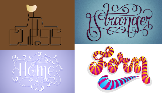
Four examples of Grebäck’s custom lettering. (Please note, these aren’t available to buy as fonts!)
|
|
|
|
In the development of script and display typography, is there a period or style that you’re especially fascinated by?
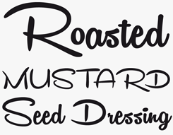
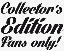
I do not necessarily have a favorite period of script typography, but as the mid-twentieth-century was a great period for script logos and slogans, and had a very wide variety of them, that’s where I tend to look for inspiration. While I’m glad to have a market, the quality of something actually handwritten is very hard to beat. I like the challenge to try to recreate the handwritten irregularities on slogans of old posters. I find it particularly interesting to make good connections between glyphs while still creating something that looks spontaneous or handwritten. I would like to believe this has made me good at spotting if a script is likely to be a typeface or not.
You’re based in Örebro, a medium-sized city in Sweden. Has your location been important for your career and daily business? Have you considered moving to a more central or culturally prominent city?
The majority of my customers are based outside of Sweden, and probably even outside of Europe. The few customers I have in Örebro are more or less accidental. I have a couple of regular clients here, though, but the location is not a necessity.
It has crossed my mind to move to another place or city, but I have no idea where that would be. Since I don’t have any particularly tempting alternative I just stay in Örebro, which is close to where I grew up and at a comfortable distance to anywhere I may want to go. I currently don’t see any advantages in moving to a bigger city within Sweden. I also just got an apartment, which is not easy, so I will probably be stuck here for a while now. Before I got it, I lived in different places around town, primarily because I did not want to be tied down and unable to leave when I wanted to. But I do feel now that it’s nice to have a real, stable home, and if I want to go somewhere else I guess I can leave the apartment empty for a while. One of the great advantages of my job is that I am pretty much free to be wherever I want, at least as long as there’s some kind of Internet connection.
You have collaborated with type designers in other parts of the world, such as Indonesian designer Vicky Mardian. Is online communication and networking an important aspect of your practice? And have you traveled a lot in search of letterforms?
I would be very unlikely to do what I do without online communication and the web market. I think that it is an understatement to call it important — essential is probably a better word, at least for the way I’m currently practicing marketing and customer contact.
I have traveled for fun to a lot of places, one of those places being Indonesia, but never gone anywhere solely for work or in search of types. That is something I really would like to do in the future though, go on trips for inspiration.
Type design is a great area for working by yourself, but I think there is potential for collaboration. One of the downsides with everything being online and designers being spread out is that you can’t sit down, look through and discuss a project as easily as in real life. That may be one of the reasons modern type design is often an individual activity, and not collaborative.
|
|
|
|
|
|
You’re in your mid-twenties; for a type designer, that is pretty young to have such a consistent output and success. Were you surprised that it worked? Do you have some kind of secret, or strategy?
As it has been a process over the last few years, I have not really had the opportunity to get a sudden feeling of surprise. And because of that process, I have never actually sat down and tried to figure out a business model; it has kind of evolved by itself. I have sometimes tried out new strategies, but with this kind of small-scale business and natural variation and unpredictable popularity between designs, I find it hard to know if a new strategy has been successful.
For example, if I release a new script and try a new strategy for it and it seems to sell well, how can I know whether it was the typeface or the strategy that accounted for the extra sales? With a larger sample it would be possible to get some hint about the effectiveness of a particular strategy, but as that also means more risk, I usually just stay with my old, reliable strategies. I am of course very happy to be successful doing something I like, and looking back I realize that I have been very lucky to find this field of work. I could just as well have skipped creating my first typefaces and been at a totally different place today. It’s tempting to think that I would have advanced in something else, but rationally I realize that that’s far from necessarily true.
That said, even though I feel like I have achieved something, in no way do I consider myself done, or at a peak. Sometimes I feel a bit stuck and repetitive, but I am constantly expanding my skills and developing new ideas; something hard to realize at the moment but obvious when I look at what I did a year ago.
I am often told I am productive, which I don’t necessarily agree with. I have productive periods, but sometimes I realize that I have not accomplished anything for a month, which makes me a bit stressed out. On the other hand, maybe that stress and need to be putting out is what defines productivity.
When I start work on something I have a good feeling about, I often finish it. Even though this is not true only for typefaces, but any creative project, I think it has helped me in my typographic career and may be one of my “secrets”. But it would be a lie to say I finish everything I start, as at the moment I have more than 80 unfinished typefaces. The majority of them are only a few letters, are more than a year old and do not have much potential. But there have been cases when I have found an old, unfinished typeface, seen it with different eyes and considered it being worth finishing. A great example of this is my new typeface “Undergone”, which should be released on MyFonts in a week or two. I began creating it in September 2012, and finished it less than a month ago.
As a type designer, you’re largely self-taught; how did you collect information on how to draw type, what to look for in letterforms and what errors to avoid?
I think I am just aware of type design; when I see a text I think about how each letter is structured. That’s especially true if I work on a sans-serif and see a sans logo. Scripts naturally draw my eyes to them, so I always consciously or subconsciously study how they are created.
The problem with being self-taught is that I may not know what to avoid. I am probably making amateur errors all the time because of this. For example, someone in the last year told me how wide a space should be in relation to the other letters in a sans font, and it was pretty recently that I started using kerning pairs. I’m not a huge fan of kerning though, as it takes away some of the challenge to make every glyph work with each other glyph, as an excuse to make exceptions to the natural harmony of the font. But I realize that it’s a great tool.
Practically, I would say I learned to create type through Internet tutorials, but over a long period of time. I would lose interest if I studied type design, 3D or any other creative subject in a concentrated period, or by following long tutorials. I like to first try out things by myself, and if there is something I don’t understand I generally go online for a quick answer. That is the way I have learned Illustrator, Photoshop, FontLab and several other applications, and I consider myself pretty good at them.
|
|
|
|
|
|
|
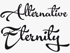
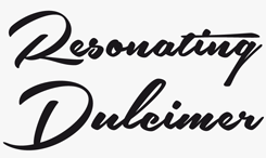
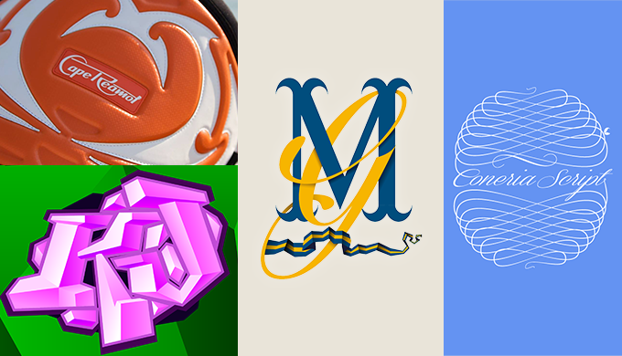
More of Grebäck’s logotype and lettering work.
|
|
|
|
Many young, type-obsessed designers decide to interrupt their design career for a year to do a specialized post-graduate in type design in places like Reading or The Hague. Are you attracted to schools like that? Do you think you could profit from it?
At the moment I am comfortable doing what I do. I am sure I would benefit greatly from it, but that would require that I am motivated to study, which I’m not sure I am... Also, I don’t see how I would be able to take a full pause from my “career”, as at this point it is at least as much about customer service and related work as about actual design or typeface creation.
To get my type design to the next level would probably require either a year of studying or a few more years of practice, but it would partly be studying for the sake of getting a degree, which I currently don’t feel is in my interest.
If you worked as an art school professor, what would your most important lesson be?
I think it’s important to find a good mix of forcing yourself to work even though you’re not a hundred percent motivated, and taking time off or spending time with something else when you’re stuck. It’s not impossible to get yourself motivated, and for me it often comes by itself when I get into something; I get motivated to get things done. But if you’re stuck, the time is sometimes better spent on other things.
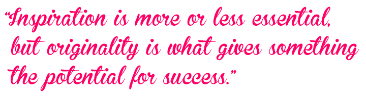
Inspiration is more or less essential, but originality is what gives something the potential for success. If I can’t figure out how to create a particular glyph, I rarely look for references or at other people’s work. Rather, I experiment until I think it looks good. This can result in very original designs, for better or worse.
What are the main projects you hope to get done in the next three years or so?
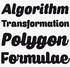
Not really a project, but I would like to create high quality serifs and sans-serifs to a greater extent that I’ve currently done. That may seem easy, but the hard part is to get them appreciated and successful, something I don’t feel I have really accomplished thus far. But I don’t want it to affect the expansion of my skills and varieties within scripts either.
As I have always created digital products, it would be interesting to try to produce and market a physical product. Not necessarily type related, but definitely design related in some way. Of course, the marketing would naturally require type design. However, this is not something I have any concrete plans to do, just something that maybe would interest me in the future.
|
|
|
MyFonts on Facebook, Tumblr, Twitter & Pinterest
Your opinions matter to us! Join the MyFonts community on Facebook, Tumblr, Twitter and Pinterest — feel free to share your thoughts and read other people’s comments. Plus, get tips, news, interesting links, personal favorites and more from the MyFonts staff.
|
|
|
|
|
Who would you interview?
Creative Characters is the MyFonts newsletter dedicated to people behind the fonts. Each month, we interview a notable personality from the type world. And we would like you, the reader, to have your say.
Which creative character would you interview if you had the chance? And what would you ask them? Let us know, and your choice may end up in a future edition of this newsletter! Just send an email with your ideas to [email protected].
In the past, we’ve interviewed the likes of Matthew Carter, Laura Worthington, Jonathan Barnbrook, Ulrike Wilhelm, Bruno Maag, Veronika Burian, and Hannes Von Döhren. If you’re curious to know which other type designers we’ve already interviewed as part of past Creative Characters newsletters, have a look at the archive.
|
|
Colophon
This newsletter was edited by Jan Middendorp and designed by Anthony Noel.
The Creative Characters nameplate is set in Amplitude and Farnham; the intro image features Bready and Acryle Script; the pull-quote is set in Brannboll NY; and the large question mark is in Farnham.
|
Comments?
We’d love to hear from you! Please send any questions or comments about this newsletter to [email protected]
|
Subscription info
Had enough? Unsubscribe immediately via this link:
www.myfonts.com/MailingList
Want to get future MyFonts newsletters sent to your inbox? Subscribe at:
MyFonts News Mailing List
|
Newsletter archives
Know someone who would be interested in this? Want to see past issues? All MyFonts newsletters (including this one) are available to view online here.
|
|
|
|
MyFonts Inc, 500 Unicorn Park Drive, Woburn MA 01801, USA
MyFonts and MyFonts.com are registered service marks of MyFonts Inc. Other technologies, font names, and brand
names are used for information only and remain trademarks or registered trademarks of their respective companies.
© 2014 MyFonts Inc
|
|
|