Creative Characters: Up and coming — XYZ Type
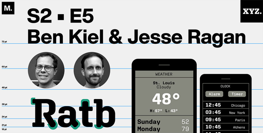
- Ben Kiel
Font designers Ben Kiel and Jesse Ragan, co-owners of XYZ Type, neither build garden fountains nor pour metal (two popular career misconceptions that the pair encounter). Instead, they’re quippy 40-somethings who launched their own shop after meeting and singing karaoke together at TypeCon NYC in 2005.
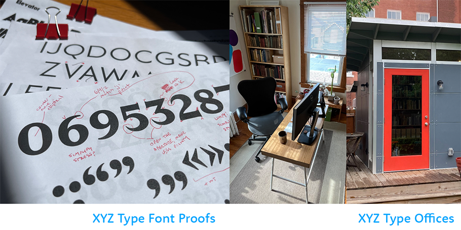
Ben handles XYZ’s finances, creates fonts and teaches at Washington University in St. Louis, MO; Jesse writes copy and designs typefaces from his home in Beacon, NY. The two love their big clients (Aldo Shoes, among them), dovetail their talents (despite living in different states and time zones), and hate typeface jargon (but use it anyway).
We spoke recently by Zoom. Our conversation has been compressed for space.
MyFonts (MF): What’s currently happening at XYZ? Any big projects underway?
Ben Kiel (BK): We’re launching a new website on Friday, so we’re a little frantic.
MF: Congratulations! What’s driving the launch?
BK: Foolishness — just kidding! Our new site is by GrayBits — they did the design and development – it allows us to offer more licensing options. So that allows us to present large families in a way we couldn’t before.
Jesse Ragan (JR): And variable fonts!
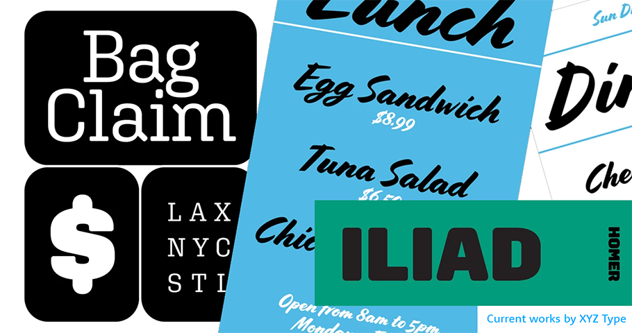
MF: Talk about font families, if you will. Are these multi-parent families? Single-parent?
BK: We welcome all families!
JR: I prefer avoiding words like “sibling” or “parent” or “cousin” when describing fonts. But “families” is an official term in type design.
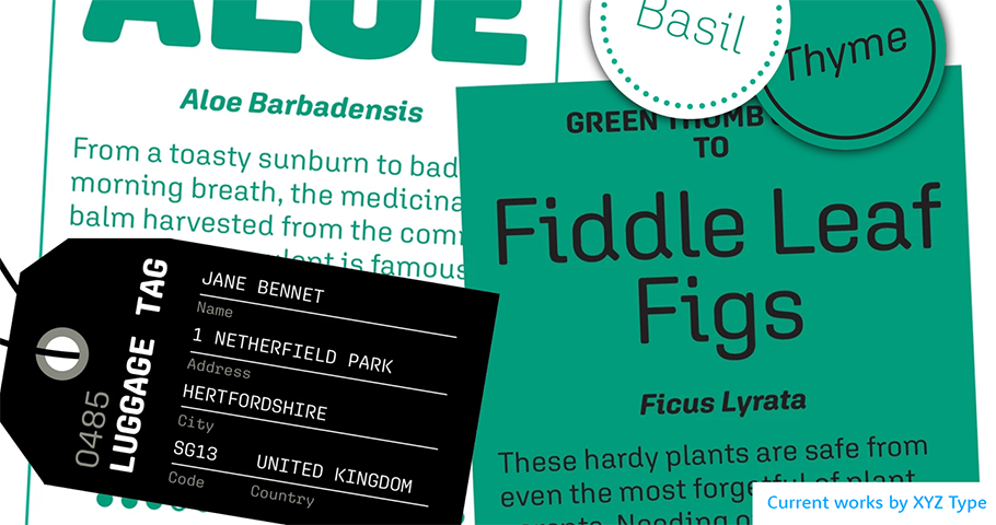
BK: It just means a collection. So, we have our Cortado font — which people like to use for coffee, for obvious reasons — along with Jesse’s forthcoming Elevator and Escalator typefaces, which we’ll post online soon. And we have fonts in forthcoming sub-collections that include condensed, compressed, regular, and wide styles. If we tried to add all that to the old website, we’d have a dropdown that just went whoosh! So we’re future-proofing.
MF: Just to circle back to the family thing: why do you not like that term?
JR: When we began looking into copywriting, we had absurd discussions, like, is this font more of a sibling or a cousin? The analogies don’t make any sense! So it seems silly to keep using them.
BK: There are enough dumb, jargony things in type design. We don’t have to make it more confusing.
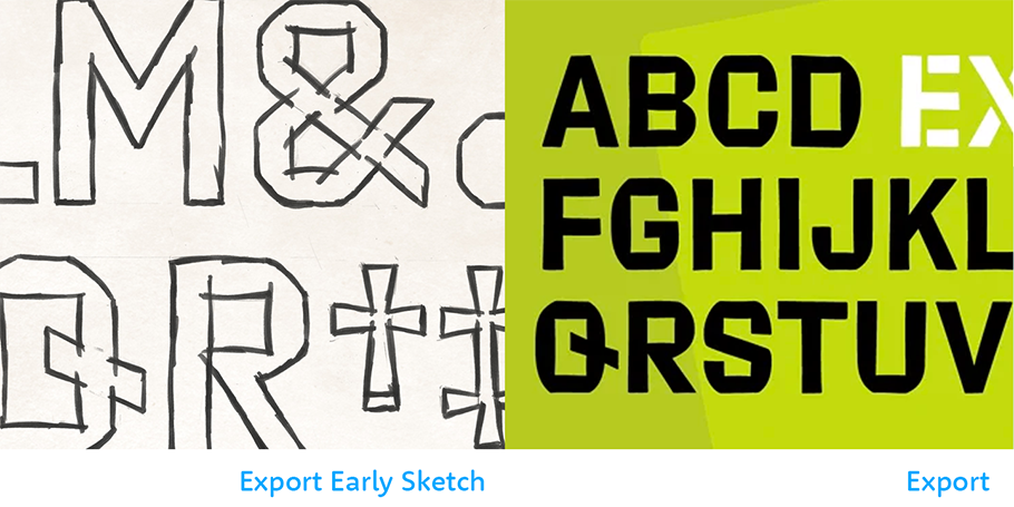
MF: Speaking of making, what’s one of the first big things that you created together?
JR: Years back, I was working on a client project with a crazy deadline. We had to do this elaborate OpenType script font, which ended up being Cortado. Not only was it a script font, which I’d never done before, but it needed OpenType features for a lot of complex substitutions. Ben had experience with both. So I asked him to work with me on it.
Once Cortado existed, we transitioned it into a retail product, because it wasn’t exclusive to the original client: Aldo Shoes. We released it without a foundry name attached. But after that, we knew that we worked well together and decided to form our own business.
MF: Now that cursive is no longer being taught to school children, do you feel that, in developing script, you’re being kind of retro?
JR: Gosh, I hope not!
BK: The “retro” word raises hackles. But, no. Cortado’s not really a cursive typeface. It’s is a very loose, nontraditional, not-what-a sign-painter-would-do brush script. It’s based on the brush-lettering of Cecilia Carlstedt, an illustrator.
MF. Why is “retro” a dirty word? What does it suggest?
BK: Retro is something that tends in design circles to be used as a pejorative. Like, “oh, that’s just retro.” Both Jesse and I like to look at history, but whenever we create a digital version of something, we’re casting it in a new light for modern usage.
That said, everything we do may be a look back, which you can’t wholly avoid in typeface design. For instance: an “a” is an “a.” You can only draw an “a” completely differently so far until people stop recognizing that it’s a letter.
JR: Also “retro” pigeonholes the design as being for a certain purpose. Yet where the design inspiration came from — like Cortado has a certain mid-century aesthetic — doesn’t necessarily dictate how it’ll be used. We hope our products will live outside of some idea of being frozen in time and can instead be put into a context that makes something entirely new.
MF: What makes your foundry distinctive?
BK: That we’re making the typefaces. They’re our take on forms and they’re our personality, expressed through letters. That may — or may not — be the flavor that someone’s looking for. But we make the things that we like making and we’ve created a space with the foundry to do that.
Give shout-out on social media using #CreativeCharacters @ben_kiel @seriousletterforms @xyz_type.
We hope you enjoyed this interview. Check out previous interviews of up and coming creative characters.


