Benton™ Sans Font Field Guide

FOUNDRY: Font Bureau
DESIGNER: David Berlow, Tobias Frere-Jones, Cyrus Highsmith, and Morris Fuller Benton
CLASSIFICATION: Sans Serif Grotesque
BEST PRACTICES
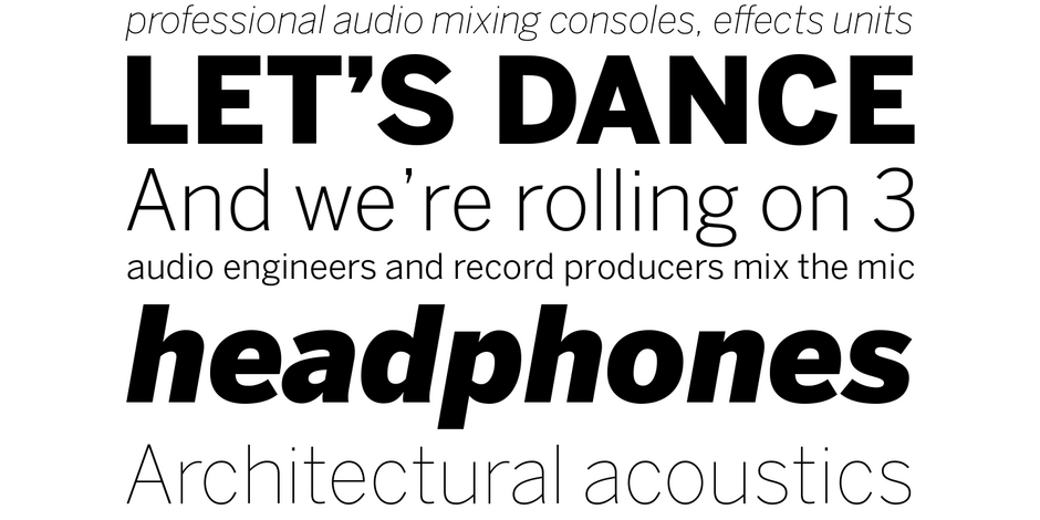
Benton Sans has the same range of uses as typefaces like Helvetica® Now and Univers® Next but differs from other grotesque sans serifs in its organic shapes and subtle transitions of stroke width – all contributing to a slightly more rustic tone of voice.

FAMILY
Benton Sans family contains 80 styles, from thin to black, in extra condensed to wide proportions. Each Roman design has a complementary italic.
FONT FACTS
- Prior to being released as a commercial suite of fonts, Benton Sans was developed for various corporate Font Bureau customers and eventually as a proprietary family for Martha Stewart Living magazine and the Martha Stewart Living Omnimedia website.
ROOTS
Benton Sans is based on the sans serif typefaces designed for American Type Founders by Morris Fuller Benton around the beginning of the twentieth century.
The commercial Benton Sans font family originally consisted of 26 fonts in 8 weights. This was expanded in 2013 to its current size.

LEGIBILITY
Modest stroke width variations, unique letter personalities, and simple character shapes, guarantees Benton Sans readability in a wide range of applications.

ALTERNATE CHOICES
PERFECT PAIRINGS
Download a PDF version of the Benton Sans Font Field Guide and view the Benton Sans font family.
More Font Field Guides

Classic Grotesque™ Font Field Guide
When asked about the intended uses for Classic Grotesque, McDonald’s answer was, “Graphic and interactive designers will probably use Classic Grotesque in ways that I would never imagine. I’ve used pre-release versions of the family in ads and in books, and they worked remarkably well in both. I can’t think of many places where Classic Grotesque won’t perform well.”

The Macklin family is a strong, adaptable family that is excellent for branding, headlines and other display uses. The simple shapes, open counters and apertures are wide and clear make it a good choice for short blocks of text copy in both print and on-screen environments.


