Dante® Font Field Guide

FOUNDRY: Monotype, DESIGNERS: Giovanni Mardersteig & CLASSIFICATION: Old Style Serif
Best Practices
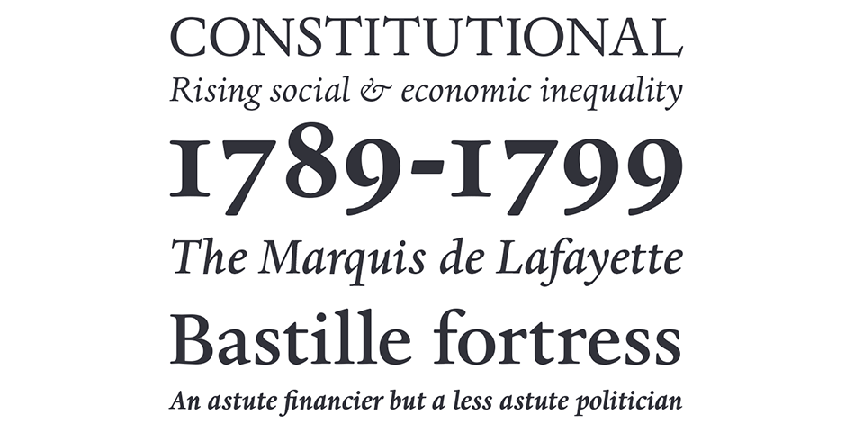
Mardersteig designed his typefaces for letterpress printing. The ultimate triumph of the Dante design is that it now serves the diverse needs of digital text typography. Designed as a “book face,” Dante can be ideal for long blocks of text copy.

FAMILY
Three weights of regular designs – each with a complementary italic
Font Facts
- A 20-year old Matthew Carter cut punches for several letters in a bold weight to show proof of concept for the additional design.
- Metal fonts were produced at Monotype’s factory in Frankfurt.
- The Dante family was Giovanni Mardersteig’s last and his most successful design.
Roots
Giovanni Mardersteig began designing the Dante typeface shortly after the Second World War. He drew on his experience of using The Monotype Bembo® and Centaur® typefaces as a book designer to establish the framework for his new text typeface for fine printing. Punches for the original handset type were hand-cut by Charles Malin. Using theses original punches as a model, Monotype’s design office was able to produce an exceptionally accurate interpretation of the typeface.
New digital versions were made by Monotype’s Ron Carpenter. Free from any restrictions imposed by machine-set technology, the new Dante family was issued in 1993.

Legibility
The design of the serifs and top curves of the lowercase create a subtle horizontal stress, which helps the eye move smoothly across the page. Wide lowercase proportions and large x-height aid legibility.
How To Spot Dante

Alternate Choices
Perfect Pairing
More Font Field Guides

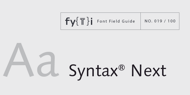
Syntax® Next Font Field Guide
Syntax is distinctive from geometric and grotesque sans serif typeface, making it a good alternative choice. Open line spacing and narrow columns are the best environments for reading ease. Learn more

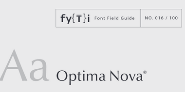
Optima Nova Font Field Guide
Optima nova should be set more open than tight. The unhurried elegance and light gray color created by the face is disrupted when letters are set too tight. Learn more


