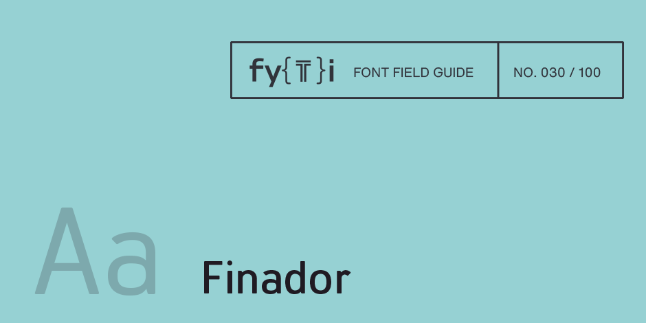
Finador Font Field Guide

Best Practices
Finador is a modern, soft sans serif family. The functional style of a sans-serif has been soften by open apertures and rounded corners. This makes Finador functional and friendly.
As a versatile allrounder Finador supports almost all your needs. It has the ability to become your next favorite workhorse family.

Family
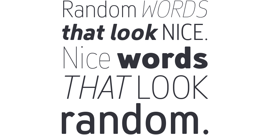
Finador is a modern, soft sans serif typeface family with a total of 16 weights, from thin to heavy and matching italics.
Font Facts
- The default version has open, modern apertures. Stylistic Set 2 includes the set of letters with closed, classic apertures. A slightly different look. It´s like having a second font.
- The Finador family includes many OpenType features like small caps, ligatures, fractions, alternates and many more.
Roots
After Julien Fincker’s first typeface Bourget – a display font with one weight – Finador was his first multiple weight typeface. The initial sketches were already drawn before and parallel to Bourget, and were quickly discarded. With the learning process in theory and practice, there were so many mistakes in form and craft, that Julien decided to redraw the entire alphabet. During the design process he learned much about OpenType features which increased the character set to over 900 characters. Finador, thus, quickly grew out of its role as a learning typeface and into an extensive allrounder family. It became universally applicable – a real workhorse.

Legibility
The thinner and thicker weights are particularly suitable for headlines, while the middle weights can be used for typographic challenges and body text. A large x-heigt, low contrast and open apertures provide a high level of typographic legibility.
How to spot Finador

Alternate Choices
Perfect Pairing
Download a PDF version of the Finador Font Field Guide and view the Finador font family.
More Font Field Guides

Spitzkant Font Field Guide
Spitzkant is a serif typeface family characterized by strong contrasts. Pointed, sharp serifs and edges contrast with round and fine forms, making it very individual and expressive. Spitzkant is particularly suitable for branding, editorial, packaging and advertising. Learn more

Ardena Font Field Guide
Ardena can be used in both a restrained and expressive way. The wide selection of styles makes it suitable for strong headlines and extensive body text. Completed with an extensive character collection, it becomes a real workhorse. Learn more


