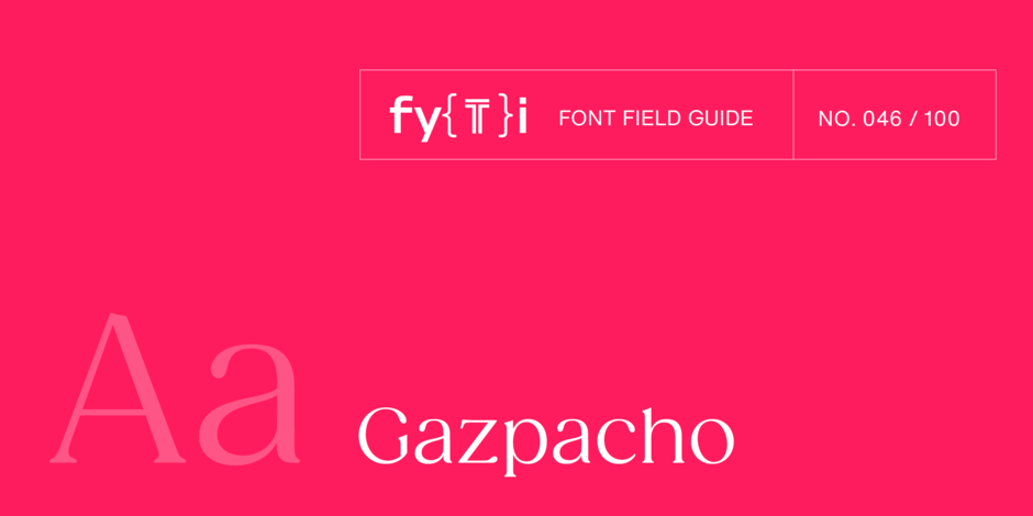
Gazpacho Font Field Guide

BEST PRACTICES
Drawing inspiration from Windsor™ and ITC Souvenir®, the Gazpacho typeface family is approachable and friendly, without being saccharine. It has a charmingly quirky personality. If it were a person, it’d be someone you’d want to hang out with.
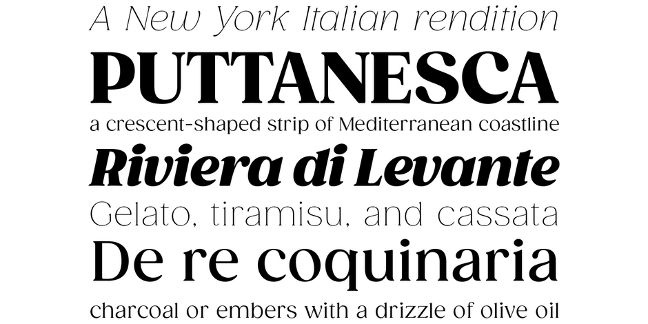
While it can be used for short block of text copy, Gazpacho is basically a display design – The bolder weights being especially effective. Gazpacho can be ideal for branding projects, restaurant menus, posters, and editorial headlines.

FAMILY
The Gazpacho font family has seven Roman weights, from Thin to Heavy, each with a companion Italic design. The family has a playful, sunny, and inviting demeanor, much like its namesake Spanish soup – fresh, vibrant, and full of flavor.
FONT FACTS
- Santi Rey’s favorite pre-made gazpacho uses Gazpacho for its branding.
- In 2021, Gazpacho was second, behind Helvetica, in the MyFonts rating of the most popular typefaces.
ROOTS
“I always have a specific use-case for each font at the beginning of every project,” explains Rey, “but that can change along the way. Gazpacho was meant to be used as a cookbook font, but now I see it in a lot of different places with completely different uses. That’s part of the beauty; you can’t control it.”

LEGIBILITY
Large counters – even in the heaviest weights – open apertures and a large x-height, make Gazpacho legible on-screen and in print.

ALTERNATE CHOICES
PERFECT PAIRINGS
MORE FONT FIELD GUIDES

FF Clan is a friendly design that melds a strong geometric aesthetic with humanist warmth. It’s appropriate for a wide variety of typographic applications, from branding to display heads and lengthy text copy, in hardcopy and digital applications.

Although the lighter weights can be used for short blocks of textual content, captions and subheads, Archer is primarily a display typeface. It’s bold weights bring a commanding, but friendly, vibe to headlines and other large-size copy


