Hidden Gem Century®
FOUNDRY: Font Bureau, International Typeface Corporation, Linotype & Monotype
DESIGNER: Various
CLASSIFICATION: Clarendon
WHY CENTURY
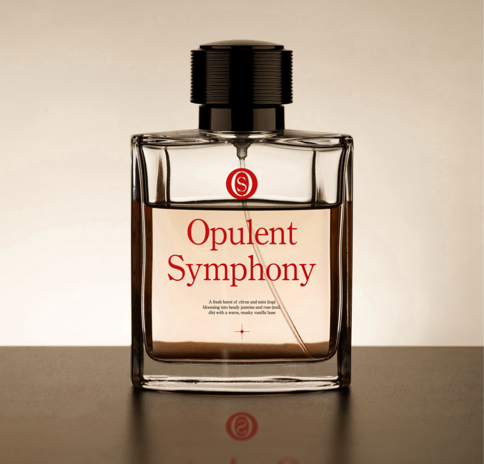
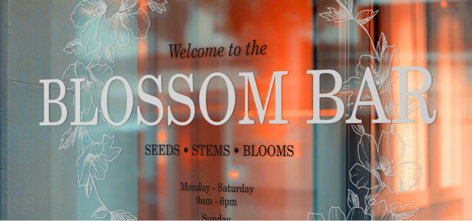
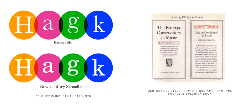
Century is a no-nonsense design, that may not stand out as pretty or clever, but gets the job done, with quiet grace. Century designs tend to be a bit chunky, with Roman weights slightly heavier than Times New Roman®. The contrast between thick and thin strokes is less pronounced than in Times New Roman. Century’s serifs are heavier, longer, and more bracketed compared to delicate text typefaces like Baskerville or Garamond. While these features don’t make Century particularly graceful or elegant, they create a typeface that is exceptionally legible and comfortable to read, making it ideal for long blocks of text. Its design prioritizes readability and ease on the eye.
ANCESTRY
- The Century family lineage dates to 1894, originating from a collaboration between publisher Theodore Lowe DeVinne and typeface designer and inventor of technology for producing metal type, Linn Boyd Benton.
- Dissatisfied with the popular text typefaces of the 1890s, DeVinne persuaded the American Type Founders Company (ATF) to develop a custom font he believed would be more legible and reader-friendly.
- Benton’s Century family shares consistent proportions and structural design changes. While the initial Century typeface and Century Expanded resembled Scotch Roman, later styles showed a distinct stylistic evolution. In 1915, textbook publisher Ginn & Company commissioned a font for schoolbooks. Benton, influenced by early legibility research, embraced the chance to apply his insights, shaping Century Schoolbook into a timeless, highly readable typeface.
PAIRING CENTURY FONTS
- Virtually any sans-serif design will pair well with the Century fonts. Geometric Sans, like ITC Avant Garde Gothic® and Harmonia Sans™ and provides a powerful counterpoint, while Grotesques like Helvetica® Now and Classic Grotesque™ provide a softer contrast to Century’s late 19th-century serif design traits.
- If you choose a serif typeface, it should be obviously different from the Century designs. Consider typefaces like Albertus™ or Quorum™
- Avoid other Slab Serif and Clarendon designs, like Egyptian Slate™, Charter™, and Rockwell® Nova.
CLASSIC FACTS
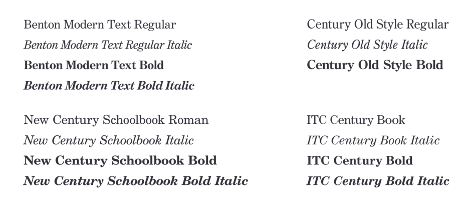
- Morris Fuller Benton’s original Century Schoolbook isn’t available digitally, but excellent revivals exist. Linotype’s 1980 New Century Schoolbook™ and Monotype’s slightly expanded, more faithful Century Schoolbook™ are popular. Monotype’s version is based on the original metal type. Monotype’s Century Old Style™ design is also a faithful rendition of ATF’s original Century Oldstyle.
- In the late 1990s, Tobias Frere-Jones redesigned Century as a text face for The Boston Globe, later expanding it for the Detroit Free Press, to echo Benton’s Century Expanded. The italic, designed by Richard Lipton and Christian Schwartz, complements the family now available as Benton Modern.
- The International Typeface Corporation (ITC) released ITC Century®, blending elements of Century, Century Expanded, and Century Schoolbook for greater usability with stronger strokes and smoother weight transitions.
FAMILY

MORE HIDDEN GEMS
Rockwell Nova®
Rockwell Nova evokes a feeling of straightforward honesty. Based on the original Rockwell design, it’s an adaptable face that is excellent for branding, headlines and other display uses. The simple shapes and robust serifs of Rockwell Nova also make the lighter weights a good choice for short blocks of text copy in both print and on-screen environments.
Bodoni™
The Bodoni typestyle is a staple of elegant graphic communication. It shines in editorial design, branding, and advertising, evoking a sense of luxury and tradition. The meticulous craftsmanship evident in Bodoni’s original letterforms ensure its place as a classic of typographic design.