Knockout® Perfect Font Pairings
Foundry: Hoefler & Co.
Designer: Jonathan Hoefler, expanded with the help of Tobias Frere-Jones
Classification: Grotesque Sans
ABOUT THE FAMILY
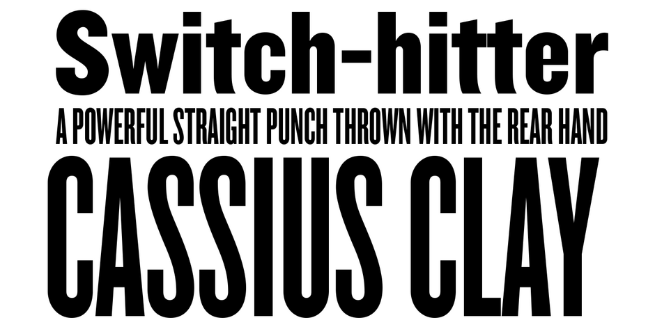
- Knockout is a modern interpretation of the sans serif typefaces used by American job printers in the late nineteenth century. With thirty-two styles, it draws inspiration from the tall, condensed woodtype fonts commonly seen in posters and advertising of that era.
- In addition to being a powerful display typeface family, Knockout also serves as an important preservation of American vernacular typography.
WHAT TO LOOK FOR IN FONTS THAT PAIR WELL WITH KNOCKOUT:
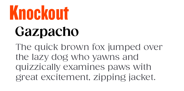
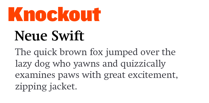
- Serif typeface – especially those with high levels of legibility.
- Slab or Clarendon typefaces with subtle to overt humanistic overtones.
- Old Style typeface designs like Eloquence™ or ITC Legacy Serif.
- Avoid sans serif fonts, but, some, like Frutiger® Next or ITC Stone Humanist, can pair well with Knockout. Just be sure that the weights of the two designs are dramatically different from each other.
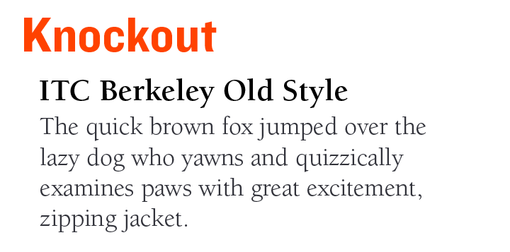
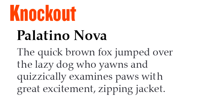
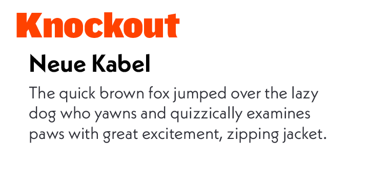
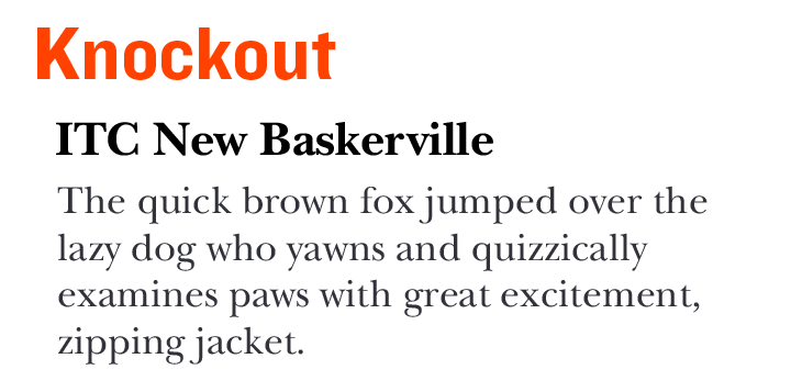
KNOCKOUT PAIRING WITH TEXT FONTS
Explore Other Font Pairing Guides
Univers Next is a refined and updated version of the original Univers typeface family. The family was expanded 63 weights, providing a much larger framework to graphic designers for choosing just the right style. Univers Next Variable are font files featuring two axis and have a preset instance from Light to Heavy and Condensed to Extended.

Gotham takes inspiration from the geometric signage at the New York Port Authority and is named after Batman’s city. Designed in 2000 for GQ and released publicly in 2002, the family now offers 140 styles and package options.
