Univers® Next Perfect Font Pairings
FOUNDRY: Linotype
DESIGNER: Adrian Frutiger, and Linotype Design Studio
CLASSIFICATION: Grotesque Sans
ABOUT THE FAMILY
- The original Univers fonts were the first typefaces to be developed as a cohesive typeface family (with consistent weight and proportion changes) from its onset. It had 27 different styles.
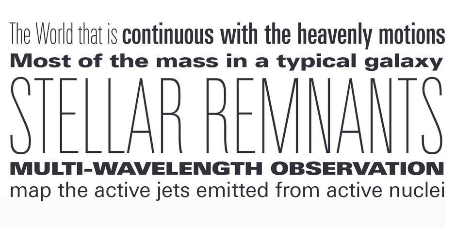
- Univers Next is a refined and updated version of the original Univers typeface family. The family was expanded 63 weights, providing a much larger framework to graphic designers for choosing just the right style. Univers Next Variable are font files featuring two axis and have a preset instance from Light to Heavy and Condensed to Extended.
WHAT TO LOOK FOR IN FONTS THAT PAIR WELL WITH UNIVERS NEXT:
- Serif typefaces with distinctive design characteristics.
- Slab or Clarendon typefaces with subtle to overt humanistic overtones.
- Old Style typeface designs like Eloquence™ or Berkeley Old Style.
- Avoid sans serif fonts but, some, like Harmonia Sans or Neue Kabel®, can pair well with Univers Next, if the weights of the two designs are dramatically different from each other..
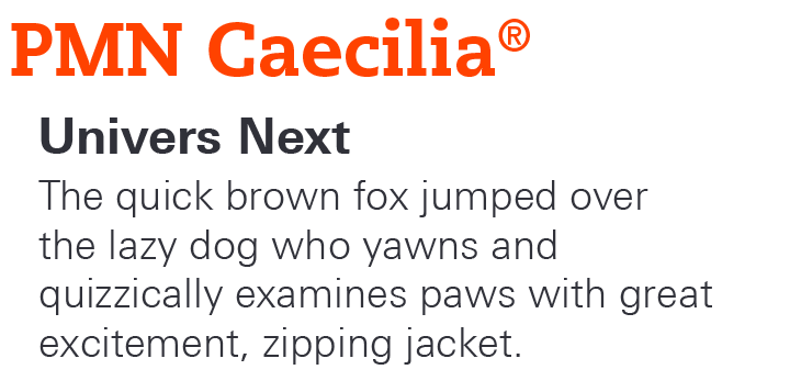
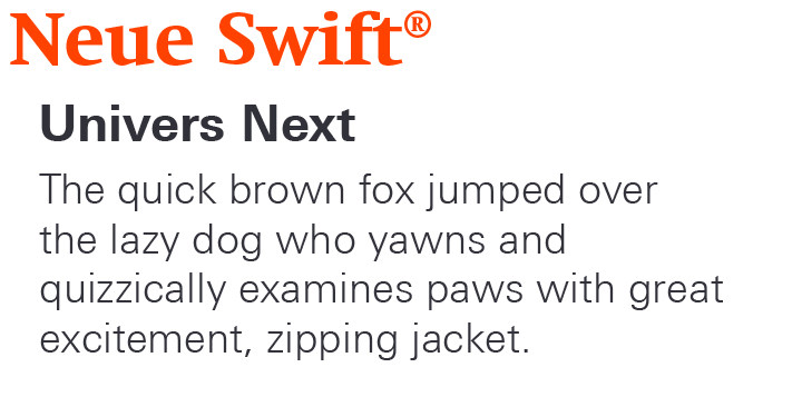
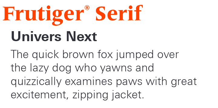
UNIVERS NEXT PAIRING WITH DISPLAY FONTS
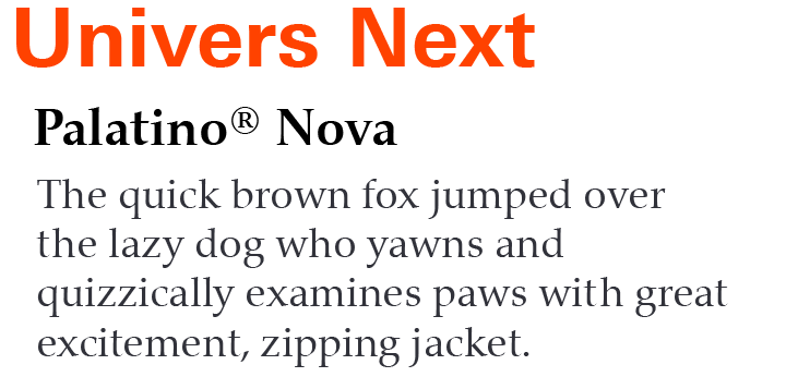
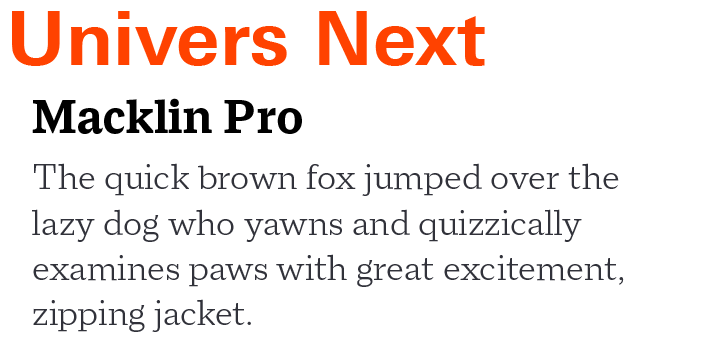
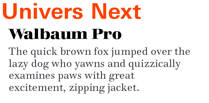
UNIVERS NEXT PAIRING WITH TEXT FONTS
Download a PDF version of the Univers Next Perfect Font Pairings and view the Univers Next font family.
Explore Other Font Pairing Guides

PMN Caecilia combines classical overtones with a contemporary vibe, creating a friendly and versatile slab serif family. Its large x-height, open counters, simple character shapes and sturdy serifs all contribute to the design’s high levels of legibility.
As a Transitional Serif design, the axis of Cotford’s the strokes normally have a vertical stress. Weight contrast is more pronounced in the display designs. Serifs are bracketed and head serifs are oblique. Cotford ranges from micro to display optical size, across Thin to Black weights, providing legible and stylish type at all sizes.
