PMN Caecilia® Perfect Font Pairings
FOUNDRY: Monotype
DESIGNER: Peter Matthias
CLASSIFICATION: Slab Serif
ABOUT THE FAMILY:
- One of the most influential reading tools of the Information Age – the Amazon Kindle® – initially used PMN Caecilia as a standard font for its books.
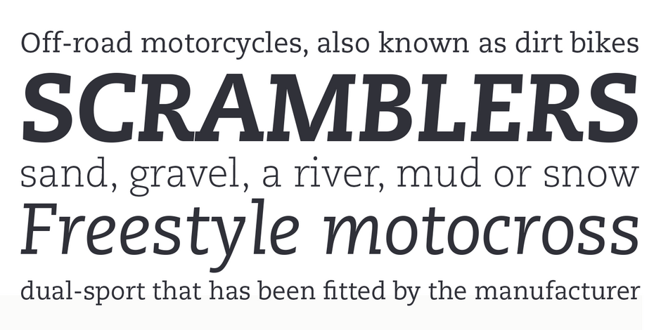
- PMN Caecilia combines classical overtones with a contemporary vibe, creating a friendly and versatile slab serif family. Its large x-height, open counters, simple character shapes and sturdy serifs all contribute to the design’s high levels of legibility.
WHAT TO LOOK FOR IN FONTS THAT PAIR WELL WITH PMN CAECILIA:
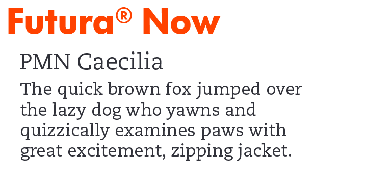
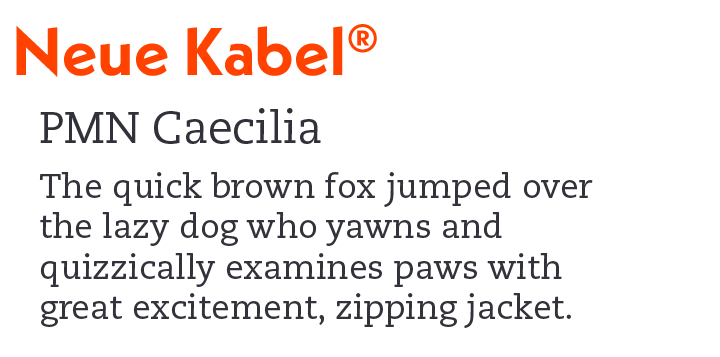
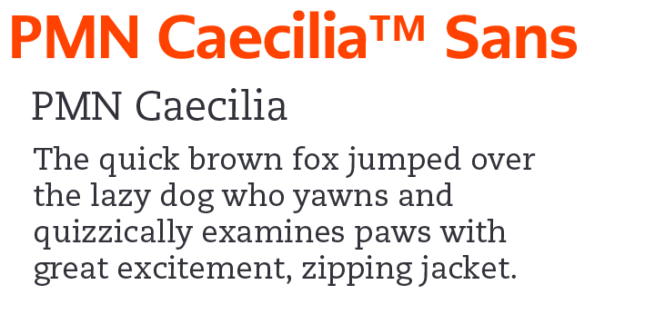
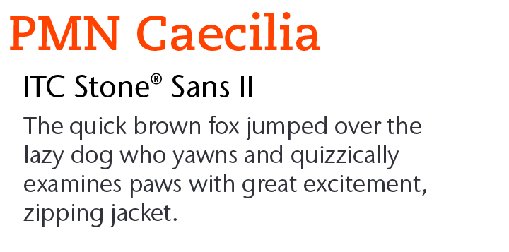
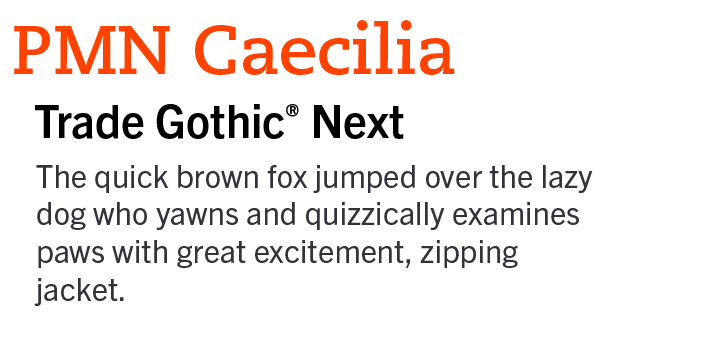
- Virtually any sans serif design will pair well with PMN Caecilia. Geometric Sans, like ITC Avant Garde Gothic® and Harmonia Sans™ and provide a powerful counterpoint, while Grotesques like Helvetica® Now and Classic Grotesque™ complement PMN Caecilia’s calligraphic overtones.
- If you choose a serif typeface, it should be obviously different from PMN Caecilia. Consider designs like Albertus™ or Quorum™
- Avoid other Slab Serif and Clarendon designs, like Egyptian Slate™, Charter™ and Rockwell® Nova
PMN CAECILIA PAIRING WITH DISPLAY FONTS
PMN CAECILIA PAIRING WITH TEXT FONTS
Download a PDF version of the PMN Caecilia Perfect Font Pairings and view the PMN Caecilia font family.
Explore Other Font Pairing Guides
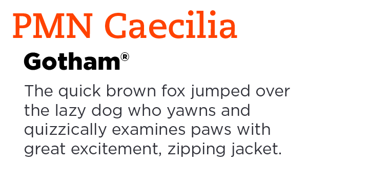
Gotham takes inspiration from the geometric signage at the New York Port Authority and is named after Batman’s city. Designed in 2000 for GQ and released publicly in 2002, the family now offers 140 styles and package options.
Futura Now is the definitive re-digitized version of the iconic geometric sans serif typeface. With 102 styles, including Condensed, Headline, and Text weights, in addition to extensive language support, Futura Now is poised to take on virtually any typographic task.
