Manual: Choosing Display Fonts
Display typefaces have four main functions:
- Attract attention
- Create differentiation
- Set a mood
- Build hierarchy
Attract Attention
Display typefaces serve the essential purpose of attracting attention, drawing readers into advertisements, brochures, or posters. The most effective designs accomplish this without being overpowering, seamlessly leading the reader to the accompanying text without distraction.
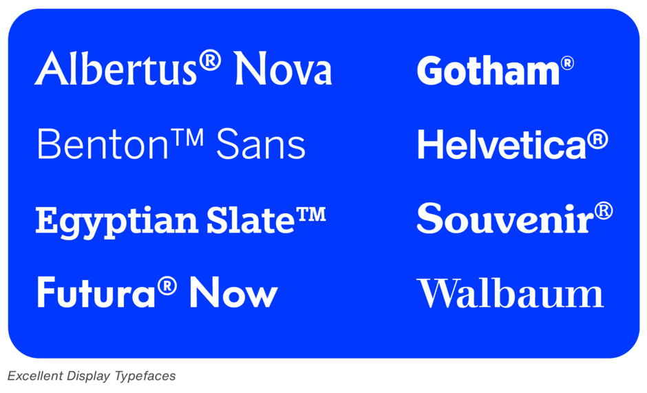
Create Differentiation
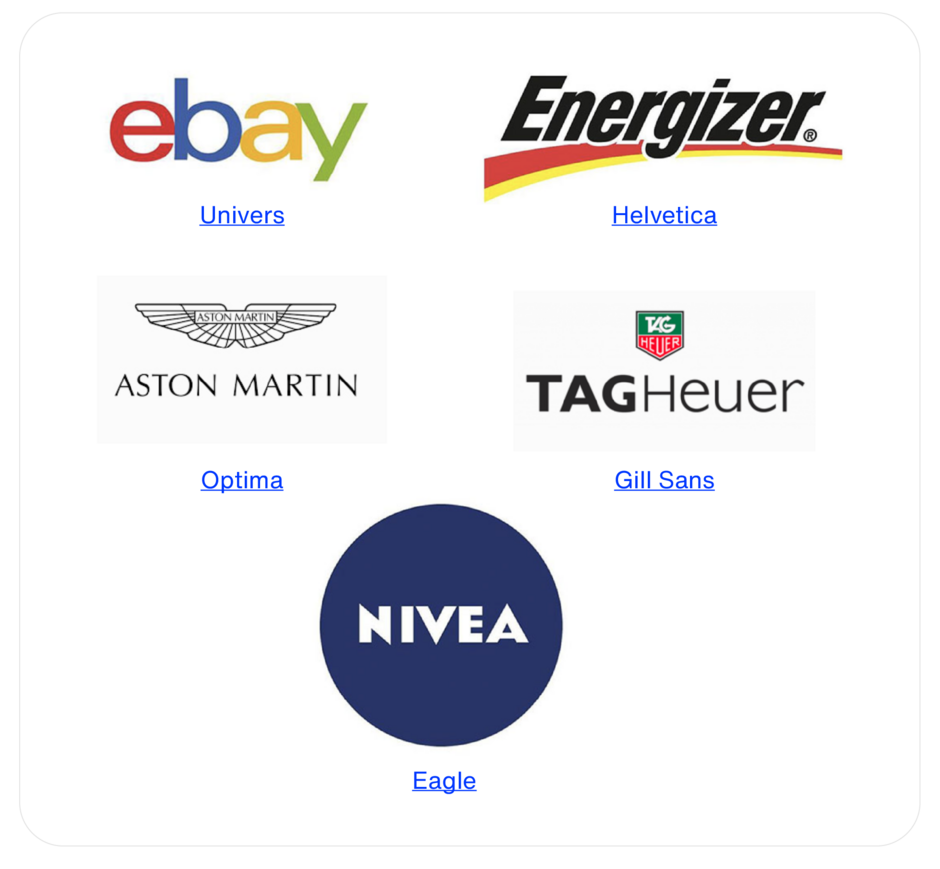
Display typefaces can establish brand and product differentiation. Thoughtfully chosen typefaces enable products and services to stand out and promote a strong brand identity
Set A Mood
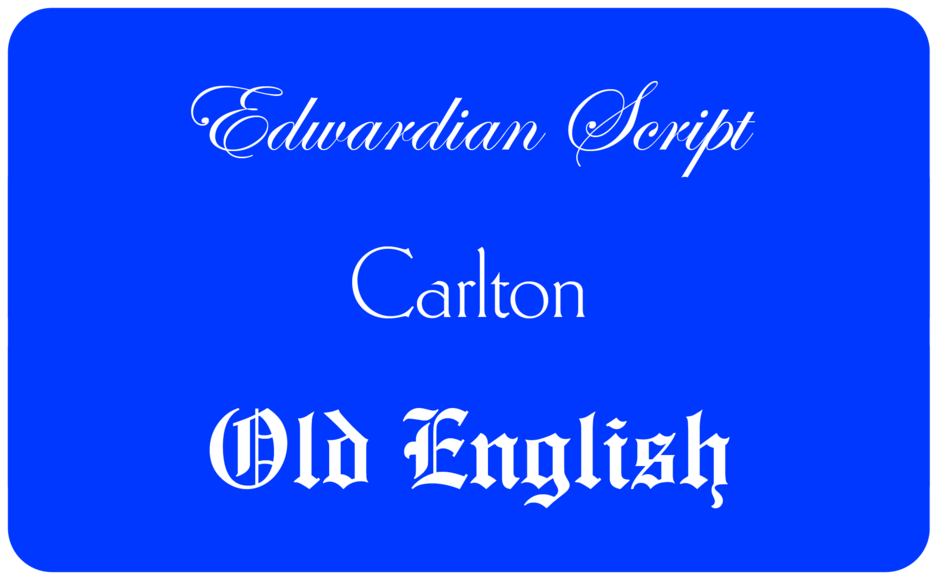
Display typefaces can evoke moods or emotional responses. For instance, the flowing letters of Edwardian Script conveys elegance, while Carlton has Art Deco overtones. However, caution is needed; using clichéd styles, such as Old English, can undermine the intended message.
Build Hierarchy
Display typefaces help create order and structure within complex content. They can divide lengthy documents into manageable sections, highlight key points, and differentiate various content elements. When display type enhances clarity without distracting from the main text, it can make documents appear shorter and more approachable.
What To Look For When Choosing Display Fonts
Choosing the right display typeface involves ensuring appropriateness for the delivery vehicle, content, and target audience.
Appropriate to Delivery Vehicle
The best display typeface for small print will differ from those that work well at larger sizes or on screens. For presentation graphics, a bold sans serif typeface ensures legibility and visibility. Conversely, sans serif designs with large x-heights are ideal for digital use, while robust, decorative fonts that shine in print may falter on screen.
Appropriate to Message
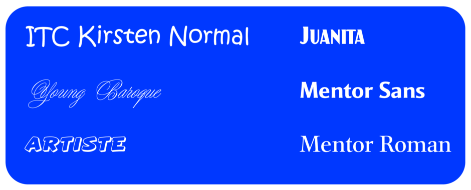
Different types convey varying messages. A birth announcement might use ITC Kirsten or Young Baroque, while a company picnic poster could benefit from strong fonts like Artiste or Juanita. For a financial newsletter, Mentor Sans Bold for headings and its serif counterpart, Mentor Roman, could be ideal.
Appropriate to Audience
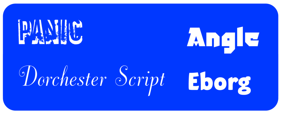
The choice of display typeface should also consider the audience. Counter-culture designs like Panic may not appeal to older adults, nor will Dorchester Script necessarily resonate with skateboard customers. Typefaces like Angle or Eborg may excel as display types but may not suit a financial firm’s readership.
Copy Length
The length of the copy influences the typeface choice. Long blocks of display text should be inviting and easy to read, with traditional designs like Charter or Mendoza being ideal. In contrast, short copy can embrace more decorative faces, such as Buccaneer or Curlz, which sacrifices legibility for impact.

Harmony and Counterpoint
Ultimately, display type can either complement or provide contrast to text copy, establishing a dynamic relationship that enhances the overall composition.
In either case, the typeface used as the emphasizer should also be bolder and have about the same x-height as the face used for the rest of the text copy.
Using a sans serif design as a display typeface with copy set with a different sans serif face almost never works well.
Display typefaces grab attention, convey brand personality, enhance readability, and create visual interest, making graphic communication inviting, effective and memorable.

